Best Furniture Layout for Small Living Room: A Practical How‑To Guide
Posted by Harvey Bruce on
Picture this: you step into a cosy living room that feels surprisingly spacious, even though the floor plan is tighter than a city flat.
That moment of relief? It’s the magic of the best furniture layout for small living room – a blend of smart placement, sleek pieces and a pinch of personality.
We get it. As homeowners chasing a luxurious yet functional vibe, you often wrestle with too many items and not enough breathing room. You might be wondering, “How can I fit a sofa, a TV stand and still have room to move without it looking cramped?”
First, think about zones. Even in a modest space, you can create a subtle living zone and a relaxed reading nook by anchoring the larger piece – usually a sofa – against the longest wall. This frees up the centre for flow and makes the room feel grounded.
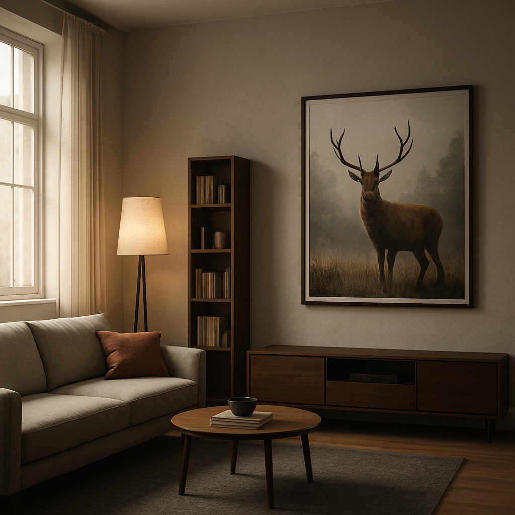
Second, choose furniture with built‑in storage. A contemporary modern media storage furniture unit, for example, hides cables and magazines while keeping the silhouette low and sleek. It’s a tidy solution that adds elegance without shouting for attention. At Harvey Bruce Interiors we source pieces that combine style and hidden storage, making the choice easy.
Third, embrace multi‑functional pieces. A stylish ottoman that doubles as a hidden chest, or a slim coffee table with a lift‑top, lets you keep the surface clear for drinks or a laptop without sacrificing style.
And don’t forget vertical space. Tall, narrow bookcases or wall‑mounted shelves draw the eye upward, creating the illusion of height. Pair them with a few well‑chosen accessories – a plush throw, a statement lamp – and you’ll see the room transform.
Finally, let natural light be your ally. Keep window treatments light and consider wooden plantation shutters for a touch of classic charm; they help regulate temperature, cut down on heating bills and look stunning in a refined setting.
So, what’s the next step? Start by sketching your floor plan, marking the focal wall, and then experiment with the pieces you already own before you add anything new. You’ll be amazed at how a few thoughtful moves can turn a cramped corner into the best furniture layout for small living room you’ve ever imagined.
TL;DR
If you want a stylish, spacious feel in a compact living room, focus on zoned layouts, sleek storage‑rich furniture, and vertical accents. Combine a low‑profile sofa, hidden‑storage media unit, and a multifunctional ottoman, then let natural light flow, and you’ll achieve the best furniture layout for your small living room.
Step 1: Assess Your Space
Before you even think about which couch to buy, grab a pencil and a blank sheet of paper. Sketch the room's outline, noting doors, windows and any built‑in features. It sounds simple, but that little drawing will become your secret weapon for the best furniture layout for small living room spaces.
Ask yourself: where does natural light pour in? Where do you want the eye to drift first when you step inside? Those zones become the backbone of your layout. If you love a bright, airy feel, you’ll want the main seating area opposite the biggest window, letting sunlight flood the space.
Next, measure everything – floor width, ceiling height, even the depth of the window sill. Write those numbers next to your sketch. It may feel a bit like a school project, but trust me, those measurements keep you from buying a sofa that ends up blocking the flow.
Now, think about the focal point. Is it a TV, a fireplace, or perhaps a striking piece of art? Whatever it is, anchor the largest piece of furniture – usually the sofa – to that wall. Our Stylish Home Interiors Sofa Collection offers compact, low‑profile options that sit nicely against a wall without overwhelming a modest floor plan.
Do you have a love‑it‑or‑leave‑it bookshelf, a media console, or a sideboard? Consider how each item fits into the flow you’ve just mapped. Tall, narrow storage units can double as vertical accents, drawing the eye upward and creating that illusion of extra height.
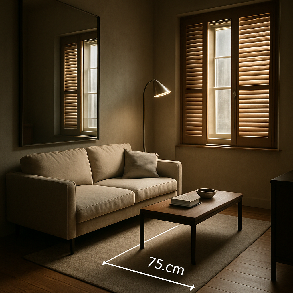
And here's a quick tip: leave at least 60‑cm of clear walking space in the centre of the room. That little breathing room makes the layout feel far larger than it actually is.
So, what about lighting? You might think a floor lamp is the easiest fix, but think bigger – a well‑placed decorative umbrella can temper harsh sunlight and add a cosy ambience. For a premium solution, check out Umbrello’s range of high‑quality outdoor umbrellas. They blend design and function, perfect for creating a soft‑lit corner even in a compact living area.
When you’ve plotted the main pieces, step back and visualise traffic patterns. Imagine yourself moving from the kitchen to the sofa, or reaching for a book on a shelf. Does the path feel natural? If not, shuffle the furniture in your sketch until the flow feels effortless.
Sometimes a piece of art can become the visual anchor you need. A striking wildlife print, for instance, can balance a minimalist sofa and add personality without taking up floor space. Explore ideas in contemporary wildlife art prints – they’re a great way to fill an empty wall and keep the room feeling curated.
Ready for a visual walk‑through? Below is a short video that shows how a simple floor‑plan tweak can transform a cramped room into a welcoming lounge.
Take a moment after the video to compare the before‑and‑after layout on your sketch. Does the new arrangement feel more open? If something still feels off, tweak the placement of one piece at a time – you’ll quickly see what works.
Finally, jot down any adjustments you made during this assessment. Those notes become your checklist when you start shopping – no more guesswork, just confident choices that fit your space like a glove.
Step 2: Choose the Right Furniture Pieces
Now that you’ve measured every wall and walked the traffic paths, the next question is: what actually belongs in that blueprint? The answer isn’t “fill every inch” – it’s “pick pieces that earn their square footage.”
Pick a scaled sofa that anchors without overwhelming
In a small living room the sofa is the room’s anchor, but it can also become a visual wall if you’re not careful. Look for a low‑profile, narrow‑depth design that sits comfortably against the longest wall while leaving at least 60 cm of breathing room on either side. A compact loveseat or a petite three‑seat sofa does the trick; it offers enough seating for two‑three people without swallowing the floor.
For inspiration, check out the range of small sofas on Italian Interiors’ small sofa collection. Their pieces blend sleek Italian styling with clever dimensions, so you get a statement seat that still feels airy.
And remember: a sofa with tapered wooden legs lifts the piece off the floor, creating an illusion of extra height – a subtle trick that makes the whole space feel larger.
Lean on multi‑functional media storage
TV stands, media consoles, and shelving units tend to dominate a room, but in a compact layout they should disappear into the background. Choose a media storage piece that’s shallow enough to sit close to the wall yet offers hidden compartments for cords, magazines, and remote controls. A low‑profile cabinet with sliding doors keeps the silhouette sleek and the clutter hidden.
If you love a clean line, a wall‑mounted media unit can free up floor space entirely. Just make sure the mount is secure and the unit spans no more than a third of the wall width so it doesn’t dominate the focal point.
Vertical storage & shelving – go up, not out
When floor area is at a premium, think vertical. Tall, narrow bookcases or floating shelves draw the eye upward, adding storage without eating precious square metres. A slim ladder shelf can hold books, decorative boxes, and even a few plants, creating a curated gallery wall.
Because you’re already using wall space for art, a staggered shelf layout can break up the visual mass and keep the room feeling balanced. Keep the top shelf no higher than 180 cm so you can reach items without a step stool.
Ottomans, nesting tables & flexible side pieces
Small rooms love pieces that wear many hats. An upholstered ottoman with hidden storage gives you a footrest, an extra seat, and a place to stash blankets – all in one compact block. Nesting side tables slide together when you need extra surface for drinks or a laptop, then tuck away to keep pathways clear.
Choose an ottoman with a removable lid; the extra compartment can become a mini‑library for magazines or a stash for board‑games when guests arrive.
Finish with textiles, lighting & personal touches
A light, neutral rug that’s slightly smaller than the seating area defines the space without cutting off the flow. Pair it with a slim floor lamp in a brushed metal finish – the lamp adds height and a warm pool of light without demanding a table surface.
Throw pillows in a pop of colour or a patterned throw can inject personality, but keep the quantity low; too many cushions can make the sofa look crowded. A single statement artwork on the opposite wall, as you already experimented with, balances the visual weight.
So, what’s the final checklist? Measure, choose a scaled sofa, pick shallow media storage, stack vertical shelves, add an ottoman with hidden space, and finish with purposeful textiles and lighting.
Give those pieces a quick “walk‑through test” now – imagine moving around them with a tray of coffee. If you can glide without bumping, you’ve nailed the best furniture layout for a small living room.
Step 3: Create a Functional Layout
Start with a conversation core
Picture the sofa and a couple of armchairs gathered around a low coffee table – that little island becomes the heart of the room. Instead of scattering pieces along the walls, pull them together so the flow moves around the conversation core, not through it. It feels cosy, but still roomy enough for a tray of tea or a laptop.
Ask yourself: does the layout let you walk from the front door to the kitchen without squeezing past a leg? If you need to sidestep a chair, you’ve probably placed too much furniture in the way.
Give the eye something to follow
When you look around, your gaze should glide from the TV or fireplace to the seating area, then up the wall to a tall shelf or artwork. This vertical‑horizontal rhythm tricks the brain into thinking the space is larger. A narrow ladder shelf on one side and a slim floor lamp on the other creates a subtle frame that guides traffic without blocking it.
We’ve seen this work wonders in tiny London flats – the eye travels up the ladder shelf, down the lamp, and lands on the sofa, keeping the room feeling balanced.
Choose furniture with visual lightness
Light‑coloured pieces or items with exposed legs appear less bulky than chunky, solid blocks. An armless chair with metal legs, for example, lets the floor stay visible and adds a sense of openness. A marble‑topped coffee table with a slim profile adds a touch of luxury without overwhelming the floor area.
Even a small ottoman can double as extra seating or hidden storage, but keep its silhouette slim. If you need a larger surface for guests, place a nesting side table next to it – pull it out when needed, tuck it away when you’re done.
Map traffic routes, then test them
Grab a piece of masking tape and mark the main pathways on your floor‑plan sketch: from the entry door, past the sofa, to the kitchen or bathroom. Aim for a minimum width of 75 cm (about 30 in) for each lane. Once you’ve arranged the furniture on paper, do a quick “walk‑through test” in the actual room. Imagine carrying a tray of coffee – can you glide past the coffee table without a wobble?
If something feels tight, slide the piece a few centimetres back or swap it for a more compact alternative. Small adjustments often free up more than you expect.
Layer functional zones without walls
In an open‑plan layout, the sofa itself can act as a visual divider between the living area and the dining nook. Position the back of the sofa facing away from the kitchen; this signals a subtle shift in purpose without erecting a wall. Add a narrow console or a slim side table at the junction to reinforce the boundary while still keeping the pathway clear.
For homeowners who love a reading corner, tuck a slim armchair and a floor lamp in the far corner of the layout. A tall bookcase behind the chair adds storage and draws the eye upward, echoing the vertical theme we mentioned earlier.
Bring in the experts
When you’re stuck on how to balance style and function, a quick look at proven small living room layout ideas can spark fresh configurations. The article highlights the power of a clear focal point and the benefit of arranging furniture in a centred cluster – exactly what we’re aiming for.
In our experience at Harvey Bruce Interiors, pairing a low‑profile sofa from our collection with a contemporary modern media storage unit (which sits flush against the wall) frees up precious floor space and keeps cables out of sight. The result is a sleek, functional layout that feels both luxurious and lived‑in.
So, what’s the final checklist? Sketch a conversation core, map clear traffic lanes of at least 75 cm, choose light‑looking pieces with legs, add vertical interest, and test the flow with a mental coffee‑tray run. Follow these steps and you’ll nail the best furniture layout for small living room – a space that feels spacious, stylish, and ready for everyday moments.
Step 4: Add Bespoke Homeware & Accessories
Now that the bones are in place, it’s time to layer in bespoke homeware and accessories that feel intentional, not cluttered. You want luxe touches that support living—not crowd it.
In our experience at Harvey Bruce Interiors, the right accessories do more than beautify. They anchor zones, cue light, and remind you why you chose the space in the first place. Choose pieces that are unique, sustainably sourced, and sized to complement your layout rather than overwhelm it.
Start by choosing a cohesive language: a mix of warm wood, softly marbled surfaces, and tactile fabrics. If you’re stacking textures, aim for three main textures—wood, linen, and ceramic—that repeat across cushions, vases, and a statement lamp.
Then select bespoke elements. A handcrafted vase, a one‑off sculpture, or an artisanal throw from our range can become a conversation starter. Because they’re bespoke, these pieces feel intentional and easy to swap out as seasons change or you update the room.
Let surfaces breathe. In small spaces, too many little objects scatter attention. Instead, pick a standout piece for the focal wall—perhaps a large, framed artwork or a sculptural lamp that creates a warm glow. The rest should support it rather than compete with it.
Layer textiles to add warmth without visual noise. A throw casually draped over the sofa, a couple of cushions in a limited palette, and a rug that defines the seating area can transform the vibe without overcrowding the space.
Practical decor matters too. Look for hidden storage opportunities that double as design features: a woven basket under a coffee table, a decorative box for remotes and chargers, or a slim storage trunk that doubles as extra seating when needed. These keepsakes feel personal and stay useful long after the first impression wears off.
Elevate vertical space with a tall plant or a sculptural light to draw eyes upward and widen the perception of the room. Plants not only bring life; they also soften hard edges and soften reflections on glass and metal surfaces.
Lighting is a design accessory in itself. A well‑placed floor lamp can sculpt corners, while a small table lamp on a console adds ambient warmth to evenings spent relaxing or working at home. When you plan lighting, think about how it interacts with art and textiles—the glow should flatter, not glare.
In short, curate with intention. Choose 2–3 hero pieces that define the room and sprinkle in supporting items that echo their tones and textures. This keeps the space cohesive, luxurious and comfortably liveable.
Does this really work in practice? Imagine a single sculptural vase on a narrow shelf, a throw tucked on the sofa with a couple of matching cushions, and a floor lamp that frames the seating area. It feels elevated, but still effortless enough for everyday life.
For inspiration, House Beautiful emphasises keeping surfaces clear while using open shelving and multipurpose items to maximise small spaces. You’ll find practical ideas that align with our approach to bespoke homeware in the way you layer and curate pieces that speak to your space. House Beautiful's small-space design ideas
Similarly, their small living room decorating ideas remind us to balance scale, light, and texture to avoid visual clutter while still making the room feel intimate. House Beautiful's small living room decorating ideas.
Step 5: Optimize Light & Flow
Okay, you’ve got the sofa, the storage and the accessories in place – now it’s time to think about how light and movement actually breathe life into that layout. Light isn’t just illumination; it’s a guide that nudges the eye and the footfall around the room.
When you treat light like a design element, the whole space starts to feel larger, even if the square footage stays the same. Think of it as a silent partner that helps the furniture layout do its job without shouting for attention.
Let the light in
First, keep your window dressings light and airy. Wooden plantation shutters are a stylish way to control glare while still letting daylight filter in – they cut down on heating bills and add a crisp, tailored look that suits a luxe living room.
If you have a large window, pull the curtains completely aside during the day. The extra daylight reflects off walls, ceiling and any light‑coloured rugs, instantly expanding the visual field. And because we’re talking about the best furniture layout for small living room, that extra glow makes each piece feel less cramped.
So, what happens when the sun sets? That’s where layered lighting steps in.
Mirror magic for flow
Mirrors are the unsung heroes of small‑room design. A well‑placed mirror not only doubles the amount of light bouncing around, it also creates the illusion of depth. Hang a tall mirror opposite a window or lean a sleek rectangular one against a wall that’s behind your sofa – you’ll see the room stretch outward.
For a deeper dive on how mirrors trick the eye, check out this guide on strategic mirror placement. The article shows how a single large mirror can act as a focal point while still keeping the floor clear for traffic.
Imagine you’re standing in front of the couch, coffee in hand – the mirror reflects the window, the lamp, even the bookshelf, giving you a sense that the room continues beyond the walls.
Layered lighting
Next, think three‑dimensional lighting: ambient, task and accent. A slim floor lamp in a brushed‑metal finish adds height without hogging floor space, while a small table lamp on a console creates a cosy pool of light for evenings.
Don’t forget subtle accent lights – LED strips tucked behind floating shelves or a narrow uplighter aimed at a tall plant can pull the eye upward, reinforcing that vertical feel we love in compact rooms.
Do you ever notice how a room feels different when you switch on a single lamp versus when you have a few soft glows? That’s the power of layered lighting.
Create clear pathways
Traffic flow is the bloodstream of any layout. Aim for at least 75 cm (about 30 in) of clear walkway between furniture groups. Use low‑profile pieces with exposed legs – they sit on “air” rather than a solid block, making the floor visually open.
Place the main seating cluster so you can walk from the entry door, past the sofa, to the kitchen without squeezing. If you need a side table, choose a nesting set that slides together when you’re not using it.
What if the layout feels tight after you’ve placed everything? That’s where a quick tweak can free up more space than you think.
Test the flow
Grab a tray of coffee or a stack of magazines and do a “walk‑through test”. Can you glide past the coffee table, reach the sofa and still have room to open the door? If you have to pivot or step over a leg, pull that piece back a few centimetres or swap it for a slimmer option.
Another trick: tape a line on the floor where the main traffic route should be. If any furniture crosses that line, it’s a red flag. Adjust until the line stays clear – that’s your visual cue for the best furniture layout for small living room.
Finally, remember that light and flow are a conversation, not a monologue. As you fine‑tune the lamps, mirrors and pathways, you’ll notice the room breathing easier, looking larger, and feeling more inviting.
Take a moment now: dim the main lights, turn on a floor lamp, glance at the mirror, and walk the path you just created. If it feels effortless, you’ve nailed it.
Step 6: Compare Layout Options
You've mapped space, picked pieces, and tested the flow. Now it's time to compare layout options in a way that helps you land the best furniture layout for small living room. The right choice depends on how you live, not just how the room looks.
In our experience at Harvey Bruce Interiors, anchored layouts tend to work best for families and everyday entertaining. They place the sofa as the visual anchor while leaving clear pathways for moving around. But maybe you crave more conversation zones, or you want modular freedom. So let's break down three common approaches and when they shine.
Anchored layout: the sofa as the visual anchor
Pros: strong focal point, predictable traffic lanes, easy to accessorise. Cons: can feel heavy if the sofa is oversized. Best for rooms where you want a clear TV or fireplace focus and simple traffic paths.
Tips: use a slim console behind the sofa to create depth; keep side chairs in line with the armrests; ensure at least 75 cm clearance for walkways. This setup often reads as calm and luxurious, especially with a low-profile media unit.
Zone-led layout: clear conversation and activity zones
Pros: flexible, makes the room feel bigger by separating functions. Cons: requires careful scale so zones don't fight for the same space. Best when you have separate needs like a reading corner or a compact dining area within an open plan.
Tips: use area rugs to delineate zones, keep pathways clear, and pick storage that serves each zone. From our perspective, good storage keeps a zone tidy and reduces visual clutter.
Floating/modular layout: moveable pieces that breathe
Pros: ultimate adaptability, easy to reconfigure for family life or gatherings. Cons: can look disjointed if pieces drift apart. Best for tiny rooms that change with the seasons.
Tips: choose modular sections with slim profiles and allow coffee tables and nesting tables to tuck away when not in use. The idea is lightness—visible legs, airy silhouettes, and plenty of floor space left intentionally open.
So, what should you pick? Start by sketching three layouts on grid paper or a floor plan app, then test them in the room. Walk the pathways with a tray of coffee and see which feels effortless. This is how you land the best furniture layout for small living room.
For a broader take on layout thinking, you might also explore parallel vs L‑shape kitchen layouts on McCoy Mart's guide. It isn't about kitchens alone; it's about how different shapes guide movement and flow in tight spaces. See McCoy Mart's guide on parallel vs L-shaped layouts.
| Feature | Anchored layout | Zone-led layout | Floating/modular |
|---|---|---|---|
| Seating density | Concentrated near focal point | Distributed across zones | Modular, adjustable |
| Traffic flow clarity | High, defined lanes | Moderate, zones may share space | High when kept stage clear |
| Storage footprint | Media unit hides cables | Per zone storage helps clutter control | Under-table or hidden options recommended |
| Visual weight | Medium to heavy silhouette | Lightened by zoning and rugs | Lightweight silhouettes, exposed legs |
Conclusion
We've walked through measuring, picking pieces, testing traffic, and adding the finishing touches. By now you can picture the moment when you step back, coffee in hand, and the room feels airy rather than cramped.
So, does the best furniture layout for small living room still feel like a puzzle? Not really – it's just a series of tiny decisions that add up. Keep the sofa low, let legs breathe, and let vertical shelves draw the eye upward.
Remember the 75 cm clearance rule. If a leg or a lamp forces you to sidestep, slide it back a few centimetres. That simple tweak often frees more space than you expect.
Quick checklist
✓ Sketch the floor plan and mark traffic lanes.
✓ Choose a scaled sofa and shallow media unit.
✓ Add vertical storage and a statement mirror.
✓ Test the flow with a tray of coffee.
✓ Layer ambient, task, and accent lighting.
When you follow these steps, you’ll end up with a layout that feels both luxurious and lived‑in – exactly what Harvey Bruce Interiors aims to inspire for homeowners seeking a stylish, functional space.
Ready to transform your own living room? Start with that sketch, experiment, and let the room reveal its best layout.
FAQ
How do I determine the right traffic clearance for the best furniture layout for small living room?
First, measure the width of any path you need to walk – think about moving from the front door to the kitchen or bathroom. Aim for at least 75 cm (about 30 in) of clear space between pieces. If you notice a leg or a lamp forcing you to sidestep, slide it back a few centimetres. That simple tweak often frees more room than you expect and keeps the flow feeling natural.
What size sofa works best without overwhelming a tiny living room?
Choose a sofa that’s low‑profile and no deeper than 55 cm, with a length that fits comfortably against the longest wall while still leaving about 60 cm on each side. A compact three‑seat or a petite loveseat works wonders – it offers enough seating for two‑three people without swallowing the floor. Look for tapered legs; they lift the piece off the ground and create a visual sense of extra height.
Can I use vertical storage to make the room feel bigger?
Vertical storage is a game‑changer in a small room. Tall, narrow bookcases, ladder shelves or floating wall units draw the eye upward, making the ceiling feel higher. Keep the top shelf within reach – around 180 cm – so you don’t need a stool. By stacking books, baskets and a few plants, you free valuable floor space for seating and traffic lanes, which is essential for the best furniture layout for small living room.
How should I arrange lighting to enhance the layout?
Layered lighting helps the layout breathe. Start with a soft ambient source – a slim floor lamp or a dimmable overhead fixture – to wash the room in even light. Add a task lamp beside a reading chair and an accent strip behind a floating shelf to highlight vertical interest. The extra glow not only makes the space feel larger, it also guides the eye along the traffic path you’ve created.
Is a floating media console better than a traditional TV stand?
Floating media consoles often win over traditional TV stands in tight spaces. Because they’re mounted or sit close to the wall, they free up precious floor area and keep the room feeling airy. Choose a low‑profile unit with hidden cable management to maintain a sleek look. If you prefer a free‑standing piece, pick one with slender legs and a depth under 35 cm – that way it stays out of the way of your traffic lanes.
What quick test can I do to see if my layout really works?
The easiest way to test your layout is the coffee‑tray walk‑through. Grab a tray, fill it with a couple of mugs, and try to move from the entry door, past the sofa, to the kitchen without bumping anything. If you have to sidestep or tilt the tray, you’ve identified a choke point. Adjust the offending piece by a few centimetres or swap it for a slimmer alternative and try again.
How often should I re‑evaluate my layout as my needs change?
As your life evolves, so should your layout. Re‑evaluate every 6‑12 months or whenever you add a new piece – a desk, a baby crib or a pet bed can shift traffic patterns. Keep the core principles in mind: clear 75 cm pathways, low‑profile furniture, and vertical interest. A quick sketch or a phone app can show you where the room feels tight, letting you make a small tweak before the space feels cramped again.
← Older Post Newer Post →
