How to Style a Console Table: Creative Ideas for Every Home
Posted by Derek Lamb on
Picture this: you’ve just moved into a new place, the hallway is empty, and you’re staring at a sleek console table waiting to become the room’s silent star. You feel that mix of excitement and a tiny panic – what do you actually put on it without looking like you threw a random assortment together?
We’ve all been there, wondering whether a stack of books looks better than a vase, or if a tray of keys turns the space into a clutter zone. The good news? Styling a console table is less about strict rules and more about telling a little story that reflects your life, while keeping the look polished.
First, think about the function of the piece. Is it an entryway welcome mat, a hallway gallery, or a living‑room sidekick? In our experience, homeowners who treat the console as a multi‑tasking hero – a place for daily essentials, a showcase for a favourite art piece, and a subtle lighting spot – end up with the most cohesive look.
Start with a base layer: a slim tray or a low‑profile basket. This anchors the items and keeps things tidy. Next, add height variation – perhaps a tall ceramic vase on one side and a stack of coffee‑table books on the other. Pair textures; a smooth marble vase beside a woven basket adds visual interest without shouting.
Lighting can make or break the scene. A slender floor lamp or a pair of wall‑mounted sconces positioned just above the console draws the eye upward and adds warmth. For that extra touch, consider linking up with a high‑end lighting provider to find fixtures that complement the wood tones of your table.
Don’t forget the power of colour coordination. If your console is a warm oak, choose accessories in muted earth tones or soft pastels – they echo the natural vibe without overwhelming the space. A splash of greenery, like a small potted fern, brings life and a breath of fresh air.
Finally, step back and ask yourself: does this arrangement feel like you? If a friend walked in, would they instantly sense your style? If you’re still unsure, browse some Stylish Wooden Console Tables for Every Home for inspiration – the variety of finishes and shapes can spark fresh ideas.
Take a photo, live with it for a week, then tweak as needed. Styling a console table is an evolving process, but with these simple steps you’ll turn that empty surface into a personal showcase that welcomes you home every day.
TL;DR
If you’ve ever stared at an empty console wondering how to style a console table, you’re not alone.
Follow our guide to balance function and flair—pick a base tray, add height with a vase or books, sprinkle colour, and finish with subtle lighting for a space that feels instantly yours.
Step 1: Choose the Right Table Size and Shape
When you first glance at an empty hallway, the console table feels like a blank canvas, but the size and shape you pick will set the tone for everything that follows.
Think about the width of your entryway. If the wall is narrow, a slim rectangular piece keeps the flow open; a chunky oval can overwhelm a tight corridor.
And if you have a wider space, you can get playful – a round or curved table adds softness, while a long, low profile runs like a runway for your decor.
So, what should you actually measure? Grab a tape and note three things: the wall length, the distance to any doors or windows, and the height you want for eye‑level accessories.
Here’s a quick rule of thumb: the table shouldn’t exceed two‑thirds of the wall width, and there should be at least 12‑inch clearance in front for easy passing.
Consider the Space
A narrow hallway often benefits from a slender, rectangular console that tucks neatly against the wall. Choose a finish that reflects the surrounding woodwork or paint, so the piece feels built‑in rather than tacked on.
Match the Shape to Function
If you plan to display art pieces or a large mirror, a straight‑edged table offers a clean line to anchor the visual weight. For a more relaxed vibe – say, a coffee‑table‑style stack of books and a vase – a gently rounded shape softens the look.
Now that you’ve settled on shape, let’s talk proportion. A console that’s too tall becomes a visual wall; too low, and it can feel like a forgotten ledge. Aim for a height that lets you comfortably reach decorative items without stooping.
Scale Matters
Look at the other furniture in the room. If your sofa sits at 38 inches, a console around 30‑32 inches high will sit nicely beneath it. For a dining area, a lower console can serve as a buffet without blocking sightlines.
Don’t forget the depth. A depth of 10‑12 inches works for most entryways – deep enough for a tray and a small plant, but shallow enough to keep the floor visible.
Material choice also influences perceived size. A light‑coloured marble top can make a larger table feel airy, while a dark walnut slab grounds a smaller piece, adding visual heft. Pair the finish with the room’s palette for harmony.
Finally, picture yourself using the table each day. Can you imagine slipping your keys into a basket, setting a mail slot, or placing a fresh bouquet without bumping into it? If the mental picture feels smooth, you’ve hit the sweet spot.
Choosing the right size and shape is the foundation of a styled console. With those basics locked down, the next steps – layering, lighting, and colour – become a playful experiment rather than a guessing game, giving you confidence to create a space that truly feels yours.
Step 2: Pick a Cohesive Color Palette
So you’ve got the right size and shape – great! The real magic happens when the colours on your console start talking to the rest of the room. If you’ve ever stared at a table and felt something was “off”, you’re probably missing that subtle colour connection.
Assess what’s already in the room
Take a quick inventory: wall paint, flooring, the sofa, even the curtains. Do the walls lean warm, like a soft sage, or are they a cool dove‑grey? Light hardwood floors whisper neutral, while a deep walnut stair runner shouts richness. Jot down the dominant hues – these become your starting point.
In our experience, homeowners who map these existing tones avoid the dreaded clash that makes a hallway feel disjointed. A simple way is to snap a photo, pull up the image on your phone, and use the built‑in colour picker to note the main shades.
Choose a base tone for the console
Neutral bases – white, cream, light grey, or natural wood – are the safest bets. They let the accessories you love shine without fighting for attention. If your walls are a bold navy, a crisp white or light oak console will balance the drama while keeping the look polished.
For a more daring feel, consider an earthy tone like burnt sienna or olive green. Tribesigns notes that these warm hues are trending and pair beautifully with both modern and traditional interiors.Read more about colour trends.
Add accent colours strategically
Once the base is settled, think about the 10 % accent rule – a pop of colour that adds personality. This could be a brass lamp, a cobalt vase, or a patterned runner. If your sofa is a muted taupe, a deep emerald vase on a light wood console creates a striking yet harmonious contrast.
Remember the 60‑30‑10 rule: 60 % main colour (walls/floor), 30 % secondary (sofa, larger furniture) and 10 % accent (your console accessories). Your console’s colour should sit comfortably in that 10 % slot or act as the neutral backdrop for those accents.
Test under your lighting
Natural light can turn a soft grey into a cool blue, while dimmer evenings push the same shade toward warm taupe. Stand your console in its intended spot at different times of day. Does a light‑grey surface look flat in the morning but come alive at dusk? If it feels flat, a slightly richer tone – think greige or warm walnut – can add depth.
House & Garden reminds us that the lighting context is crucial when styling a hallway console.See hallway styling tips
Pull it all together
Now sketch a quick mood board: a swatch of your wall colour, a sample of the console finish, and a photo of one accent piece you love. If the pieces feel like they belong together, you’ve nailed the palette. If not, swap one element – often the easiest fix is changing a small décor item rather than the whole table.
Finally, live with it for a few days. Take a photo, step back, and ask yourself: does this console feel like a natural extension of the room, or does it still feel like an afterthought? Small tweaks now save you from a costly redo later.
Choosing a cohesive colour palette doesn’t have to be a daunting design exam. By grounding yourself in what’s already there, picking a neutral or on‑trend base, sprinkling in thoughtful accents, and testing in real light, you’ll create a console that feels effortlessly curated – a true reflection of your home’s personality.
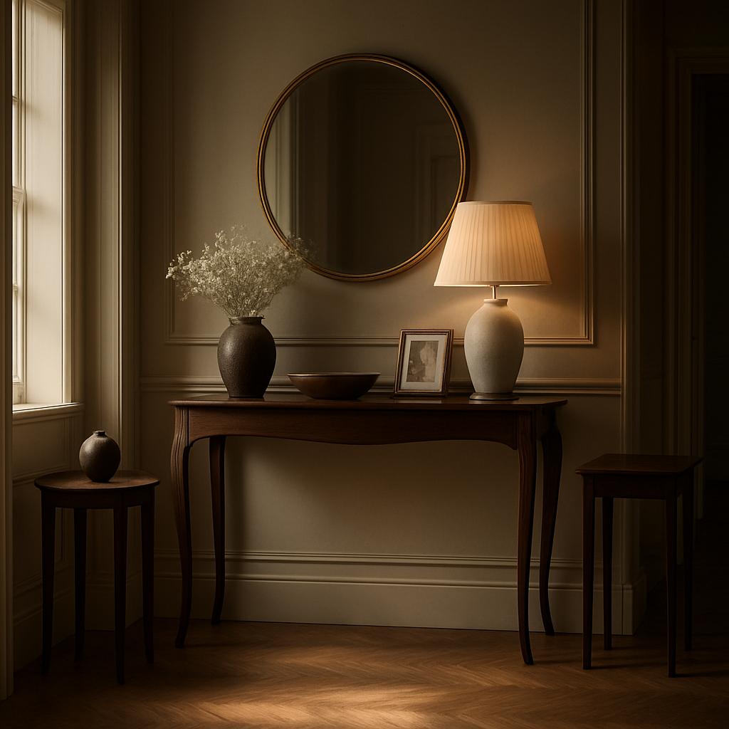
Step 3: Select Functional and Decorative Accessories
Now that you’ve nailed the size and colour, it’s time to think about what actually lives on the console. This is where the piece stops feeling like a spare board and starts becoming a purposeful vignette.
First, ask yourself: what do you need at arm’s length every morning? Keys, mail, a charging pad, maybe a pretty spot for the day‑old newspaper? Those are your functional anchors. A slim metal tray or a woven basket works like a quiet hero – it gathers the clutter without shouting.
Imagine a narrow, matte‑black tray from a local maker. It slides right onto the surface, holds your keys, a handful of letters, and even a small scented candle. Because the tray is low‑profile, the rest of your décor can breathe.
But functional pieces don’t have to be boring. A wooden catch‑all box with a soft‑close lid adds a touch of warmth, while a built‑in USB hub keeps your phone charged discreetly. In our experience, homeowners who blend tech‑friendly accessories with natural textures end up with a console that feels both modern and homey.
Decorative accessories – the personality boosters
Once the basics are settled, layer in the decorative items that tell your story. A tall ceramic vase on one side creates height; a small cluster of faux olives or a real potted fern on the other brings life. Jenna Kate notes that “fresh greenery always adds a breath of air” and it’s a tip that works in any UK hallway.
Don’t forget lighting. A slender brass table lamp or an understated sconce adds ambient glow and draws the eye upward, making the console feel taller. Pair the lamp with a sculptural object – perhaps a marble bowl or a brass figurine – for a curated look.
Artwork can also live on the console itself. A narrow framed print leaned against the back of the table adds colour without demanding wall space. If you’re feeling adventurous, a small gallery of three mini‑frames in varying heights creates a dynamic focal point.
Now, what about texture? Mix smooth glass, rough wood, and soft fabric. A woven linen runner draped just behind the vase adds depth, while a couple of polished stone coasters protect the surface and act as tiny decorative accents.
Balancing function and flair
The secret is to keep visual weight evenly distributed. You don’t want a mountain of books on one side and an empty void on the other – it feels lopsided. Instead, place a stack of coffee‑table books beside a lamp, and balance that with a vase or a decorative bowl on the opposite end.
Here’s a quick checklist you can print out and hang by the console:
- Functional base: tray, basket, or catch‑all box.
- Tech need: charging station or USB hub.
- Height element: tall vase, lamp, or sculpture.
- Green touch: real plant or faux foliage.
- Texture mix: glass, metal, wood, fabric.
- Final polish: candle, decorative bowl, or small artwork.
Does this feel overwhelming? Take it step by step. Start with the tray, add a lamp, then experiment with one decorative piece at a time. You’ll see the arrangement evolve naturally.
One trick we love at Harvey Bruce Interiors is to “test‑drive” the look before committing. Arrange the accessories on a coffee table first; snap a photo; then move them onto the console. If something feels off, swap it out – you’re not locked into a decision.
And remember, the console should still feel functional. If you find yourself constantly moving things around, you probably have too many decorative items. Trim back to the essentials, then re‑introduce a piece that truly makes you smile.
For extra inspiration, check out Jenna Kate’s summer console décor ideas – she breaks down the perfect mix of accessories for every season. Likewise, Oomph Home explains how balancing style with practicality makes a console table feel intentional.
When you’re happy with the final set‑up, step back, take a photo, and live with it for a few days. If the surface still feels cluttered, remove the least‑loved item. The goal is a curated vignette that serves you daily while looking effortlessly stylish.
Step 4: Arrange Books, Plants, and Art (Includes Comparison Table)
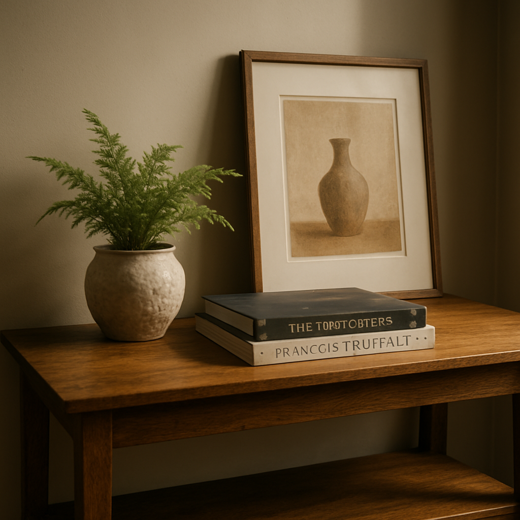
Okay, you’ve got your tray, your lamp, maybe a vase – now it’s time to bring the story to life with books, greenery, and a splash of art. Think of the console as a tiny gallery where each piece whispers something about you.
Start with a book stack that feels purposeful
Grab a couple of coffee‑table books you actually love – a travel guide, a coffee‑table photography book, or a design‑inspirations volume. Stack them in twos or threes, keeping the tallest on the left or right side to create visual weight. The key is to choose books with covers that complement your colour palette; a muted navy spine against a light oak console adds a quiet contrast.
Do you ever notice how a single book can become a mini‑sculpture? That’s the trick: let the stack act as a height anchor, then balance it with something lighter.
Introduce greenery for breath and texture
Plants are the magic wand that turns a static surface into a living tableau. A small potted fern, a succulent in a ceramic pot, or a trailing pothos in a woven basket works wonders. Place the plant opposite the book stack so the eye moves back and forth, preventing a heavy‑left feeling.
Pro tip: choose a pot with a texture that mirrors another element – perhaps a matte terracotta that echoes a woven tray, or a glossy black pot that matches a metal lamp base.
Layer art to add personality
Art can be a single statement piece or a curated cluster. If you have a favorite print, lean it against the back of the console for a relaxed vibe, or prop it on a low easel. For a layered look, place a smaller frame in front of a larger canvas – just like the Instagram‑savvy stylists do.
We found a helpful guide on styling art on a console that walks you through focal points and layering techniques here. It reminded us that leaving a bit of negative space lets each piece breathe.
Now, before you get overwhelmed, pause and ask: does the arrangement feel balanced? If one side looks crowded, swap a book for a plant or shift the art a few inches.
Mixing materials is where the personality shines. Pair a sleek metal bookend with a rustic wooden tray, or choose a marble coaster under a ceramic vase. The contrast keeps the eye engaged without shouting.
A quick visual cheat‑sheet can help you decide which piece goes where. Look at the three columns below – they break down the essential considerations for books, plants, and art, so you can tweak the arrangement on the fly.
Quick decision table
| Item | Styling Tip | Example |
|---|---|---|
| Books | Stack in odd numbers, tallest on one side, cover colours that echo the palette. | Three travel books with navy spines on a light oak console. |
| Plants | Place opposite the book stack, choose a pot that matches another texture. | Fern in a matte terracotta pot beside the books. |
| Art | Lean a single piece or layer a smaller frame in front of a larger canvas, leave negative space. | 50x40 canvas leaning against back, small gold‑framed print in front. |
Finally, live with it for a day. Walk past, grab your keys, and notice if anything feels out of place. If the console still looks busy, remove the piece you’re least attached to – often that’s the one you reach for the most.
Remember, styling is an experiment. Don’t be afraid to swap a fern for a sculptural candle or replace a coffee‑table book with a glossy design magazine. The console will evolve as your tastes do.
When you’ve got a harmonious trio of books, plants, and art, you’ve turned a simple surface into a curated vignette that welcomes you home every time you walk by.
Step 5: Add Personal Touches with Bespoke Pieces
Now that the basics are in place, it’s time to let your personality shine. Think of the console as a quiet stage where the starring role belongs to the objects that mean something to you.
Do you have a vintage camera you inherited from a grandparent? A handcrafted ceramic bowl from a market trip to Marrakesh? Those pieces instantly make the space feel lived‑in, not staged.
Start with one statement piece
Pick an item that has a story – maybe a brass sculpture you bought on a weekend getaway, or a set of heirloom silver candlesticks. Place it where the eye naturally lands, usually the centre or the far‑right edge of the table.
Why not try the “one‑object rule” for a week? If the piece feels out of place, you’ll notice quickly. If it feels right, you’ve just found your focal point.
Layer bespoke accessories around it
Once your statement is set, add smaller, complementary items. A hand‑woven linen runner, a pair of artisanal coasters, or a custom‑cut wooden box can echo the material of the main piece without competing for attention.
For example, if your statement is a brushed‑copper vase, choose a thin copper‑finished tray or a set of copper‑tone photo frames. The subtle repetition of texture creates cohesion while still feeling curated.
Pro tip: keep the total height variation under 12‑inch (30 cm). Too many tall objects make the console look unstable; a balanced silhouette feels intentional.
Mix function with sentiment
Luxury isn’t just about looks – it’s about how the objects serve you. A bespoke key holder made from reclaimed oak can sit next to a decorative piece, reminding you that beauty and practicality can coexist.
Imagine a bespoke ceramic mug rack that holds your favourite coffee mug while also acting as a visual break between a sculpture and a stack of books. It’s a tiny win that makes the whole table feel purposeful.
Play with colour accents
Introduce a pop of colour that ties back to another room. A deep emerald glass jar, for instance, can echo the sofa cushions in the living room, creating a visual thread through your home.
According to console styling ideas from Elle Decor, a single bold accent – like a red vase on a neutral console – can lift the entire vignette without overwhelming it.
Check scale and proportion
Before you cement the look, step back and measure the visual weight. If your bespoke piece is heavy, balance it with lighter objects on the opposite side – think a delicate glass bowl or a small potted succulent.
When you’re unsure, grab a piece of paper the size of the object and hold it up on the table. If it feels too dominant, consider a smaller version or a different placement.
Test the feel over a few days
Live with the arrangement for at least 48 hours. Does the piece still spark joy after you’ve set down your keys and left for work? If it feels like a conversation starter rather than a background prop, you’ve nailed it.
And if something feels off, don’t be afraid to swap. The beauty of a console is its flexibility – you can rotate pieces, change the runner, or even switch the statement item altogether.
Remember, the goal isn’t to fill every inch but to create a curated story that feels uniquely yours. When you walk past and smile because a small, bespoke object reminds you of a special moment, you’ve truly mastered how to style a console table.
Step 6: Maintenance and Seasonal Updates
Now that your console looks like a curated story, the next question is – how do you keep it fresh when the seasons change and everyday life rolls in?
First thing’s first: set a simple weekly check‑in. Grab a soft cloth, give the surface a quick dust‑off, and glance at the accessories. If you notice a stray leaf, a smudge on a vase, or a coffee ring on the tray, swipe it away before it sets. This tiny habit takes less than five minutes and stops grime from becoming a permanent eyesore.
Protect the finish
Most of our customers choose wooden consoles – think the elegant walnut of the Amaya Nordic Style Console Table. Wood loves a bit of love, but it also hates harsh chemicals. A dab of natural olive oil or a beeswax polish once a month restores shine and shields against humidity. If you have a lacquered finish, a water‑based polish works just as well. The key is consistency, not intensity.
Pro tip: place felt pads under any heavy decorative objects (like a brass sculpture or a ceramic urn). Those pads keep the table from developing dents when you rearrange for a holiday refresh.
Seasonal swaps that feel effortless
Spring is the perfect time to introduce fresh greenery. A small potted herb, a fiddle‑leaf fig cutting, or even a terracotta succulents cluster adds a breath of life. Pair it with a pastel linen runner – think soft sage or blush – and you’ve instantly updated the vibe without buying new pieces.
When summer rolls around, think about lightness. Swap a heavy marble bowl for a woven rattan tray, and trade the vase to a citrus‑scented tealight. A light‑coloured mirror placed just above the console reflects the longer daylight hours, making a narrow hallway feel wider.
Autumn calls for warmth. Bring in a woolen runner in muted amber, switch the vase to a deep amber glaze, and add a few dried‑flower bundles. A small stack of seasonal books – maybe a coffee‑table design book with a cover in burnt orange – reinforces the colour story.
Winter? Go for texture. A plush velvet runner, a brass candle holder, and a few evergreen sprigs in a glass jar create a cosy nook that feels inviting even when the heating is on full blast. Don’t forget to protect any metal finishes with a quick wipe‑down to avoid water spots from condensation.
Quick maintenance checklist
- Dust surface and accessories weekly.
- Polish wood or lacquered finishes monthly.
- Rotate decorative items every 4‑6 weeks to prevent uneven wear.
- Update one seasonal element (runner, plant, candle) each quarter.
- Inspect hardware (hooks, drawer pulls) for loose screws.
For a visual walk‑through of a seasonal swap, check out this short YouTube guide.
These steps sound simple, but research shows that homes with a regular cleaning rhythm keep their décor looking “new” up to 30 % longer than those that don’t according to Homes & Gardens. That extra longevity also means you spend less on replacement accessories over time.
Dealing with unexpected wear
Sometimes a favourite piece gets a scratch or a glass vase chips. Instead of panicking, treat it as a chance to get creative. A tiny crack can be highlighted with a brushed‑metal frame, turning a flaw into a feature. Or, if a tray loses its luster, a fresh coat of chalk paint in a complementary hue can make it look intentionally vintage.
For tech‑savvy households, consider a discreet charging station that slides under the console. When it’s time to clean, you simply lift the tray – no cords tangled, no extra clutter.
Long‑term seasonal plan
Mark your calendar at the start of each season. Allocate 15 minutes on the first Saturday of March, June, September, and December to do a “console refresh”. Write down what you’ll swap: runner colour, plant type, candle scent, and any decorative accents. Having a plan removes the guesswork and keeps the look intentional.
And remember, the console is a living vignette. It should evolve as your home does. By staying on top of maintenance and embracing subtle seasonal tweaks, you’ll keep the space feeling fresh, functional, and beautifully styled year after year – exactly what we love to teach you about how to style a console table.
Conclusion
If you’ve made it this far, you already know that styling a console table isn’t a one‑size‑fits‑all formula – it’s a little experiment you run in your own hallway.
Remember that first moment of recognition when the empty surface felt… empty? We turned that frustration into a chance to showcase a few favourite objects, and now you have a living vignette that greets you each morning.
What’s the biggest takeaway? Keep the basics simple: a balanced base tray, a splash of colour, one or two height pieces, and a touch of greenery. Then let the seasonal swaps you outlined do the heavy lifting year after year.
So, what should you do next? Grab a notebook, sketch a quick “refresh plan” for the upcoming season, and pick one new element – maybe a pastel runner or a scented candle – to swap in.
In our experience at Harvey Bruce Interiors, homeowners who treat the console as a rotating showcase end up feeling more connected to their space, and they spend less time re‑thinking décor.
And don’t forget to step back, take a photo, and live with the arrangement for a few days. If something feels off, tweak it. The table will thank you.
Ready to give your hallway that effortless luxury feel? Explore our curated collection of wooden console tables and start building your personal style story today.
FAQ
How do I choose the right size console table for a narrow hallway?
Start by measuring the wall length and leave at least 15‑20 cm of breathing space on each side. A depth of 30‑35 cm works for most accessories without crowding the passage. If the hallway is under 1.2 m wide, go for a slimmer profile – think a tall, narrow console that still offers a surface for a tray or a small vase. Visualise traffic flow: can someone glide past with a coat on a hook without brushing the table? If the answer is “yes,” you’ve hit the sweet spot.
What colour palette works best with a wooden console table?
Neutral bases like white, light grey, or natural oak let the wood’s grain shine while giving you room to add accents. Pull a colour from nearby walls, floorboards or upholstery and use it for a runner, a vase, or a small decorative object. The 60‑30‑10 rule helps – 60 % main room colour, 30 % secondary furnishings, and 10 % accent pieces on the console. Test the palette at different times of day; natural light can shift a soft greige toward a cooler tone.
How can I keep my console table functional without looking cluttered?
Pick one functional anchor – a slim metal tray, a woven basket, or a catch‑all box – to gather keys, mail and tech chargers. Then add height with a vase or lamp, and sprinkle a single plant or a piece of art for personality. Balance visual weight by distributing objects evenly: a stack of books on one side, a decorative bowl on the opposite. If the surface feels crowded, remove the piece you reach for the least.
What are some easy seasonal swaps for my console?
Think of one element to change each season. In spring, swap a pastel runner and add a fresh potted herb. Summer calls for lighter textures – a rattan tray and a citrus‑scented tealight. Autumn is perfect for a woolen runner in muted amber and a deep‑glaze vase. Winter? Layer a plush velvet runner, brass candle holders, and a few evergreen sprigs. Updating just one or two items keeps the look fresh without a full redesign.
Should I use decorative objects that match my existing décor or contrast with it?
Both approaches work, but the key is intention. Matching tones create a calm, cohesive feel – a brass lamp that echoes a gold‑tone mirror, for example. Contrasting pieces add visual interest – a cobalt vase on a light‑wood console draws the eye. Play with texture as well: pair a smooth glass vase with a rough‑hewn wooden box. If you’re unsure, start with a neutral base and introduce a single bold accent to test the balance.
How often should I refresh my console styling?
A gentle refresh every 4‑6 weeks keeps the space feeling alive. Rotate accessories, switch out a runner, or move a plant to a new spot. Mark your calendar at the start of each season and allocate 15 minutes for a quick “console refresh” – decide which element (runner, plant, candle) you’ll swap. Living with the arrangement for a few days before deciding lets you notice what feels off and what still works.
Can I incorporate personal heirlooms without making the console look dated?
Absolutely. Choose one heirloom as a focal point – maybe a vintage brass key holder – and build the rest of the vignette around it with contemporary pieces. Keep surrounding items in a modern palette (neutral tray, sleek lamp) so the heirloom feels like a curated accent rather than a relic. If the piece feels too heavy, display it on a low easel or lean a small framed photo beside it to lighten the visual weight.
← Older Post Newer Post →
