Creative Wall Art Ideas to Inspire Your Home with Bespoke Style
Posted by Admin on
Imagine walking into your living room and the first thing that catches your eye isn’t the sofa or the rug, but a piece of wall art that feels like it was made just for that space.
That moment of recognition is exactly what we aim for at Harvey Bruce Interiors – a quiet confidence that your walls are speaking your style, not shouting trends.
We’ve spent years curating collections that blend timeless craftsmanship with a splash of personality, so whether you’re a first‑time homeowner trying to make a statement or a seasoned design lover looking to refresh a gallery wall, there’s a starting point that feels personal.
One of the biggest frustrations we hear is the overwhelm of choosing the right size. A canvas that’s too small can look lost, while one that’s too large dominates the room. A good rule of thumb? Measure the wall space, leave about 10‑15 % breathing room, and let the art fill that gap.
Another common hurdle is style cohesion. You might love a bold abstract piece, but wonder how it fits beside a classic marble mantle. In our experience, pairing a striking canvas with subtle frames or complementary mirrors creates balance without muting the impact. Think of it as a conversation between textures.
So, how do you start? First, decide the mood you want to set – calm and serene, vibrant and energetic, or maybe a touch of drama. Then browse collections that echo that vibe. Our wall canvas art range offers everything from soft botanicals to daring geometric prints, all crafted with premium materials that age gracefully.
Finally, don’t forget the little details – the lighting angle, the height at eye level, and the surrounding accessories. A well‑placed mirror or a sleek decorative clock can amplify the effect without stealing the spotlight. When everything clicks, you’ll notice that your walls have become the room’s quiet hero.
TL;DR
Choosing the right Wall Art transforms a room from ordinary to a personal gallery, balancing size, style, and lighting for instant impact. Follow our quick guide—measure your wall, pick a mood‑matching piece, and add subtle accessories—to create a cohesive, luxe look that feels uniquely yours and enjoy the confidence of a space that truly reflects your style.
Step 1: Choose Your Wall Art Style
Okay, picture this: you’re standing in front of a blank wall, coffee in hand, and you feel that tiny spark of excitement mixed with a little dread. That moment—when you realize the wall could either stay a quiet backdrop or become the room’s personality‑driver—is exactly what we’ll tackle first.
Before you dive into the endless sea of prints, canvases, and mirrors, ask yourself one simple question: what vibe do you want the space to whisper (or shout) at you every day? Are you after calm serenity, bold drama, or maybe a touch of playful nostalgia? Your answer will be the compass for the style you choose.
1. Minimalist & Monochrome – The Quiet Hero
If you love airy rooms where every piece feels purposeful, minimalist black‑and‑white art is your friend. Think single‑line portraits, subtle geometric shapes, or abstract tonal shifts. The magic? They add depth without crowding the eye, letting your furniture and lighting take center stage.
Real‑world tip: A client in a London loft paired a 30‑inch charcoal canvas with a sleek metal frame above their sofa. The result? A gallery‑wall vibe that felt upscale yet uncluttered. Want something similar? Check out our Wall Canvas Art collection for pieces that stay low‑key but high‑impact.
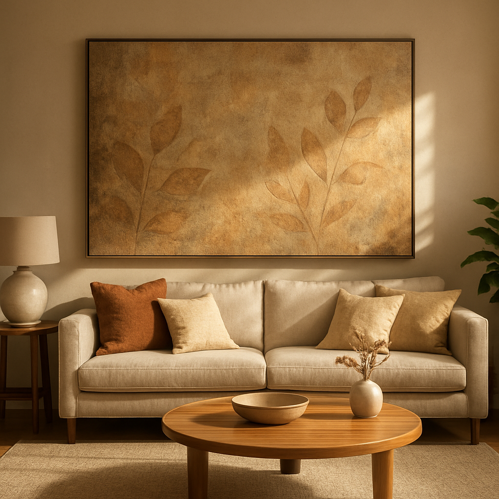
2. Textured & Dimensional – Feel‑First Art
When you want a piece that you can almost run your fingers over, look for textured canvases, layered collages, or mixed‑media prints. These works bring physical depth, turning a flat wall into a tactile experience.
Imagine a family room where a reclaimed‑wood canvas with raised leaf patterns sits next to a plush rug. The texture ties the room together, making the space feel lived‑in and inviting. For homeowners who love nature‑inspired accents, this style also pairs beautifully with organic‑tone décor.
3. Bold Oversized Statements – The Room Anchor
Got a large, open wall that feels a bit… empty? Go big. An oversized abstract, a panoramic landscape, or a dramatic typographic piece can become the focal point that pulls the whole room together.
One of our recent projects in a countryside manor featured a 6‑ft‑wide, vibrant brush‑stroke canvas across the dining‑room wall. The piece not only filled the void but also set a lively tone for family gatherings. The key is to leave about 10‑15 % breathing space around the edges, so the art doesn’t overwhelm the room.
4. Soft Surrealism – Dreamy Escape
If you’re a fan of gentle escapism, soft surrealism blends fluid shapes, muted palettes, and whimsical motifs. These works work wonders in bedrooms or home offices, where a hint of imagination can boost creativity without being too loud.
Think of a pastel‑toned canvas with floating clouds and abstracted foliage—perfect above a bedside table. The piece adds a calm narrative that encourages relaxation before sleep.
5. Global & Cultural Patterns – Storytelling Through Design
Looking to inject personality and heritage? Choose art that celebrates global traditions—Moroccan geometric tiles, Japanese ink washes, or African textile prints. They act as conversation starters and bring a sense of travel right into your living space.
We once helped a couple who had just returned from a Mediterranean vacation. They selected a set of three framed prints inspired by Moroccan mosaics, arranging them in a staggered grid above their hallway console. The result was a curated travel story that felt both personal and sophisticated.
So, how do you actually decide? Here’s a quick, actionable checklist:
- Define the mood: Write down three adjectives that describe how you want the room to feel.
- Measure the wall: Keep the art’s width between 60‑80 % of the wall’s length for balanced impact.
- Pick a style that matches the mood: Minimalist for calm, textured for depth, oversized for drama, etc.
- Consider existing décor: Choose colors or materials that echo what’s already in the room.
- Test virtually: Use a phone or tablet to overlay a photo of the artwork on your wall before buying.
And remember, there’s no one‑size‑fits‑all rule. The best wall art is the one that feels right to you, that makes you pause for a second and say, “Yep, that’s exactly what this space needed.”
Step 2: Measure & Plan Your Space
Alright, you’ve picked a style you love – now it’s time to make sure the piece actually fits the room without looking like a stray postcard.
1. Grab a tape measure (or a laser measurer if you’re feeling fancy)
Measure the width of the wall you intend to dress up. Write it down, then measure the height of the area that isn’t blocked by windows, doors, or built‑in shelving. Pro tip: jot the numbers on a sticky note and stick it to the wall – you’ll thank yourself when you’re comparing sizes later.
2. Apply the 60‑75% rule
Most designers, including the folks at CanvasPop, recommend that wall art should cover roughly 60‑75% of the available wall space. That means if your wall is 10 ft wide, aim for a piece (or group of pieces) that’s between 6 ft and 7.5 ft wide. This rule keeps the art from looking lost or overwhelming.
When you’re hanging above furniture, shrink that range to two‑thirds to three‑quarters of the furniture’s width. A 6‑ft sofa, for example, looks balanced with a 4‑ft‑wide canvas placed right above it.
Size guidelines suggest wall art should occupy 60‑75% of the wall – a quick math check that saves you weeks of second‑guessing.
3. Sketch it out on the floor
Take a few sheets of paper or some painter’s tape and outline the dimensions you just calculated directly on the floor. Walk around the mock‑frame; does it feel right? If it looks cramped, step back and add a few inches. If it feels airy, you might be able to go a touch larger.
4. Consider orientation
Portrait‑oriented images work best on narrower walls, while landscape‑oriented pieces love a wide stretch. Flip your sketch upside‑down to see how a landscape would read across a sofa versus a portrait above a mantel.
5. Height matters – aim for eye level
Generally, the centre of the artwork should sit at about 57‑60 inches from the floor – that’s the average eye level for most people. If you’re hanging above a couch, leave 6‑12 inches of breathing room between the top of the furniture and the bottom of the frame.
6. Use a digital “wall‑scape” tool
If you prefer a virtual test, the Wexel Art wall‑designer lets you input your wall’s dimensions, drag‑and‑drop frames, and see how colours and sizes play together. It even suggests frame sizes once you enter your artwork’s dimensions.
Wexel Art’s wall‑designer can help you visualise the perfect fit without ever lifting a tape measure.
7. Take a photo and step back
Snap a picture of your taped‑out outline, then view it on your phone from across the room. Your brain does a great job of spotting imbalance that a ruler can’t.
Sometimes the illusion of space tricks us – a large canvas can feel smaller when flanked by tall windows, and a modest piece can dominate a low‑ceilinged hallway.
8. Make a quick checklist before you buy
- Wall width measured?
- Does the size fall in the 60‑75% sweet spot?
- Is the orientation right for the wall’s shape?
- Height set to eye level with 6‑12 inches above furniture?
- Have you visualised it with a mock‑frame or digital tool?
Once you’ve answered “yes” to every bullet, you’re ready to shop with confidence.
So, what’s the next move?
Watch that quick video for a visual walkthrough of measuring, hanging, and fine‑tuning your wall art placement. It’s the kind of thing we love to show our clients at Harvey Bruce – simple, practical, and instantly useful.
When you finally step back and see the piece sitting just right, you’ll feel that little “aha!” moment we keep talking about. The room suddenly has a focal point, a story, and a sense of completeness. And because you did the math, the art looks intentional, not accidental.
Ready to turn those measurements into a masterpiece? Grab your tape, sketch, and start planning – your walls are waiting.
Step 3: Curate a Cohesive Gallery
Okay, you’ve measured, you’ve picked a style, and now the fun part begins – making those pieces talk to each other. A gallery wall isn’t just a random cluster; it’s a curated story that pulls the room together.
1. Start with a “lead” piece
Think of the biggest canvas or most eye‑catching artwork as the anchor. I usually place it a little off‑center so the eye wanders, not freezes. That off‑center spot becomes the reference point for everything else.
Does it feel right? Step back, squint, and ask yourself, “If I could only keep one piece, would this be it?” If the answer is yes, you’ve found your lead.
2. Mix orientations for visual flow
Vertical and horizontal frames create a rhythm, just like verses and choruses in a song. If your lead is landscape, sprinkle a couple of portrait pieces on either side. The contrast keeps the wall from feeling flat.
Pro tip: Keep the spacing around 3‑inches – it’s a sweet spot that Emily Henderson mentions in her gallery‑wall guide. You can tighten it for a tighter collage or widen it for a breezier look.
3. Choose a limited colour palette
Pick three to four hues that already live in the room – maybe the sofa’s navy, the rug’s warm taupe, and a pop of mustard from a throw pillow. Then, select artworks that echo those shades. It doesn’t mean every frame has to be the same colour, but the overall mood should feel harmonious.
Imagine you’re putting together an outfit; you wouldn’t wear a neon shirt with a pastel dress unless you’re going for a bold statement. Same idea with wall art.
4. Vary frame styles, but stay cohesive
Mixing wood, metal, and painted frames adds texture, but limit yourself to three styles max. For example, a sleek black metal frame, a warm walnut wood frame, and a thin white painted frame can coexist without a visual clash.
If you have a collection of mirrors or clocks, treat them as “accessory frames.” They break up the picture density and add reflective interest.
5. Add non‑art elements for personality
Think of a small woven wall hanging, a vintage metal sign, or even a framed family recipe. These bits feel like conversation starters and remind you that a gallery wall is part home, part memory.
Don’t overstuff – every object needs breathing room. When the wall looks too busy, pull back a piece and see if the remaining items still tell a complete story.
6. Test with paper templates
Cut out newspaper or kraft paper in the exact dimensions of each frame, tape them to the wall, and step back. This low‑commitment mock‑up shows you if the layout feels balanced before you hammer a nail.
If a piece feels cramped, slide the whole group a few inches. Small adjustments can make a huge difference.
7. Keep eye level consistent
Most people view art from a standing height of about 57‑60 inches. Align the centre of your lead piece around that line, then let the surrounding items cascade up or down naturally.
It’s like arranging books on a shelf – you don’t want the top of the stack to stare down at you, you want it to sit comfortably at eye level.
8. Finish with a quick checklist
- Lead piece placed off‑center?
- Mix of portrait and landscape?
- Colour palette limited to 3‑4 tones?
- Maximum three frame styles?
- Non‑art accessories added?
- Paper template tested?
- Center at eye level?
Run through those bullets, and you’ll know you’ve built a cohesive gallery that feels intentional, not accidental. When you finally step back and see the wall, you’ll get that quiet “aha!” moment – the room now has a visual heartbeat, and you’re the one who made it happen.
Step 4: Mix Materials & Textures
1. Pair a plush canvas with a sleek metal frame
Imagine a soft, linen‑textured canvas next to a thin brushed‑steel frame. The contrast lets the artwork breathe while the metal adds a whisper of modern edge. For a living‑room where you’ve already chosen a velvet sofa, the canvas feels like a friendly echo, and the steel frame keeps things from feeling too cosy.
2. Layer a mirrored accent behind a painted piece
We’ve seen couples in their first home place a small, round wall mirror just a few inches behind a bold, abstract print. The mirror catches stray light, making the colours pop a bit brighter without stealing the spotlight. It’s a simple trick that turns a flat wall into a subtle depth cue.
3. Mix wood grain with glossy lacquer
A reclaimed‑oak frame next to a lacquered black border creates a conversation between natural warmth and polished sophistication. If your hallway already sports a hardwood floor, the oak frame reinforces that organic vibe, while the lacquer adds a dash of drama you’d expect in a boutique hotel lobby.
4. Introduce woven textiles as mini‑art
Think about hanging a small, hand‑woven wall hanging between two canvas pieces. The textile brings a tactile pause – you can almost feel the weave when you run a fingertip across it. It works especially well in spaces that already have a mix of cushions and throws; the wall then mirrors the layered comfort of the room.
5. Use sculptural objects as “frames”
Instead of a traditional frame, try a thin, sculptural metal strip that follows the contour of the artwork. It feels like a custom‑made border and adds a three‑dimensional quality without adding bulk. We’ve noticed interior designers use this on oversized prints to keep the piece feeling light rather than heavy.
6. Play with matte vs. glossy finishes
A matte‑finished canvas placed beside a high‑gloss photo print creates a visual rhythm. The matte side soaks up ambient light, while the glossy side reflects it, giving the eye a gentle push‑pull. In a bedroom where you want calm, the matte dominates; the glossy accent adds just enough sparkle to keep the space from feeling flat.
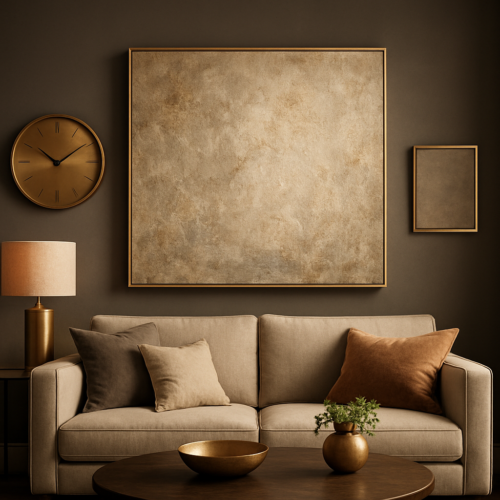
7. Combine decorative clocks with art
A sleek decorative wall clock can act as both function and texture. The clock’s brushed‑gold hands against a neutral canvas add a metallic shimmer that changes with the time of day. It’s a low‑effort way to inject personality without cluttering the gallery.
8. Add subtle accents like metal dials or brass handles
Small details matter. A brass handle affixed to a small frame, or a metal dial used as a decorative element, can tie together the various materials you’ve introduced. When you step back, those tiny bits become the glue that makes the whole wall feel intentional.
Putting all these ideas together is less about following a strict formula and more about listening to the room’s existing palette. Ask yourself: does the texture I’m adding echo something already in the space? If the answer is yes, you’re on the right track. If it feels out of place, pull back and try a softer alternative.
Here’s a quick checklist to run before you hang the final pieces:
- Do you have at least two contrasting materials (e.g., wood vs. metal)?
- Is there a balance between matte and glossy surfaces?
- Did you include a tactile element like a woven hanging or textured canvas?
- Are decorative accessories (clock, mirror, handle) serving both form and function?
- When you step back, does the wall feel layered without feeling crowded?
When the checklist passes, you’ll have a gallery wall that feels curated, dynamic, and unmistakably yours – a true reflection of the luxurious yet lived‑in aesthetic we love at Harvey Bruce Interiors.
Step 5: Install & Style Your Wall Art
Okay, you’ve measured, you’ve curated, and now the wall is practically begging for its final dress‑up. That moment when you step back and think, “Wow, that actually works,” is the sweet spot we’re shooting for.
First thing’s first – pick the right hanging hardware. If you’re dealing with drywall, a simple picture‑frame hanger will do for pieces under 20 lb, but for anything heavier you’ll want a molly bolt or a toggle bolt. This Old House breaks down which anchor fits which weight, so you can avoid that dreaded wall‑hole nightmare.
1. Find the “eye‑level” sweet spot
Most designers aim for the centre of the artwork about 57‑60 inches from the floor. It’s not a hard rule – if your ceiling is lofty or your sofa is low, shift it up or down a few inches. Emily Henderson puts it nicely: think of the wall as four vertical zones and aim for the third quadrant from the bottom (her guide on hanging art). That way you won’t end up with a piece that forces anyone to crane their neck.
And remember: the art should live in relation to the furniture below. A good rule of thumb is 6‑10 inches of breathing room between the top of the sofa and the bottom of the frame. Too tight and the wall feels cramped; too loose and the piece looks lost.
2. Level it like a pro
Grab a cheap laser level or just a carpenter’s level and a pencil. Mark a light line where the centre of the piece will sit. Even a half‑inch wobble is noticeable when you step back, and we don’t want that little imperfection stealing the spotlight.
Pro tip: tape a piece of kraft paper cut to the exact frame size on the wall first. Step back, snap a photo, and judge the height from the picture. If it feels off, adjust before you drive any screws.
3. Use the right anchors for the right wall
Plaster? Reach for a molly bolt. Concrete? Toggle bolts are your friend. For wooden studs, a simple wood screw will hold most canvases securely. The key is matching the anchor’s weight rating to the piece – always add a 5‑lb safety margin.
If you’re hanging a mirror or a decorative clock, treat it like a heavy art piece. The same hardware rules apply, and you’ll avoid that heart‑stopping moment when it drops.
4. Add personality with accessories
Once the main piece is up, think about the little details that make a wall feel lived‑in. A sleek wall clock from our decorative‑clock collection can act as both function and texture. A small dimpled mirror or a brass handle affixed to a narrow frame adds that extra whisper of luxury without stealing focus.
These micro‑accents are the glue that turns a simple gallery into a curated experience.
5. Play with spacing and rhythm
When you have a grouping, keep the gaps consistent – about 3‑inches works for most collections. If you want a more dynamic feel, vary the spacing a little, but stay within a 1‑inch range so the wall doesn’t feel haphazard.
Think of the spacing like musical rests; they give each piece room to breathe.
6. Light it right
Spotlights or wall‑mounted picture lights angled at 30 degrees will highlight texture without creating glare. If you have a dimmer, set it low enough to keep the room cozy but bright enough that the art’s colours pop.
Even a simple floor lamp positioned at a 45‑degree angle can do the trick for smaller rooms.
7. Test, tweak, and lock it down
After everything is hung, take a step back, then walk around the room. Does the arrangement feel balanced from every angle? If something feels off, it’s easier to shift a few inches now than to live with it forever.
Finally, seal the hardware with a dab of interior‑grade silicone if you have pets or kids who love to tug at frames. It adds a layer of safety without looking ugly.
| Hardware Type | Best For | Weight Capacity (lb) |
|---|---|---|
| Picture‑frame hanger | Drywall, light pieces | 15‑20 |
| Molly bolt | Drywall or plaster, medium‑heavy | 25‑50 |
| Toggle bolt | Drywall, plaster, hollow‑core concrete | 30‑50 |
And there you have it – a practical, human‑centric checklist that takes the guesswork out of installing and styling your wall art. When you follow these steps, the wall becomes more than a backdrop; it becomes the room’s quiet hero.
Conclusion
We’ve walked through everything from picking the perfect style to measuring, curating, mixing textures, and finally hanging your wall art with confidence.
If you’ve ever stared at a blank wall and felt that mix of excitement and doubt, you now have a clear roadmap to turn that space into a personal gallery.
Remember the 60‑75 % rule, the eye‑level sweet spot, and the three‑inch breathing room around each piece – these tiny numbers keep the room feeling balanced, not cluttered.
A quick final checklist: lead piece off‑center, mix orientations, limit colour palette, cap frame styles at three, add one tactile accent, level everything, and seal hardware for families with kids or pets.
When you step back and see the composition click, that quiet “aha!” moment tells you the wall has become the room’s quiet hero – exactly what great wall art should do.
Ready to bring that feeling home? Browse our curated collection, grab the perfect piece, and let your walls tell the story you’ve been waiting to share.
And don’t forget the finishing touches – a sleek decorative wall clock or a subtle mirror can add that final sparkle without stealing the spotlight. It’s the little details that make a luxury feel lived‑in today.
FAQ
How do I choose the right size of wall art for my living room?
Choosing the right size is all about the wall’s proportion and the room’s scale. First, measure the width of the area you want to fill and aim for a piece that takes up 60‑75 % of that space – that’s the sweet spot we recommend. Then step back and picture the canvas at eye level; if it feels too cramped or dwarfs the furniture, trim the dimensions down a bit. The goal is a balanced focal point, not a visual overload.
What’s the best height to hang wall art in a family home?
The safest bet is to centre the artwork around 57‑60 inches from the floor – that’s roughly average eye level for most adults. In a family setting, add a 6‑12 inch buffer between the bottom of the frame and any seating, so kids can still see it without having to stretch. If your ceiling is higher than 9 feet, you can nudge it up a couple of inches; just keep the visual line comfortable for everyone.
Can I mix different frame styles without looking chaotic?
Mixing frame styles can feel daring, but it works when you set a unifying rule – like colour, material tone, or spacing. Stick to three maximum finishes; for example, a sleek black metal, a warm walnut wood and a thin white painted frame. Keep the gap between each piece consistent, usually three inches, so the eye reads them as a collection rather than a clash. The result is a curated, layered look that feels intentional.
How often should I rotate my wall art collection?
Rotating your wall art keeps the space feeling fresh and lets you showcase seasonal pieces without a full redesign. A good rhythm is every six to eight months – think of it like changing the sheets on a bed. Pick a night when you have a cup of tea, swap one or two items, step back and notice how the mood shifts. This habit also helps you spot pieces that might need a new spot or a deeper cleaning.
What lighting works best for textured wall art?
Texture thrives under directional lighting that highlights the surface without flattening it. Spotlights or picture lights angled at about 30 degrees give depth to woven canvases and raised‑leaf prints. If you prefer a softer glow, place a floor lamp a few feet away and aim it toward the top third of the piece – that mimics natural window light. Remember to use bulbs with a warm 2700‑3000 K rating; cooler light can wash out the subtle relief you worked hard to create.
Is it okay to hang wall art above a sofa?
Yes, you can hang art above a sofa, but the key is proportion and breathing room. Aim for a piece that’s about two‑thirds the width of the couch, and leave roughly 6‑10 inches between the top of the sofa cushion and the bottom of the frame. This gap prevents the wall from feeling crowded and lets the artwork breathe. If you have a tall piece, anchor it at eye level and let the lower edge hover just above the sofa back.
How do I protect wall art when I have pets or kids?
Kids and pets love to investigate, so securing wall art is a must. Use picture‑frame hangers that spread the load across a stud, or choose a toggle bolt for heavier canvases. A thin bead of clear silicone around the screw heads stops little hands from loosening them. For delicate prints, consider an acrylic frame that won’t shatter if bumped. When you clean, give the artwork a dust‑off with a microfiber cloth – it keeps the surface fresh without harsh chemicals.
← Older Post Newer Post →
