How to Choose Rug Color for Living Room: A Practical Design Guide
Posted by Harvey Bruce on
Ever walked into a living room and felt that something was just a shade off? Maybe the sofa looked perfect, the art was spot on, but the rug seemed to clash like socks with sandals. You're not alone – that tiny colour misstep can throw off the whole vibe, and it’s surprisingly easy to fix.
When we talk about how to choose rug colour for living room, the first thing to ask yourself is: what mood do you want the space to exude? A calm, muted palette with soft greys or beiges whispers relaxation, while a deep navy or emerald can create a dramatic, cosy nest. Think about the feeling you get when you sink your feet onto a plush rug after a long day – that’s the emotional cue you want to amplify.
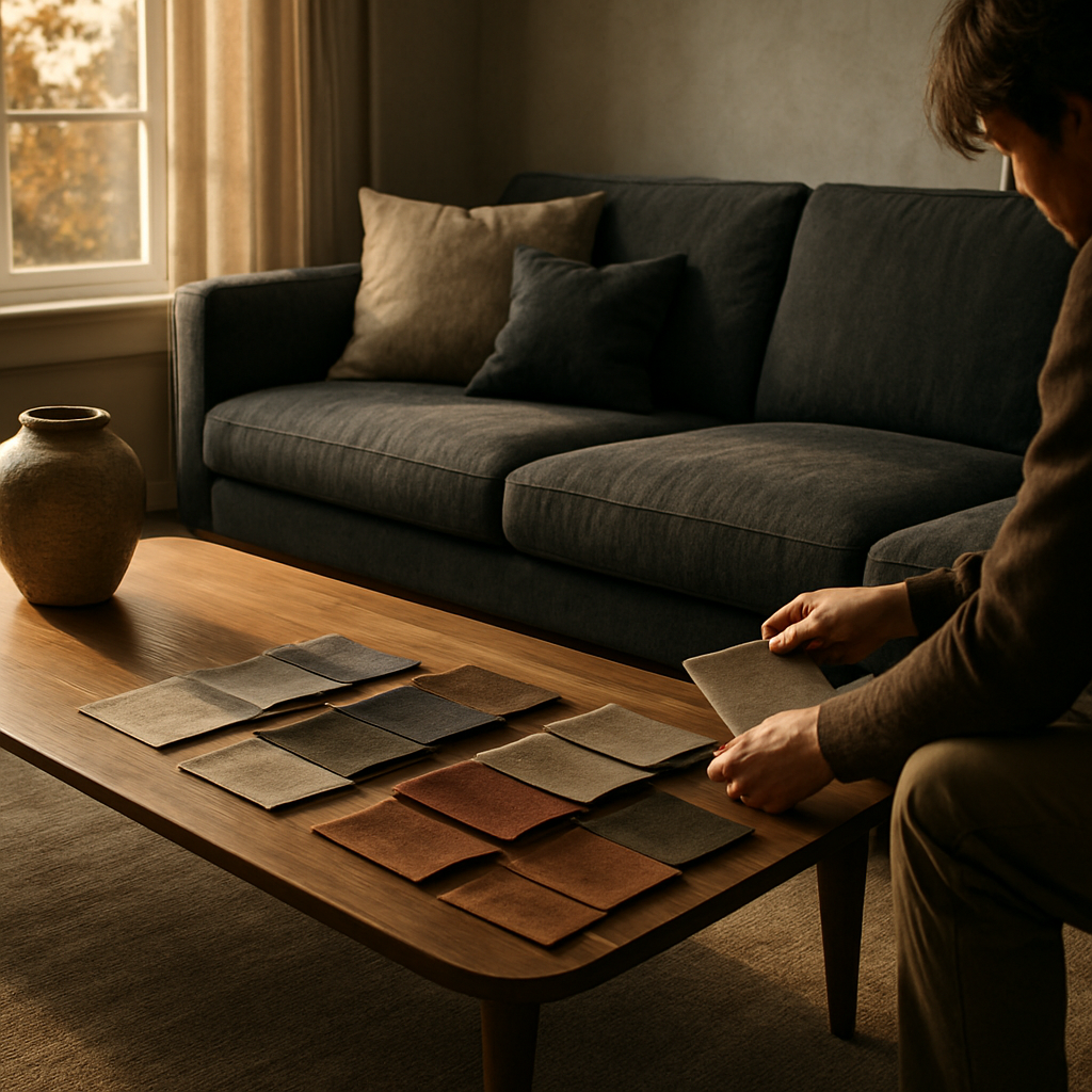
Here’s a quick reality check: most homeowners I’ve spoken to start by looking at the dominant colour of their upholstery. If your sofa is a warm taupe, a rug with subtle hints of rust or muted gold can pull the whole room together. On the other hand, a cool charcoal sofa pairs beautifully with a rug that has a splash of teal or dusty rose, adding just enough contrast without shouting.
Real‑world example: a couple in London recently refreshed their loft with a charcoal velvet sofa, a light walnut coffee table, and a patterned rug that featured a soft teal line running through a neutral base. The teal echoed the blue‑grey curtains they later chose, creating a seamless flow. In our experience, the trick is to let one element – the rug, the sofa, or the walls – be the “lead colour” and let the others support it.
Step‑by‑step, here’s how you can nail it:
- Identify the dominant hue in your main furniture piece.
- Choose a rug that either mirrors that hue in a lighter/darker shade or introduces a complementary accent colour.
- Test the combo with a large swatch or a virtual room planner – don’t rely solely on store photos.
- Consider the room’s lighting. Natural light will brighten cool tones, while cosy lamps can make warm shades feel richer.
Don’t forget texture – a high‑pile rug in a muted colour can add depth, while a flat‑woven rug in a bold shade becomes a visual anchor. And if you’re still unsure, take a peek at our guide on Choosing linen curtains for living room spaces. It shows how coordinating curtains, rugs and sofas can turn a good room into a great one.
So, grab a coffee, pull out a colour swatch, and start experimenting. The perfect rug colour is waiting – you just have to let your intuition and a few practical steps lead the way.
TL;DR
Pick a rug colour that mirrors your main furniture hue, works with the room’s light, and adds personality without stealing the show. Then follow three quick steps—identify the dominant shade, match or complement it with a rug, test it in natural light, and use texture to instantly seal the look.
Step 1: Assess Your Living Room’s Existing Color Palette
You know that moment when you love every piece in a living room, yet the rug refuses to cooperate? The sofa, the curtains, even the art can feel like they're speaking different languages. You’re not imagining it—the rug color is the hinge that can swing the whole room from nice to unforgettable. The good news? It’s way easier to fix than you think.
Here's how we approach it at Harvey Bruce Interiors: we start by diagnosing the room's color conversation before we even pull swatches. We map out the dominant hues, watch how daylight travels from morning to dusk, and test how texture changes the mood. When the color story makes sense on paper, picking the rug becomes a confident, almost intuitive step.
Ground yourself in the room’s core hues
Look at the space as a whole. What's the loudest color you see? Is it the sofa's warm taupe or the drapes' cool grey? Even the walls behind the sofa may be whispering something. Decide whether the rug should echo that lead color, so it reads as a natural extension, or whether it should play the role of a quiet counterpoint that lets the other pieces shine.
Start by naming the main hue that appears most in your furniture, walls, and curtains. It’s the thread you want to pull through the rug. If your sofa is warm taupe, you’ll likely want a rug that echoes that warmth in a lighter or darker shade. If you’ve got charcoal furniture, a rug with a touch of teal or dusty rose can add life without shouting. The goal is harmony, not a battle of colors.
Identify the dominant hue in your main furniture
Think of your sofa as the room’s anchor. What color does it push forward? With a warm anchor, you may lean toward earthier rug tones; with a cool anchor, you might introduce a controlled contrast. The aim is to let one element lead while the others politely support it. This keeps the space cohesive rather than chaotic.
The floor often influences your choice too. A light wood floor can support richer rug colors, while a dark floor wants a rug that helps the furniture breathe. Your rug should feel like a natural extension of the space, not a separate character on a stage.
Test in real light, not just store photos
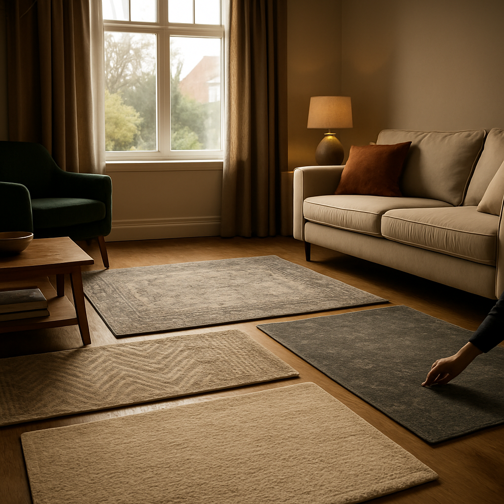
Lighting changes everything. Natural light will brighten cool tones and can dull warm ones, while lamps with warm bulbs can wrap a color like velvet in a cozy glow. Bring home several swatches and place them where the rug will live. Observe how natural light shifts the hue by afternoon, then how artificial light settles in after dark. If a shade looks amazing in photos but off in person, swap to a notch lighter or darker.
Photos are useful, but light is king. A rug that looks perfect under showroom lighting might drift under your living room’s daylight or lamplight. Bring home a few swatches, lay them on the floor, and observe them at different times of day. See how natural light softens or sharpens the rug’s hues and how lamps warm or cool the color balance.
Texture matters as much as color
Texture is the secret weapon. A plush pile adds warmth and depth; a flat‑weave offers crisp contrast. If you’re worried about overloading the space with color, choose a muted color with rich texture to create depth. Layer textures with cushions, throws, and curtains to reinforce the story. And if you’re unsure, start with a neutral base rug and bring in color with accessories rather than a big print.
Texture gives your palette personality. It can make a calm color feel tangible and inviting, or it can turn a bold shade into a settled, livable space. When you mix different textures, you’re not just adding contrast—you’re building a mood you can feel as you walk through the room.
Does this approach feel manageable? Start by picking the lead hue, test it in real light with swatches, and then let texture seal the look. If you’d like a quick demonstration, the video below shows how these decisions translate into a finished room.
After you’ve watched, take a moment to reflect: how does your sofa color feel with a rug of your chosen hue in different lighting? If you want a second opinion tailored to your space, we’re happy to help you refine the palette so the rug truly anchors the room.
Step 2: Determine the Mood You Want to Create
Okay, you’ve already taken stock of the colours already living in the room – now it’s time to ask the bigger question: what feeling do you want the space to give you every time you step through the door?
Do you picture a calm, quiet retreat after a hectic day, or a lively backdrop that invites friends to linger over drinks? That feeling is your north‑star; everything else – the rug, the cushions, the art – will fall into place once you nail it down.
Grab a sticky note and write the mood in a single word. Maybe it’s “cozy”, “energetic”, “sophisticated”, or “playful”. Keep that word on the wall while you browse. It sounds simple, but naming the vibe gives you a quick decision filter that stops you from falling down endless trend rabbit holes.
Why does a single word matter? Because colour psychology is real. Soft blues and muted greens whisper relaxation, while deep reds or burnt oranges spark warmth and conversation. As how colour influences mood in a living room, the hue you choose can set the emotional tone for the entire space.
To translate that mood into a rug colour, ask yourself three quick questions:
- What primary emotion do I want to feel when I walk onto the rug?
- Which existing elements (sofa, artwork, floor) already support that feeling?
- How will the room’s lighting amplify or mute that emotion?
Answering these will point you toward a colour family – cool blues for calm, warm terracotta for cosy, vibrant teal for energetic, and so on.
Match mood to lighting
Natural light is a game‑changer. A cool grey can look icy in a sun‑filled loft but turn to soft dove under evening lamps. Walk around the room at three different times of day and notice how the same swatch shifts. If your favourite mood is “relaxing”, choose a hue that stays muted in bright daylight but deepens when the lights are low – think muted sage or warm taupe.
Conversely, if “lively” is your goal, a richer colour like rust or emerald will brighten under lamps, giving the room a pop of energy after sunset.
Consider lifestyle and durability
Families with kids, pets, or high traffic need a rug that hides wear without sacrificing mood. Mid‑tone colours – heather grey, dusty olive, muted navy – are forgiving while still conveying sophistication. A darker base also keeps the room feeling grounded, which is perfect for a “cozy” atmosphere.
On the other hand, if you’re styling a formal sitting area for occasional entertaining, you can afford a lighter, more delicate shade because the rug won’t face daily scuffs.
Create a quick mood board
Take a handful of fabric swatches or use a free online room planner. Lay them next to your sticky‑note mood word and see which hue sings the loudest. Even a quick photo on your phone, taken at different times of day, can reveal whether the colour maintains the feeling you’re after.
Finally, narrow it down to two colours that both reflect your chosen mood and work with the lighting and lifestyle factors you’ve identified. Order small samples, place them where the rug will live, and walk on them barefoot – does the colour still feel right after a few minutes? If yes, you’ve found your mood‑driven rug colour.
Once you’ve confirmed the shade, you’ll be ready for the next step: matching that colour to the perfect rug style and texture.
Step 3: Match Rug Color with Furniture and Accents
Now that you’ve nailed the mood, it’s time to look at the pieces that already live in the room. Think about your sofa, coffee table, and those little accent chairs – they’re the anchors that will either hug or clash with your rug colour.
First, ask yourself: does the furniture lean warm or cool? A buttery‑tan leather sofa shouts warmth, while a sleek charcoal velvet whispers cool sophistication. Matching the rug’s undertone to that dominant vibe creates a visual handshake that feels intentional, not accidental.
Here’s a quick trick we swear by at Harvey Bruce Interiors: pull a fabric swatch from each major piece, hold them up to the rug sample, and note the colour family that ties them together. If the sofa has a hint of rose, a rug with a soft dusty rose line can echo that subtle note without overpowering the space.
Use the “one‑lead, two‑support” rule
Pick one furniture item to lead the colour conversation – usually the sofa or a statement armchair – and let the rug either mirror it (lighter or darker) or complement it with a harmonious accent. The other pieces then become supporting actors, picking up secondary tones from the rug’s pattern or border.
Example: you have a deep navy sofa. A rug with a muted teal stripe can bring a fresh pop while still nodding to the navy base. Meanwhile, a light oak coffee table will pick up the cool undertones, keeping the palette cohesive.
What about metallic accents? Brass or gold lamp bases can act as colour bridges too. If your rug has a faint gold thread in the weave, those metal finishes will feel like they belong, tying the whole room together.
Balance boldness with durability
Living rooms with kids or pets need a colour that hides the inevitable traffic. Mid‑tone greys, muted olives, or soft terracotta work wonders because they camouflage scuffs while still resonating with most furniture palettes.
But if you’re styling a formal sitting area that sees occasional guests, you can lean lighter – think a dove‑grey rug under a cream sofa. The lighter backdrop invites conversation without the worry of daily wear.
Don’t forget texture. A high‑pile rug in a deep hue adds plush depth, while a flat‑woven rug in a lighter shade feels airy. Choose the texture that mirrors the tactile language of your furniture – velvet sofa with a plush rug, linen sofa with a flat‑weave.
Quick visual checklist
- Identify the leading furniture colour (sofa, armchair).
- Decide if the rug will mirror (lighter/darker) or complement (accent).
- Test swatches under your room’s main lighting.
- Consider foot traffic – pick mid‑tone for high‑use areas.
Once you’ve run through that list, you’ll have a clear direction for the rug colour that feels like a natural extension of the room, not an afterthought.
Below is a handy table that sums up the most common furniture‑rug pairings and a quick tip for each.
| Furniture Piece | Rug Colour Strategy | Tip |
|---|---|---|
| Sofa (warm leather) | Match with a muted rose or terracotta accent | Use a rug with a subtle pattern to break up the solid colour. |
| Coffee Table (light oak) | Complement with a cool grey or sage rug | Let the rug’s border pick up the wood grain for cohesion. |
| Accent Chairs (bold teal) | Echo with a neutral base and a pop of teal in the rug | Choose a rug that has a thin teal stripe or fringe. |
Finally, place your chosen rug sample where it will live, walk on it, and live with it for a day. If it still feels right after a coffee and a few steps, you’ve cracked the code on how to choose rug colour for living room that truly belongs.
Step 4: Consider Light, Size, and Pattern
Okay, you’ve nailed the colour family – now it’s time to ask the practical questions that keep a rug from feeling like a stray carpet. Light, size and pattern are the three levers you can pull to make the colour you chose work every hour of the day.
1. Let the light do the heavy lifting
Natural light is a mood‑shifter. A rug that looks buttery beige in the morning may turn soft‑taupe under a south‑facing lamp. The opposite happens in a north‑facing room: cool greys can look almost blue in the daylight, then warm up once the lights come on. Walk the space at three moments – sunrise, mid‑day and evening – and place a sample rug square on the floor. Does the hue stay comforting, or does it swing wildly?
One tip we’ve seen work for London couples is to keep a neutral base with a subtle undertone. The base stays stable under shifting daylight, while a thin stripe of colour (think teal or rust) pops only when the room is lit just right. This way the rug anchors the palette without becoming a mood‑swinging focal point.
2. Size matters more than you think
Size is the silent designer. A too‑small rug will chop the seating area, making the room feel fragmented. A too‑large rug can drown a cosy nook, especially if you have a low ceiling.
Measure the “living zone” – the rectangle formed by your sofa, armchairs and coffee table. Then add at least 45 cm of floor space on all sides; that breathing room tells the eye the rug is intentional. If you’re working with a modest 3‑meter lounge, a 2 × 3 m rug often hits the sweet spot. For larger open‑plan spaces, go for a 3 × 4 m rug or layer two rugs for depth (just keep the pattern language consistent).
Emily Henderson reminds us that consistency is key when you can’t fit a full‑size rug: “All legs on or all legs off” – so decide whether the sofa’s front legs sit on the rug or hover just above it, then treat the chairs the same way. This tiny decision prevents a visual hiccup that can make a perfectly chosen colour feel off‑balance.
3. Pattern – the visual glue or the visual chaos?
If your furniture is solid‑coloured, you have freedom to bring in a patterned rug. Think of a geometric medallion that echoes the line of a walnut coffee table, or a subtle herringbone that mirrors the grain of a reclaimed oak sideboard. The pattern becomes a bridge, linking the rug colour to the rest of the room.
When your upholstery already has a pattern – say a plaid armchair or a floral sofa – tone down the rug. A tone‑on‑tone design, maybe a flat‑weave in a muted shade of the same colour family, prevents the floor from looking like a visual battlefield. The rule of thumb: one bold element per visual plane.
Colour temperature and saturation also play with pattern. A highly saturated rug (bright teal, deep burgundy) can dominate a room, so pair it with a low‑pile, simple weave. Conversely, a desaturated rug (dusty olive, soft rose) can afford a richer texture like a hand‑knotted pile without overwhelming the space.
4. Actionable checklist – light, size, pattern
- Test a rug swatch at sunrise, midday and after you’ve turned on your main lamps. Note any colour shift.
- Measure the seating rectangle and add 45 cm around it. Choose a rug that meets or exceeds that footprint.
- If you have patterned furniture, select a rug with a subtle or monochrome pattern; if furniture is solid, feel free to explore a bolder motif.
- Consider the rug’s pile: high‑pile adds warmth in a cosy room, flat‑weave keeps a minimalist space airy.
- For high‑traffic zones, lean toward mid‑tone, slightly desaturated colours – they hide scuffs better.
Finally, place the full‑size rug (or a large sample) where it will live, walk on it barefoot, and live with it for a coffee‑break. Does the colour still feel right when the sun is setting? If yes, you’ve cracked the code on how to choose rug colour for living room while honouring light, size and pattern.
When you’re ready to shop, remember that a well‑chosen rug can transform a room without the need for a full makeover – a little colour, the right scale, and a thoughtful pattern can make your living space feel curated and cohesive.
Step 5: Finalize Your Choice and Coordinate with Accessories
So you’ve found a rug colour that feels like it belongs in your living room. You’ve watched it shift in sunlight and glow under lamps. Now the question is: how do you lock it in and layer in accessories so the whole room reads as one story?
In our experience, the final flourish is less about one big moment and more about a handful of small, deliberate choices. It’s the cushions that echo the rug’s undertone, the curtains that softly frame the colour, and the art that picks up a note from the weave. Let’s walk through a simple, practical approach that keeps you in control without turning your space into a colour chart.
First, test the mood one last time with real‑world props. Drag a few cushions from your sofa and a couple of throws onto the rug. Do they harmonise, or do they shout? If you’re aiming for calm, you want their hues to dip into the rug rather than compete. If you want a bit of drama, introduce a texture or pattern in a slightly bolder shade that still sits within the same colour family.
Next, pull the curtain swatches or samples near the rug. Natural fabrics in off‑whites, greys, or soft sage often work as a quiet backdrop that lets the rug remain the lead colour. If your curtains are bold, make sure their tone ties back to the rug’s accent hues so nothing feels out of place when you’re sitting in the room at night.
Here’s a quick rule of thumb we use with our clients: pick one lead colour from the rug and let all accessories echo it in small doses. The rest of the palette should support, not overshadow. Brass lamps, a wooden coffee table, or a ceramic vase can act as colour bridges that make the rug feel anchored rather than incidental.
Another practical tick‑box: consider texture layering. A plush rug loves a soft, matte textile like linen or wool for nearby upholstery. A flat‑woven rug pairs well with tactile textures—think boucle, weaves, or a velvet cushion—that catch the light differently and keep the room lively without distracting from the rug’s colour.
And don’t forget lighting. A warm temperature of light will deepen warm tones and soften cool ones. If you’re unsure, test a couple of table lamps at different heights and angles; you’ll see where the colour stabilises and where it shifts with the glow.
If you want a trusted partner to help build this cohesive look, Harvey Bruce Interiors offers bespoke homewares and accessories designed to harmonise with your rug colour and furniture. Our team has sourced pieces worldwide to create calm, luxurious spaces that still feel truly you.
So, what should you do next? Gather three accessory groups that feel aligned with the rug’s mood, test them in the room, and choose the combination that makes you smile when you walk in. It really can be this simple—a few thoughtful touches, not a full redo.
FAQ
How do I start choosing a rug colour for my living room?
First, take a step back and look at the dominant hues already in the room – sofa, walls, flooring, and any artwork you love. Jot down the main colour family (warm neutrals, cool blues, earthy greens, etc.) and decide whether you want the rug to echo that family or provide a subtle contrast. From there, pull a few swatches that sit a shade lighter or darker than your lead piece and see how they sit next to each other. This simple inventory turns a vague feeling into a concrete direction.
What role does lighting play when picking a rug colour?
Natural light can shift a colour by several shades throughout the day, so a rug that looks perfect at sunrise might feel muted at night. Test a sample in morning, midday, and evening light, and also under your favourite lamp. Notice if the hue stays soothing or swings dramatically. If you need stability, choose a neutral base with a faint undertone – it will stay balanced no matter the light source.
Should I match the rug colour to my sofa or let it contrast?
Both approaches work, but think about the mood you want. Matching the rug (or picking a tone‑on‑tone) creates a calm, cohesive feel – perfect for a relaxed lounge. A contrasting colour adds visual interest and can anchor the seating area, especially if the rest of the room is neutral. A good rule of thumb is the “one‑lead, two‑support” method: let either the sofa or the rug lead, and let the other support with a lighter or darker shade.
How can I test a rug colour before buying?
Order a small sample or request a fabric swatch from the retailer. Lay it on the floor where the rug will sit and walk on it barefoot for a few minutes. Observe it in the room’s natural light and under your evening lighting. Take a photo, step away, and come back – if the colour still feels right, you’ve got a winner. Many suppliers also offer virtual room planners that let you overlay the swatch on a photo of your space.
Are there colour families that hide wear better for homes with pets or kids?
Mid‑tone, slightly desaturated hues are your best friends here. Think muted olive, dusted terracotta, charcoal grey, or soft sage. These colours camouflage scuffs, pet hair, and occasional spills without looking dull. Avoid stark whites or ultra‑bright reds, which reveal every little mark. Pair a durable, low‑pile weave with a colour that blends into the existing palette, and you’ll enjoy a rug that looks fresh for years.
Does rug size affect how the colour looks in the space?
Absolutely. A large rug spreads its colour across a bigger visual field, making the hue feel more grounded and room‑defining. A smaller rug concentrates the colour, turning it into a focal point that can pop against a neutral floor. Measure the seating rectangle, add about 45 cm of floor space around it, and choose a size that lets the colour either dominate or accent, depending on the effect you’re after.
How can I coordinate accessories with my new rug colour without over‑doing it?
Pick one accent colour that appears in the rug – perhaps a thin stripe or a subtle pattern hue – and let cushions, throws, or a decorative vase echo that shade in small doses. Keep the rest of the accessories in a neutral or complementary palette so they support rather than compete. A brass lamp or a wooden sideboard can act as a colour bridge, tying the rug into the larger room narrative without creating visual chaos.
Conclusion
We've walked through the whole journey of how to choose rug colour for living room – from spotting the mood in your space to testing swatches in morning light.
Remember, the colour you pick should echo the dominant hue of your sofa or act as a quiet accent that ties your accessories together. A mid‑tone shade like dusty sage or muted terracotta will hide the inevitable scuffs from kids or pets, while a bold pop works beautifully when your furniture is neutral.
Size matters too: give the rug a breathing room of at least 45 cm around your seating rectangle, and let the pattern either complement solid pieces or tone down an already busy upholstery.
And the lighting test? It's non‑negotiable – place a sample at sunrise, midday and under your favourite lamp. If the hue feels steady, you’ve found your match.
So, what’s the next step? Grab a few swatches, lay them where the rug will live, and walk on them barefoot while you sip your coffee. When the colour still feels right, you’re ready to bring it home.
Need a curated selection that meets these criteria? Harvey Bruce Interiors offers bespoke rugs and accessories designed to fit your palette, lighting and lifestyle – all sourced sustainably for a timeless look.
← Older Post Newer Post →
