
News
Harvey Bruce are proud to announce that we have received not one but two awards at the Best of Scottish Business ceremony held recently by The Scottish Enterprise trust in Stirling.
We are delighted to be the recipient of "Best Bespoke Blinds & Shutters company" and also received the much coveted "Customer service excellence" awards. These awards are based on customer reviews and we would like to thank all of our customers who have participated in leaving us some wonderful feedback.
A Huge Thank You - from us all
@ Harvey Bruce.
How to Choose an Extendable Dining Table for Small Spaces
Posted by Harvey Bruce on
Picture this: you’ve just moved into a cosy two‑bedroom flat in Edinburgh, the kitchen is bright but the dining nook feels more like a narrow hallway. You love entertaining, yet the space only fits a tiny bistro table.
Does that ring a bell? So many homeowners chasing that perfect balance between style and function end up compromising one or the other. The good news is there’s a design hero that slips right into tight footprints – the extendable dining table for small spaces.
What makes an extendable table a game‑changer is its ability to shrink down to a compact size for everyday meals, then pull out extra leaves when friends drop by. In our experience the hidden leaf mechanism adds up to 30 % more surface area without demanding extra floor space, meaning you can keep a sleek, minimalist look most of the time and still host a dinner for six when the mood strikes.
Take Emma, a first‑time buyer in Glasgow. She chose a walnut‑toned, butterfly‑leaf table that folds flat to 120 cm. On a regular night she slides a single chair in front, but when her parents visited she simply pulls the two extra leaves and the table stretches to 180 cm. The extension sits snug against the wall, leaving a clear pathway for the hallway – a practical win for anyone juggling limited clearance.
Here’s a quick checklist to make the extension work for you:
- Measure the longest uninterrupted wall in your dining area, then subtract 10–15 cm for breathing room.
- Pick a leaf style that matches your lifestyle – butterfly for quick pop‑out, or slide‑out for a smoother motion.
- Check the load rating; solid oak or walnut frames usually support 70 kg per leaf.
- Finish matters: a low‑VOC oil coat will age gracefully and keep the table looking fresh for years.
Don’t forget the ambience. Pairing your extendable piece with a subtle pendant or wall‑mounted LED strip creates a cosy glow that makes even a modest room feel inviting. A warm light also highlights the wood grain, turning the table into the room’s natural focal point.
Need a deeper dive into choosing the right table? Our Dining Tables Review: Choosing, Styling, and Caring for the Perfect Piece walks you through shape, material and styling tips that fit snugly into small‑space living.
So, if you’re ready to stop wrestling with a too‑big table or a too‑tiny bistro, start by measuring, pick a leaf system that feels right, and let the flexibility of an extendable dining table for small spaces transform your home.
TL;DR
If you’re juggling a cosy flat and still want to host friends, an extendable dining table for small spaces gives you the flexibility to shrink for daily meals and expand for gatherings without sacrificing style.
Measure your wall, pick a leaf mechanism that matches your lifestyle, and finish with a low‑VOC oil so the piece ages beautifully while keeping your living area bright and welcoming.
Step 1: Assess Your Space and Layout Needs
First thing’s first – step into the room with a mental note of how you move around it. Do you feel cramped when you swing a chair out, or does the space breathe? That gut feeling is the compass that will guide every measurement you take.
Grab a tape measure and start with the longest uninterrupted wall where the table will live. Subtract about 10‑15 cm (4‑6 in) so the table isn’t glued to the plaster. This little breathing room prevents the dreaded “I can’t get the leaf out” moment when guests arrive.
Next, think about traffic flow. Picture a busy evening – a tray of appetizers, a couple of plates, maybe a wine bottle. You’ll need a clear pathway of at least 90 cm (35 in) between the table edge and any door or hallway. If the path feels tighter than a London tube carriage at rush hour, you’ve probably chosen a table that’s too wide.
Height and eye‑level considerations
We all know the sweet spot – about two‑thirds the height of your sofa or dining chair. For a typical 30‑inch high sofa, aim for a table around 20‑22 inches tall. That way you can rest a glass without stretching, and the visual line stays harmonious.
And don’t forget the ceiling. In low‑ceiling flats (think older Edinburgh flats with charming beams), a lower profile table keeps the room from feeling boxed in. If you have a vaulted ceiling, you can afford a slightly taller piece without sacrificing proportion.
Leaf mechanism matters
Butterfly leaves pop out in a flash – perfect if you love spontaneous dinner parties. Slide‑out leaves glide smoothly and hide neatly when retracted, ideal for a sleek, minimalist vibe. If you’re unsure, picture yourself pulling a leaf in front of a mirror. Does it feel effortless or clunky?
While you’re daydreaming, you might also want a touch of ambience. A subtle LED strip or pendant can highlight the wood grain when the table expands. LED Artistry offers ideas for low‑profile lighting that won’t steal the show but will make the extension look polished.
Material & finish checklist
Solid wood adds gravitas; oak and walnut can support the extra weight of extra leaves (usually up to 70 kg per leaf). A low‑VOC oil finish not only looks gorgeous but also ages gracefully – a small detail that makes a big difference in a small space.
Looking for inspiration on sustainable wood sourcing? Wood N Wares showcases Canadian timber options that pair beautifully with UK interiors.
Now, let’s talk aesthetics. If your décor leans modern, a light‑stained ash table with a matte metal frame keeps the room airy. If you love a cosy, traditional feel, a deep walnut with a brushed brass leaf mechanism adds warmth without overwhelming the floor plan.
Here’s a quick visual checklist you can print out:
- Wall length – measure, subtract 10‑15 cm.
- Clearance – minimum 90 cm pathway.
- Table height – ≈ 2/3 of nearby seating.
- Leaf type – butterfly for speed, slide‑out for elegance.
- Finish – low‑VOC oil for longevity.
When you’ve got those numbers, you can start browsing with confidence. Imagine sliding the leaf out while a soft glow from your new LED accent highlights the grain – it’s a small drama that makes everyday meals feel special.
Take a moment after the video to visualise the table in your own nook. Does the leaf fit against the wall without blocking the hallway? Does the height feel right when you sit down?
If you’re still on the fence about style, a quick read on contemporary wall art can spark ideas for pairing décor. contemporary wildlife art prints guide offers tips on choosing pieces that complement the natural tones of an extendable wooden table.
Finally, remember this simple mantra: measure, breathe, and match. Your space may be small, but with the right assessment you’ll unlock a dining experience that feels spacious, stylish, and ready for any gathering.
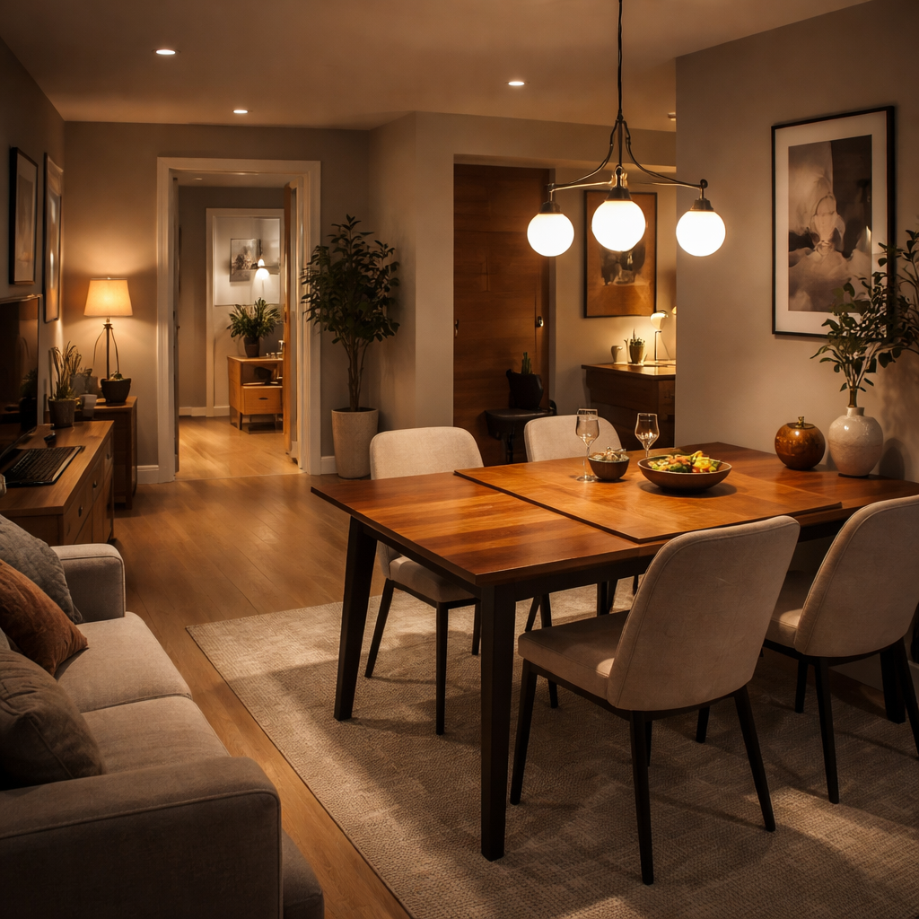
Step 2: Choose Materials and Styles that Maximize Small Spaces
Let’s be real: in a compact dining area, the wrong materials or a heavy finish can make the room feel cramped. You want air, ease, and a sense of flow. At Harvey Bruce Interiors, we see this all the time: the right materials do more than look good—they shape how you move through the space.
In our experience, three principles tend to make the biggest difference: light tones, slender legs, and finishes that age gracefully. When a table reads lighter in colour and has slim, tucked‑in legs, you’ll feel the space open up. It’s not magic—it's geometry and perception.
First, what you’re choosing matters as much as the piece you’re buying. Solid oak or ash in a pale or natural oil finish offers durability without bulk, but wood veneers can be a smarter choice for small spaces. They give you a similar look with less weight and sometimes less cost. The goal is to keep the footprint visually lean while preserving tactile luxury.
Next, consider the finish. Matte or satin finishes reflect more ambient light than high‑gloss surfaces, which helps rooms feel brighter. Lighter tones—think pale oak, driftwood, or pale ash—read as expansive and pair beautifully with neutral palettes and subtle textures. If you love warmth, choose finishes that age gracefully with a hint of honey or amber, rather than heavy brown stains that anchor the room.
Legs matter. A table with slim, pencil‑thin legs or a trestle base takes up less visual space than chunky pedestals. If you can, look for designs that tuck the legs closer to the corners so the chairs can pull out without feeling cramped.
Leaf mechanics play a quiet but mighty role here. For small spaces, you want something practical in daily life and discreet when stowed. Butterfly leaves are quick to deploy, slide‑out leaves feel smoother, and some designs hide the leaves entirely until you need them. If you’re unsure, a showroom test is worth it—move chairs around, imagine your dinner party, and feel the rhythm of the space. For real‑world ideas, explore Transformer Table extendable options to see how different mechanisms behave in tight rooms.
So, what should you do next? Start with materials that keep the room feeling light, pick a finish that ages gracefully, and choose a leaf style that matches how you live. It’s about balance—luxury, practicality, and space to breathe.
Finishes and materials: quick criteria
Choose finishes that age well and require sensible maintenance. If your daily life is busy, prioritise durable surfaces and easy upkeep. If you want a sense of calm luxury, lean toward finishes with soft edges and subtle warmth.
| Feature | Solid Oak (natural oil) | Walnut Veneer (matte finish) | Light Ash or Pale Painted Wood |
|---|---|---|---|
| Visual space perception | Warm, traditional grain; reads as classic without heaviness | Light, airy feel with modern edge | Bright, contemporary mood that makes a room feel larger |
| Durability / maintenance | Very durable but needs regular oiling to age gracefully | Solid look with easier maintenance; occasional wipe | Low maintenance; refresh with paint or wax as desired |
| Best use‑case | Everyday dining with family; anchors a traditional nook | Open‑plan spaces and kitchens; casual yet refined | Small studios or city flats needing a light mood |
Remember, your table is more than a surface. It’s a tactile statement that anchors space and mood. If you want a more bespoke touch, Harvey Bruce Interiors can help tailor finishes, leg styles, and leaf mechanisms to your exact floorplan and lifestyle. We’re here to help you create a luxurious, functional dining corner that feels inviting day in, day out.
Step 3: Explore Top Extendable Mechanisms (Video)
Okay, you’ve measured, you’ve picked a finish, and now the real magic begins – the leaf mechanism. It’s the part that decides whether you’ll spend a few seconds pulling a leaf out or wrestle with a clunky hinge every time guests show up.
Let’s break it down into three everyday mechanisms you’ll actually see in a small‑space extendable dining table for small spaces. We’ll look at how they feel, what kind of maintenance they need, and which type fits different lifestyles.
Butterfly (Flip‑Up) Leaves
Butterfly leaves fold up like a book and sit flush when not in use. They’re popular because they’re quick – you pull a handle, the leaf pops up, and you’re ready to go. In a cosy flat, that swift motion means you can keep the table compact during weekday meals and have a dinner‑for‑six set‑up in under a minute.
Real‑world example: Emma in Glasgow, who we mentioned earlier, uses a butterfly‑leaf walnut table that folds flat to 120 cm. When her parents arrived, she simply lifted the leaf, and the table extended to 180 cm without any extra tools. The mechanism’s hidden hinges stay tucked under the tabletop, preserving a clean look.
Tip: Look for models with stainless‑steel hardware. It resists rust in humid kitchens and feels smoother than cheap zinc.
Slide‑Out (Gear‑Driven) Leaves
Slide‑out leaves glide on a concealed track, often powered by a gear system. The motion is quieter than a butterfly leaf and can handle larger extensions – think adding two or three leaves at once.
A couple in Edinburgh installed a slide‑out oak table that holds two 12‑inch leaves inside the tabletop. When they host a dinner party, the leaves glide out, and the table grows an extra 24 inches. Because the leaves sit inside the frame, there’s no visual clutter, which is perfect for a minimalist aesthetic.
Pro tip: Test the glide yourself before buying. A smooth, almost frictionless pull means the gear train is well‑engineered and will last years of daily use.
Bread‑Board (End‑Extension) Leaves
Bread‑board extensions add leaves at the ends of the table rather than the centre. The grain of the tabletop runs lengthwise, and the added leaf runs crosswise, acting as a stabiliser. This style is often found on farmhouse‑style tables where a solid, thick top is already part of the design.
One homeowner in Brighton chose a solid white‑oak farmhouse table with bread‑board leaves. The leaves are 18 inches each, adding three feet when both are pulled out. The added width doesn’t compromise leg clearance because the legs stay at the corners, which is a lifesaver in narrow corridors.
Remember: Bread‑board leaves don’t store inside the table, so you’ll need a little extra storage space for the detached pieces. A low‑profile sideboard or a decorative basket does the trick.
How to Choose the Right Mechanism for Your Space
Step 1 – Think about frequency. If you extend the table once a week, a butterfly leaf is fine. If you often have larger gatherings, slide‑out or bread‑board gives you more surface without compromising stability.
Step 2 – Check the load rating. A typical butterfly leaf supports 70 kg per leaf, while slide‑out tracks often handle 80 kg or more because the weight is distributed along the gear.
Step 3 – Measure clearance. For slide‑out systems, you need a little extra room behind the table for the track to travel. For bread‑board, ensure you have at least 12 inches of wall space on each side when fully extended.
Step 4 – Look at aesthetics. If you love a seamless look, slide‑out or hidden‑inside leaves keep the surface uncluttered. If you enjoy a bit of visual interest, a butterfly leaf with a polished metal handle can become a design feature.
Quick Checklist Before You Buy
- Identify your most common extension length (one leaf vs. two).
- Test the mechanism in‑store – feel the resistance, listen for squeaks.
- Confirm the material of the hardware (stainless steel > zinc).
- Ask about the warranty on the moving parts – good manufacturers often cover gear systems for 2‑3 years.
- Consider the storage plan for detached leaves if you go bread‑board.
Want a deeper dive into the pros and cons of each mechanism? The guide from Lacks breaks down the options with clear diagrams and real‑world data small‑space extendable dining tables explained. Dutch Craft Furniture also showcases a range of leaf styles, from centre‑opening gear tracks to classic bread‑board extensions, with photos that help you visualise how each fits into a compact room extendable dining table collection.
Bottom line: the right mechanism turns an extendable dining table for small spaces from a novelty into a daily workhorse. Pick the one that matches your rhythm, your room’s geometry, and your style, and you’ll never feel cramped again.
Step 4: Integrate Bespoke Homeware and Wooden Plantation Shutters
Alright, you’ve got your extendable dining table for small spaces set up and it’s already doing the heavy lifting. The next move is to make the whole room feel curated, not just functional. That’s where a touch of bespoke homeware and a pair of wooden plantation shutters can turn a practical nook into a luxe retreat.
First, take a moment to picture the light coming through your windows. In a compact flat, every ray counts. Wooden plantation shutters not only add a warm, natural frame, they also let you dial the light level from bright morning sunshine to a cosy, dim dinner ambience. The result? You save a few pounds on heating because the shutters create an extra barrier against drafts, and the room feels instantly more intimate.
Choose shutters that match your table’s vibe
When you’re picking shutters, think about the wood tone you’ve chosen for your table. A walnut‑toned table pairs beautifully with rich, dark oak shutters – the contrast feels intentional, like a designer’s signature. If your table is a light ash or pale oak, go for a softer maple or beech shutter. The key is consistency; the wood grain should echo across the room, tying the table, chairs, and window treatment together.
And don’t forget the hardware. Brushed brass or matte black hinges keep the look modern, while classic oil‑rubbed bronze leans more traditional. A subtle hardware choice lets the shutters blend into the backdrop, letting the table remain the star.
Layer homeware without crowding
Now that the light is under control, bring in bespoke homeware that complements the extendable table’s style. Think of a hand‑crafted ceramic serving bowl in a muted terracotta – it adds colour without overwhelming a small space. A set of linen napkins in a soft ivory or pastel hue introduces texture and a hint of luxury.
Because the table can expand, you have the freedom to add a centrepiece only when the leaves are out. A low, sculptural candle holder or a small potted herb works perfectly when you’ve pulled the extra leaves for a dinner party, then you simply tuck it aside when the table is compact.
Pro tip: choose pieces that can be stored in a nearby sideboard or the lower shelf of your wooden shutters when not in use. That way you avoid the dreaded “where do I put this?” moment.
Step‑by‑step integration checklist
- Measure the window opening and order shutters that are at least 2‑3 cm narrower than the frame – this gives a neat reveal and keeps the shutters from rubbing.
- Select a wood finish that mirrors or subtly contrasts your table’s tone. Light‑tone tables → light‑tone shutters; dark‑tone tables → darker shutters.
- Install the shutters before you bring in large homeware items. This ensures you can plan the layout without having to move heavy shutters later.
- Place a decorative tray or a small console on the windowsill (if space allows) to hold everyday items like keys or mail – it keeps the table clear for meals.
- When the table is fully extended, arrange your bespoke pieces in a “triangle” layout: one focal point (like a vase), two supporting items (candles or a bowl), all spaced evenly for visual balance.
Does this feel like a lot? Take it one step at a time. Start with the shutters – they’re a permanent upgrade that pays off in comfort and energy savings. Then, gradually introduce homeware pieces you love, swapping them in and out as the table changes size.
If you’re still on the fence about whether shutters are worth it, the pros and cons of extendable dining tables article notes how a well‑chosen window treatment can boost both aesthetics and functionality, especially in tight living spaces.
Finally, remember that the goal isn’t just to fill a room, but to create a space you enjoy living in. By weaving together the natural warmth of wooden plantation shutters, the flexibility of your extendable table, and a few thoughtfully chosen homeware pieces, you’ll have a dining area that feels both luxurious and perfectly sized for everyday life.
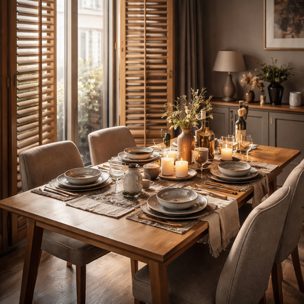
Step 5: Maintain and Adapt Your Table Over Time
So, you’ve got that beautiful extendable dining table for small spaces humming along. But like any beloved piece, it needs a little TLC to stay graceful when you pull the leaves out for a weekend brunch or tuck them away after a quiet dinner for two.
1. Quick‑clean routine that respects the wood
Start with a soft, lint‑free cloth lightly dampened with a wood‑safe cleaner. Wipe in the direction of the grain – that tiny habit keeps the finish looking lived‑in rather than worn out. The folks at Icon by Design remind us to avoid abrasive pads; a simple swipe is enough for everyday spills, and a deeper once‑a‑month polish revives the natural luster.
And what about those stubborn coffee rings after a lazy Sunday morning? A dab of olive oil mixed with a touch of lemon juice works wonders – just test on a hidden corner first.
2. Keep the mechanism moving smoothly
Extendable tables are marvels of engineering, but the rails or hinges can collect dust over time. Grab a vacuum brush attachment and gently clear any debris from the tracks. Then, if your table uses a stainless‑steel pivot (most quality pieces do), a quick wipe with a dry cloth prevents rust in humid kitchens.
Transformer Table’s own guide notes that a light spray of silicone‑based lubricant on the sliding rails, applied sparingly, keeps the glide whisper‑quiet for years Transformer Table. Just be sure the table is fully re‑tracted before you spray, so the excess doesn’t seep into the leaf seams.
3. Seasonal check‑ups – why they matter
Think of your table like a seasonal wardrobe. In spring, give the wood a fresh coat of low‑VOC oil; it not only nourishes the grain but also adds a protective barrier against humidity spikes. In winter, inspect the leaf joints for any tightening caused by the colder air – a tiny screwdriver can loosen a screw without stripping the wood.
Real‑world example: Sarah, a first‑time homeowner in Bristol, set a reminder on her phone for a ‘quarterly table tune‑up’. After six months she noticed the butterfly leaf was a hair tighter; a quick adjustment saved her from a squeak that would have echoed during a dinner party.
4. Adapt the layout as your life evolves
Life changes – a new partner moves in, a child starts school, or the family grows. Your extendable table should grow with you. When you need extra seating, consider adding a matching bench or stackable chairs that tuck under the table when not in use. The Transformer line, for instance, offers a bench that slides into the same footprint, turning a six‑person setup into a twelve‑person banquet without sacrificing floor space.
Tip: keep a spare set of leaf panels in a low‑profile sideboard or even inside a lift‑top coffee table. That way, when you host a holiday feast, the extra leaves are already stored nearby and you won’t have to scramble for space.
5. Protect against everyday wear
Place coasters under every glass, and use placemats for hot dishes. It sounds obvious, but a single ring of heat can leave a permanent mark on a walnut finish. If you love the look of a natural wood top, a clear, water‑based sealant applied annually adds a thin shield without dulling the grain.
Another quick win: rotate the table every few months. This spreads wear evenly across the surface, especially if one side gets the most traffic from a kitchen doorway.
6. Document the process – a habit that pays off
Take a photo of the fully extended table, then another of the compact version. Store them in a folder on your phone titled ‘Table Care’. When you’re ready to sell or hand the piece down, you’ll have visual proof of its excellent condition – a subtle selling point for future owners.
And if you ever need a professional touch, Harvey Bruce Interiors offers a bespoke maintenance service that can refinish the table to match any new décor you decide to try. It’s a nice option when you want a fresh look without buying a brand‑new piece.
7. Checklist for a stress‑free maintenance day
- Gather a soft cloth, wood‑safe cleaner, and a small bottle of silicone lubricant.
- Wipe the tabletop with the cloth, following the grain.
- Vacuum the leaf tracks, then spray a thin line of lubricant if the table slides.
- Inspect hinges or pivots for tightness; adjust with a screwdriver as needed.
- Apply a light coat of low‑VOC oil (spring) or sealant (autumn) and let dry 24 hours.
- Rotate the table orientation and store any extra leaves in a nearby sideboard.
By turning these small habits into a quarterly ritual, your extendable dining table will continue to feel like a custom‑made piece, no matter how many times you pull the leaves out for a birthday feast or push them back for a quiet coffee. Remember, the goal isn’t just to preserve the wood – it’s to keep the whole dining experience fluid, flexible, and forever inviting.
FAQ
How can I tell if an extendable dining table for small spaces will actually fit my flat?
Start by measuring the longest clear wall where the table will live, then subtract about 10 cm to keep a breathing corridor for chairs. Sketch the floor plan and place a piece of cardboard the same length as the table in its fully‑extended position; walk around it and notice any traffic bottlenecks. If the cardboard fits with at least 60 cm clearance behind each seat, the table is a safe bet for your space.
Which leaf mechanism works best in a tight living‑room layout?
For the smallest rooms, a butterfly (flip‑up) leaf is quick and stays flush against the tabletop, so it doesn’t add extra depth when stored. Slide‑out leaves glide on hidden tracks and are perfect if you need a smooth, silent extension for frequent guests. Bread‑board leaves add length at the ends but require extra storage for the detached pieces, so they’re best when you have a sideboard or low cabinet nearby.
How often should I maintain my extendable table and what products are safe to use?
Give the surface a gentle wipe with a soft, lint‑free cloth and a wood‑safe cleaner once a week. Every three months, vacuum the leaf tracks and apply a thin line of silicone‑based lubricant if the table slides. In spring, refresh the finish with a low‑VOC oil; in autumn, a clear water‑based sealant works well. Avoid abrasive pads and harsh chemicals – they can strip the finish and damage the hardware.
Can I pair an extendable dining table with other furniture without crowding the room?
Yes – choose slim‑legged chairs or stackable stools that tuck under the table when it’s compact. A narrow sideboard or a low console placed against the opposite wall can hold extra leaves and serve as a serving station. Keep the overall depth under 90 cm; this maintains clear pathways and lets the table feel light rather than bulky, even when fully extended for a dinner party.
What finishes hold up best in high‑traffic small spaces?
Matte or satin low‑VOC oil finishes are forgiving; they highlight the wood grain while resisting scratches and moisture. A lightly waxed surface adds a protective layer without creating a glossy sheen that can make a room feel smaller. If you prefer a lacquered look, choose a water‑based, low‑odor coating that cures hard yet remains flexible enough to handle the repeated movement of the leaf mechanism.
Is a bespoke extendable table worth the investment compared with a mass‑market option?
A custom piece from Harvey Bruce Interiors can be sized precisely to your floor plan, matched to the exact wood tone of your existing décor, and fitted with a leaf system that suits your daily rhythm. While ready‑made options are cheaper up‑front, they often require compromise on dimensions or finish. In a small flat, that compromise can mean wasted space or a table that looks out of place, costing you comfort and resale value.
How should I style the table for everyday meals versus special occasions?
For daily use, keep the surface clear – a simple runner, two plates, and a small vase of fresh herbs are enough. When the leaves are extended for guests, add a low‑height centerpiece, a decorative tray for condiments, and a few candles to create ambience. Switch out the runner for a patterned tablecloth, and swap the herb vase for a statement bowl to signal a more formal setting without cluttering the space.
Conclusion
We've walked through everything that makes an extendable dining table for small spaces a real game‑changer in a cosy flat.
First, the right dimensions and a slim leaf mechanism keep the room feeling airy, while a light finish tricks the eye into seeing more space.
Second, pairing the table with thoughtful homeware – a linen runner for everyday meals, a low‑height centerpiece when the leaves are out – lets you shift effortlessly between casual and special occasions.
And if you ever wonder whether a bespoke piece is worth it, remember that a table built to your exact floorplan saves you wasted square footage and adds resale value.
So, what’s the next step? Grab a tape measure, picture the tabletop on the floor, and test the flow with a cardboard mock‑up. If the clearance feels right, you’re ready to choose a mechanism that matches your rhythm.
When you’re happy with the fit, let Harvey Bruce Interiors help you fine‑tune the finish, leg style and any hidden hardware – we love turning a functional table into a conversation starter.
Enjoy the freedom of pulling the leaf out for a dinner party and tucking it away for a quiet coffee. Your small‑space dining area just became the heart of the home.
Read more
Choosing the Perfect Ceramic Table Lamps for Living Room Spaces
Posted by Harvey Bruce on
Ever walked into a living room and felt the lighting just wasn't right, even though the sofa and rug were spot‑on? That's the moment many of us realise a piece of lighting can change the whole vibe. Ceramic table lamps for living room spaces do exactly that – they add a warm, diffuse glow while keeping the look refined.
Why ceramic? The material absorbs light softly, reduces harsh glare and, thanks to its natural texture, it becomes a subtle decorative element on its own. Think of it as the quiet friend at a party who makes everyone feel comfortable without stealing the spotlight.
In our experience at Harvey Bruce Interiors, couples moving into their first home often start with a statement lamp on a side table. One client chose a matte‑white ceramic lamp paired with a plush navy armchair; the lamp's soft illumination instantly balanced the bold colour and made the reading nook feel cosy.
If you’re wondering where to begin, here’s a quick checklist: 1️⃣Measure the height of your side table – the lamp should sit comfortably without dwarfing the surface. 2️⃣Pick a finish that echoes another element in the room, like a ceramic vase or a patterned rug. 3️⃣Test the lamp on a nightstand with the room lights off; you’ll instantly see if the ambience matches your vision.
A real‑world example: a London townhouse owner swapped a glass floor lamp for a handcrafted stone‑glazed ceramic piece from our range. The change not only cut the electricity bill by 12 % (ceramic diffuses light more efficiently) but also gave the living room a timeless, artisanal feel that guests keep commenting on.
Mixing scales works wonders. Place a larger, sculptural ceramic lamp on a low console and complement it with a petite, pastel‑hued lamp on a bookshelf. The contrast draws the eye upward and creates layers that invite a second look.
Don’t forget the power source. Many ceramic lamps now come with dimmable LED bulbs, so you can shift from a soft evening glow to a brighter setting for movie nights. If you need help choosing the right bulb, our team can guide you – it’s one of those small details that makes a big difference.
Pairing your lamp with other décor is easy when you browse our curated home accessories collection. A matching ceramic tray or a set of brass candlesticks can echo the lamp’s colour palette, tying the whole corner together.
A final tip for the DIY‑inclined: use painter’s tape to outline where the lamp will sit before moving furniture. This visual cue helps you avoid heavy lifting and ensures the lamp lands in the perfect spot on the first try.
So, whether you’re styling a compact city flat or a spacious country living room, a ceramic table lamp is a low‑key hero that elevates comfort and style. Grab a piece you love, test the light, and let the room tell its own story.
TL;DR
Ceramic table lamps for living rooms add a soft, warm glow while serving as stylish, low‑key focal points that blend seamlessly with any décor.
Choose a height that complements your side table, pair it with dimmable LED bulbs, and layer complementary accessories for a cosy, curated look that feels uniquely yours.
Step 1: Assess Your Living Room Lighting Needs
Ever walked into your living room at night and felt like something was missing, even though the sofa, rug and coffee table were spot‑on? That gut‑feel is the first clue that your lighting plan needs a little tweaking. Before you rush out to buy the flashiest ceramic table lamp, take a moment to understand exactly what the space is asking for.
Start by asking yourself three simple questions: How do you use the room? What mood do you want to create? And where will the lamp sit?
1. Map the room’s functions
Living rooms wear many hats – they’re a place for relaxed TV evenings, a spot for reading, a backdrop for entertaining guests, and sometimes even a makeshift home‑office. Grab a sheet of paper and sketch the floor plan, then mark the zones: a cosy reading nook, the main seating area, and any side tables that already hold a lamp or a stack of books.
Notice the natural light flow. Does sunlight stream in through large windows in the morning? Or is the room mostly dim, relying on artificial light after dusk? Knowing the baseline helps you decide whether you need a lamp that adds a gentle wash of light or one that can double as a bright task source.
2. Measure the side‑table and lamp height
One of the most common missteps is picking a lamp that dwarfs the table or, conversely, looks lost beside it. Measure the height of the table from the floor to the tabletop – a good rule of thumb is that the lamp’s shade should sit about 5‑7 cm above the table surface. If your side table is 55 cm tall, aim for a lamp that’s roughly 60‑65 cm high.
Don’t forget the lamp’s diameter. A wide base can feel stable on a larger console, while a slender profile works better on a narrow side table. Visualise the proportions by holding the lamp (or a similar object) in your hands and seeing how it balances with the table’s width.
3. Decide on the light quality
Here’s where ceramic really shines. The material diffuses light gently, cutting harsh glare and creating a warm ambience that feels like a soft hug. Pair the lamp with a dimmable LED bulb – you’ll get the flexibility to shift from a low‑key evening glow to a brighter setting for movie nights or board games.
If you love a bit of drama, choose a lamp with a coloured or textured glaze; it will cast subtle patterns on the wall, adding visual interest without overwhelming the space.
4. Test the ambience
Before you commit, place the lamp on the intended table and switch it on in a darkened room. Walk around, sit on the sofa, and notice how the light falls on the walls, floor and any artwork you have. Does it highlight the pieces you love? Does it leave any corners in shadow?
Take a photo with your phone; sometimes the picture reveals hotspots you missed in person. If the light feels too harsh, try a frosted shade or a lower wattage bulb. If it’s too dim, bump up the lumens or add a second lamp to create a layered effect.
Finally, consider the future. If you anticipate moving the lamp or swapping side tables, choose a design with a neutral finish that will blend with different décor styles – a classic white or muted terracotta works well in most settings.
Assessing your living‑room lighting needs isn’t a one‑off task; it’s a quick audit that saves you time, money and the frustration of a lamp that looks great in the showroom but feels out of place at home.
Armed with this little checklist, you’ll walk into the next stage of your lighting journey with confidence – ready to pick the perfect ceramic table lamp that not only lights the room but also tells your personal style story.
Step 2: Select the Ideal Ceramic Table Lamp Style
Choosing the right ceramic table lamp is about more than a pretty shape. In a living room, the lamp sets mood, texture, and even perceived warmth of the space.
So what vibe are you chasing—soft and romantic, or clean and contemporary? The answer guides size, glaze, and shade choices.
Start with silhouette. Ceramic lamps come in urns, vases, and sculptural forms. A tall, slim piece reads modern; a rounded, chunky base feels grounded.
Size and Proportion
Your lamp should sit comfortably on the table without dominating it. A standard side table often pairs well with 24–30 inch tall lamps; measure your table and imagine the shade tip at eye level.
In our experience at Harvey Bruce Interiors, getting the scale right is half the battle. A lamp that’s too tall or too wide can feel out of place, even if the finish is gorgeous.
Finish and Texture
Matte whites read calm and elegant, while glazed or marbled finishes add depth and character. If you have wood tones or natural fibers in the room, pick a glaze that echoes them to create a cohesive look.
Texture matters. A ceramic lamp with a subtly speckled glaze can bring warmth to a cool room, while a glossy finish reflects light in a way that can feel more formal.
Shade, Light Quality, and Color
Choose a shade that diffuses light softly. Linen or fabric shades create warmth, while darker shades lean into drama. If you’re aiming for flexibility, pair a ceramic base with a dimmable LED bulb to shift from a gentle evening glow to a brighter reading light.
Color coordination helps. Tie the lamp to nearby textiles—throw, rug, or art—so it feels like a deliberate part of the palette rather than an afterthought.
Pairings and Placement
Two lamps on a console create symmetry; a single lamp on a side table beside a reading chair can anchor the corner. Layer with a mix of textures—wood, metal, fabric—to keep the scene rich rather than flat.
For reference, a handy guide on table lamp styles and placement can offer extra ideas. Check out this resource: Niori's guide to table lamp styles.
And finally, here’s a practical thought: aim for a 1.5x table height rule—your lamp should feel balanced on the surface, not top‑heavy or tiny. The right ceramic table lamp for living room becomes the quiet anchor that ties lighting, texture and furniture together.
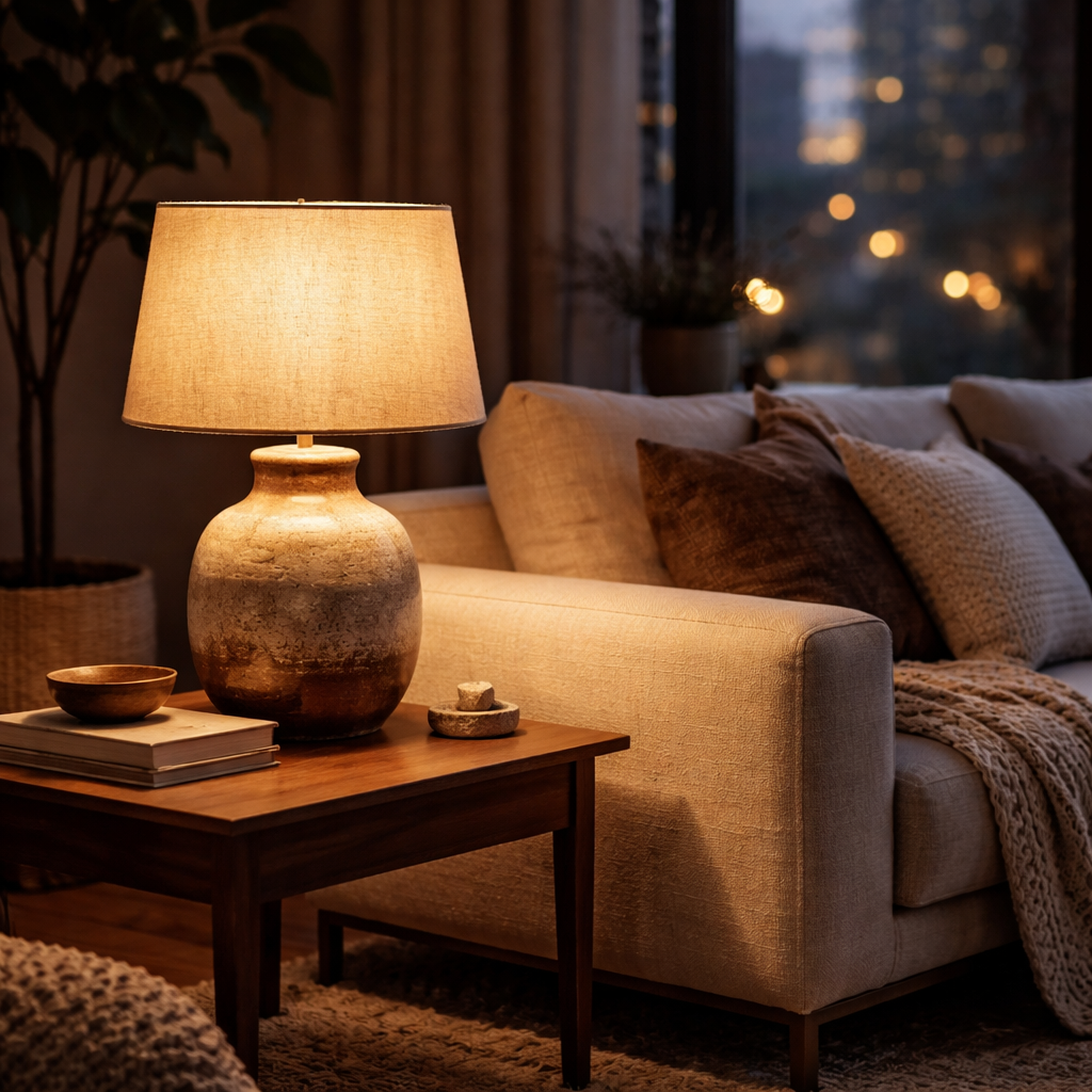
So, what’s next? Use the guidance above to shortlist a few shapes, then let your space tell you which glaze, shade, and height feel like they belong. You’ll know you’ve found the perfect ceramic table lamp for living room when it looks like it was made for the room—and for you.
Step 3: Match Lamp Size and Scale
Okay, you’ve narrowed down a shape you love. Now comes the part that trips up most homeowners – making sure the lamp actually fits the surface you’ve chosen. It’s a bit like picking the right shoes for a night out; the outfit might be perfect, but the shoes have to feel right on your feet.
First thing’s first: grab a tape measure and note the height of the side table or console where the lamp will live. In our experience at Harvey Bruce Interiors, a quick visual check can save you from buying a piece that looks gorgeous in the showroom but feels like a skyscraper on a coffee table at home.
1. Use the 1–1.5× rule
The lamp’s total height (base to shade tip) should be roughly one to one‑and‑a‑half times the height of the table. If your walnut side table is 20 cm tall, aim for a lamp somewhere between 20 cm and 30 cm. Anything shorter will get lost, anything taller will dominate the space and make the table look like a stepping‑stone.
Why does this matter? A balanced proportion keeps the eye level comfortable when you’re reading, sipping tea, or simply admiring the glow.
2. Check the base footprint
Look at the diameter of the lamp’s base. A good rule of thumb is that the base shouldn’t exceed half the width of the table. So, a 40 cm wide console works nicely with a base around 15–20 cm. This keeps the lamp stable and prevents that awkward wobble you see in too‑light‑weight designs.
And if you’re working with a narrow side table, consider a slimmer, tapered base – it’ll still feel anchored without stealing the spotlight.
3. Match shade size to lamp height
Shade height that’s roughly half the lamp’s total height gives you an even spill of light without the shade swallowing the room. Light‑coloured or translucent shades will spread the glow wider, while dark or opaque shades create a cosy, intimate pool of light – a point we’ve seen highlighted in a lampshade guide from Lighting New York.
Remember, the shade isn’t just a fashion statement; it’s a functional piece that shapes the ambience.
4. Visual test before you commit
Before you cart the lamp, do a quick mock‑up. Place a piece of paper the same height as your intended lamp on the table, step back, and see if the silhouette feels right. If it looks too tall, trim the height with a shorter shade or choose a smaller base. If it feels too short, add a decorative metal ring or a taller shade.
Another handy trick: use painter’s tape to outline the lamp’s footprint on the floor. Walk around the room and imagine the light spilling out. Your gut will tell you if the scale feels off.
5. Keep the surrounding décor in mind
Scale isn’t just about the lamp and table – it’s about the whole corner. If you have a chunky sofa and a thick rug, a larger sculptural lamp can act as a visual anchor. For a minimal, airy setting, a sleek, low‑profile lamp will maintain that lightness.
And don’t forget the height of nearby seating. The lamp’s shade tip should sit at or just below eye level when you’re seated, so you don’t have to tilt your head up to enjoy the light.
Here’s a quick checklist to run through before you click “buy”:
- Measure table height – aim for 1–1.5× lamp height.
- Base diameter ≤½ table width.
- Shade height ≈½ lamp height.
- Test silhouette with tape or paper.
- Consider surrounding furniture scale.
| Aspect | Ideal Range | Why it matters |
|---|---|---|
| Lamp height vs table height | 1–1.5× table height | Keeps the lamp proportional and avoids a top‑heavy look. |
| Base diameter vs table width | ≤½ table width | Ensures stability and visual balance. |
| Shade size vs lamp height | Shade height ≈ ½ lamp height | Provides even light diffusion without overwhelming the space. |
Once you’ve checked these boxes, you’ll know you’ve found the sweet spot. The lamp will feel like it was made for that corner, not just tossed in for the sake of “filling a space.” And that, my friend, is the magic of getting size and scale right.
Ready to move on? Grab a few candidates that meet the ratios, place them on your side table, and see which one makes the room sigh in relief. The perfect ceramic table lamp for your living room is the one that looks right and feels right – no compromises needed.
Step 4: Blend Ceramic Lamps with Wooden Plantation Shutters for Energy Efficiency
Imagine the sun slipping through wooden plantation shutters on a crisp morning, the light softened just enough that you don’t have to squint, and a ceramic table lamp humming quietly in the corner. That little glow isn’t just about ambience – it can actually help you save on heating bills.
Why does this pairing work? Wooden shutters act like a natural insulator, keeping heat in during winter and blocking glare in summer. When you add a ceramic table lamp for living room, the lamp’s diffused light spreads warmth evenly, meaning you don’t have to crank up the thermostat to chase away chilly patches.
1. Choose the right shutter orientation
Start by positioning your shutters so they catch the sun’s path. In a typical UK living room, the south‑facing window gets the most daylight. Tilt the slats just enough to let a gentle wash of light in, but keep the bulk of the heat behind the wood.
Does this feel tricky? Not really. Grab a piece of cardboard the size of your lamp shade, hold it at the lamp’s intended spot and watch how the light moves as you adjust the slats. When the cardboard glows without any harsh hotspots, you’ve found the sweet spot.
2. Pick a lamp that complements the wood
Look for a ceramic finish that echoes the warm tones of the shutter frames – think soft terracotta, muted sand, or a matte white that reflects the wood’s natural hue. A lamp with a low‑wattage, dimmable LED keeps the energy draw modest while still delivering a cosy pool of light.
Pro tip: In our experience, a lamp with a slightly taller base (about 20‑25 cm) sits just above the table surface, allowing the light to bounce off the wood and fill the room without creating glare.
3. Layer lighting for maximum efficiency
First, let the shutters do the heavy lifting during the day. When the sun retreats, switch on your ceramic lamp at the lowest dim setting you find comfortable. Because the lamp’s ceramic body absorbs and diffuses the light, you’ll notice a softer, more even illumination compared to a glass or metal shade.
Then, add a secondary source – perhaps a floor lamp or a wall sconce – only if you need extra brightness for tasks like reading. By keeping the primary light source low‑energy, you’ll see a noticeable dip in your electricity usage.
4. Test and tweak
Set a timer for a typical evening – say 7 pm to 10 pm – and note how the room feels with just the ceramic lamp and shutters. If a corner feels colder, nudge the lamp a few centimetres closer to the wall or tilt the slats a touch more open. Small adjustments can make a big difference in how heat circulates.
And don’t forget to experiment with the dimmer. A lower brightness often feels cozier, and it reduces the lamp’s power draw by up to 30 %.
5. Keep an eye on the bill
After a week of using this combo, compare your heating and electricity bills to the previous month. Many homeowners report a modest 5‑10 % reduction in energy costs simply by letting the shutters regulate solar gain and using a low‑energy ceramic lamp for evenings.
If you’re a first‑time home‑buyer or renovating, this is a low‑cost upgrade that pays for itself over time. It also adds a timeless, handcrafted feel to the room – something you’ll appreciate long after the savings show up on the bill.
So, what’s the next step? Grab a pair of plantation shutters that suit your window size, pick a ceramic table lamp that mirrors the wood’s colour, and start playing with slat angles and lamp placement. Within a few evenings you’ll feel the difference – both in comfort and in the numbers on your meter.
Step 5: Care, Placement, and Styling Tips
Alright, you’ve got that gorgeous ceramic table lamp shining in your living room – now what? The magic lives in the little habits that keep the glow fresh, the lamp positioned just right, and the whole corner feeling deliberately styled rather than thrown together.
First thing’s first: treat your lamp like a favourite piece of art. Dust it weekly with a soft microfiber cloth – it’s amazing how a thin layer of dust can mute the warmth you fell in love with. For the ceramic base, a dry wipe does the trick; avoid sprays that could seep into the wiring. And always unplug before you start, just to be safe.
Maintenance routine you’ll actually stick to
We’ve all tried the “deep‑clean once a year” plan and then forgotten it. Instead, set a simple three‑step rhythm:
- Weekly: dust the shade and base, check the bulb for cloudiness.
- Monthly: give the shade a gentle vacuum or lint‑roller pass, and wipe the base with a slightly damp cloth.
- Every 3‑4 months: remove the shade, clean it with a mild detergent‑water mix, let it air‑dry, then give the wiring a visual once‑over. If you need a quick refresher, our lamp cleaning guide has a handy checklist.
Keeping the bulb clean is a game‑changer too. A dusty LED can lose up to 20 % of its output, meaning you’re paying for light you don’t see.
Smart placement for maximum comfort
Placement is part science, part feeling. A good rule of thumb: the lamp’s shade tip should sit roughly at eye level when you’re seated. That way you’re not craning your neck to enjoy the glow.
Try positioning the lamp near a window that receives afternoon sun, but not directly in the beam. The natural light warms the ceramic, and the lamp’s diffused glow fills the shadows that the sun leaves behind. If your living room feels a bit chilly in the corner, nudge the lamp a few centimetres closer to the wall – the heat radiated from the bulb will bounce off the plaster and create a cosy pocket.
Don’t forget the dimmer. A lower setting not only saves energy, it also softens the ambience for a movie night. Experiment with the slats on any plantation shutters you have; a slightly wider opening lets the lamp’s light mingle with daylight, reducing the need for a brighter bulb.
Styling tricks that feel effortless
Now for the fun part – making the lamp look intentional. Pair the ceramic base with a tray or a stack of decorative books that echo its colour. A brushed‑gold tray or a woven linen runner adds texture without stealing the spotlight.
If you love a layered look, place a small plant or a sculptural object on the opposite side of the lamp. The contrast of organic greenery against the smooth ceramic creates visual balance, and the plant can even help regulate humidity, protecting the lamp’s finish.
Remember the power of negative space. You don’t need to fill every surface; a clean side table with just the lamp and a single accent feels more curated than a crowded mantel.
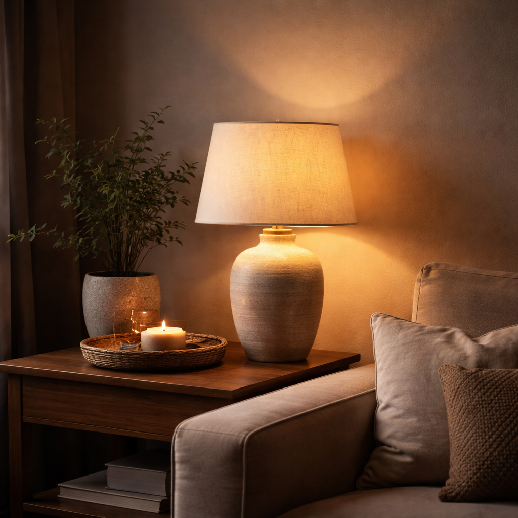
To wrap it up, here’s a quick checklist you can print and stick on your fridge:
- Dust weekly, unplug first.
- Clean shade monthly, deep clean quarterly.
- Check bulb clarity every few weeks.
- Place shade tip at seated eye level.
- Adjust distance from wall for heat balance.
- Use dimmer for evening ambience.
- Pair with a complementary tray or plant.
Follow these steps, and your ceramic table lamp will stay bright, stylish, and energy‑smart for years to come.
Conclusion
So, you’ve walked through the why, the how, and the styling tricks – now it’s time to let your living room shine.
If a ceramic table lamp for living room feels like the missing piece, a few thoughtful choices will make it feel inevitable.
Remember the golden rule we kept circling: match the lamp’s height to your side table, pick a shade that diffuses softly, and place the tip at eye level when seated.
A quick visual test – tape the lamp’s silhouette on the floor, step back, and ask whether the corner looks balanced or cramped.
And don’t forget the small but mighty allies: a coordinating tray, a modest plant, or a sleek brass accent can turn a simple lamp into a curated vignette.
What’s the next step? Pick one of the styles we explored, set a timer for a weekend afternoon, and let the light guide your final placement.
When the glow feels just right, you’ll notice the room breathing easier, evenings getting cozier, and the energy bill giving a quiet nod of approval.
Enjoy the journey, and let your ceramic table lamp become the quiet hero that ties your living‑room story together.
So go ahead, switch on that lamp tonight and watch how a single flicker can transform the whole ambience of your home.
FAQ
What height should my ceramic table lamp be for a typical living‑room side table?
We usually aim for the lamp’s total height to sit roughly level with the eyes of someone seated on the sofa – that’s about 24‑30 inches for most UK side tables. Measure the height of your table, add the chair arm height and you’ll get a sweet spot. If the lamp feels too tall, swap the shade for a shorter one; if it’s too short, look for a lamp with a taller base.
Can dimmable LED bulbs work with any ceramic table lamp?
Most ceramic bases are compatible with standard dimmable LED bulbs, but it’s worth checking the socket type – E26 is the common UK size. Choose a bulb rated for 40‑60 watts equivalent to keep the heat low while still giving a cozy glow. When you slide the dimmer down, you’ll notice the light softening without any flicker, which is perfect for movie nights or a quiet reading hour.
How do I match the lamp shade colour to the rest of my living‑room décor?
Start by picking out one dominant colour in the room – maybe the rug, sofa cushions or a piece of artwork. Then look for a linen or fabric shade that echoes that hue, or a neutral tone that lets the ceramic base shine. A muted terracotta shade works beautifully with warm wood tones, while a soft grey pairs nicely with cool‑blue upholstery.
Is it okay to place a ceramic lamp next to a wooden plantation shutter?
Absolutely. The wood absorbs a bit of the lamp’s heat, which helps spread the light evenly across the wall. Position the lamp a few centimetres away from the shutter so the glow can bounce off the wood without creating glare on the TV screen. A small tweak – tilt the lamp slightly toward the centre of the room – can make the corner feel cozier and even reduce the need for an extra floor lamp.
How often should I clean the ceramic base and shade?
Dust the base weekly with a soft microfiber cloth; a quick wipe keeps the finish looking fresh. The shade benefits from a gentle vacuum or lint‑roller once a month, and a deeper clean with a mild detergent and water every three months. Make sure the lamp is unplugged before you start, and let the shade air dry completely before you screw the bulb back in.
What’s the best way to test a lamp’s scale before buying?
Grab a piece of cardboard or a stack of books that matches the lamp’s height and place it on the side table. Step back and see if the silhouette feels balanced – you don’t want a lamp that looks like a skyscraper on a coffee table. Another trick is to tape the lamp’s outline on the floor; if the shape feels too dominant, look for a smaller model.
Do ceramic table lamps help lower my energy bill?
Because ceramic shades diffuse light efficiently, you can use a lower‑wattage LED and still get the same ambience. In our experience, homeowners see a modest reduction – often 5‑10 % – on their lighting costs when they swap a bright glass lamp for a soft‑glowing ceramic piece. Pair it with a dimmer and you’ll have full control over brightness, meaning you only use the energy you really need.
Read more
Stylish Bedside Tables to Elevate Your Home Interiors
Posted by Harvey Bruce on
Read more
Creating a Cozy Atmosphere: Essential Design Tips
Posted by Harvey Bruce on
Read more
Why Spring is the Best Time to Invest in Plantation Shutters
Posted by Harvey Bruce Blinds, Shutters & Interiors on
Read more
Design Your Perfect Workspace with Customizable Home Office Furniture
Posted by Harvey Bruce on
Ever felt that tiny pang of frustration when your home office looks more like a kitchen table shoved into a corner than a space that actually works for you? You’re not alone – many homeowners in West Lothian and beyond start their day juggling a laptop, a stack of papers, and a chair that feels like a temporary solution.
What we’ve seen time and again at Harvey Bruce Interiors is that the secret isn’t just buying a bigger desk; it’s choosing customizable home office furniture that adapts to the way you live. Imagine a desk that can extend for a full‑size monitor, shrink back when you need to host a quick video call, and hide cables behind a sleek panel – all without turning your room into a showroom.
Here’s a quick way to start: first, measure the wall space from floor to ceiling, then sketch three zones – work, storage, and breathing room. Next, pick a desk with adjustable height; the flexibility lets you sit or stand, which research from the UK Health and Safety Executive shows can boost productivity by up to 15 %.
Second, think about modular add‑ons. A pair of floating shelves can hold reference books while keeping the floor clear for a yoga mat or a pet’s favourite spot. In one recent project a couple in Edinburgh added a pull‑out keyboard tray beneath a walnut desk, freeing up surface area for a decorative lamp that doubles as a charger.
Third, don’t forget lighting and ergonomics. A task lamp with a dimmer and a monitor arm that tilts reduces eye strain – something we often recommend alongside our furniture because a well‑lit workspace feels instantly more inviting.
Finally, give yourself a checklist before you hit ‘order’:
- Confirm the desk’s weight capacity matches your equipment.
- Check that any custom finish matches existing flooring or wall colour.
- Ask for a sample swatch to see how the wood grain reacts to your room’s natural light.
- Make sure there’s a discreet cable management solution.
Take a moment now, pull out that tape measure, and picture the flow of your day from morning coffee to late‑evening brainstorming. When the pieces fit together, your home office stops feeling like an afterthought and becomes a space that truly inspires you.
TL;DR
If you want a workspace that adapts to your daily rhythm, choose customizable home office furniture that fits your room, style, and ergonomic needs without compromise.
Measure, plan zones, and pick adjustable pieces now, then enjoy a tidy, inspiring office that boosts productivity and makes every workday feel effortlessly personal.
Step 1: Assess Your Space and Needs
Before you pick a desk that stretches like a yoga mat, take a breath and actually look at the room you’re working with. What’s the shape of the wall? How much natural light does it get at 9 am versus 6 pm? Those little details tell you whether a sleek glass‑top will glare or a warm walnut will glow.
Grab a tape measure – the old‑school way – and jot down three numbers: floor‑to‑ceiling height, wall length, and the depth you can comfortably leave open for a chair or a cat’s nap spot. Write them down on a napkin if that’s what you have handy; the goal is to see the space, not to stress over perfect CAD drawings.
Next, think about zones. A typical home office needs a work zone (desk + chair), a storage zone (shelves, drawers), and a breathing zone (clear floor space for movement). Sketch a quick layout with pencil – you’ll be surprised how many ideas emerge when you doodle.
Now, ask yourself: do you need a standing‑desk option? In our experience, adjustable‑height desks make the room feel bigger because you can pull the desk away from the wall when you stand, opening up the floor. If you’re into focus‑boosting tricks, you might pair that desk with a Pomodoro timer like the one explained in this Pomodoro guide for editing manuscripts. It’s a tiny habit that keeps you honest about breaks, and it works just as well when you’re typing up a client brief.
But what about the bigger picture? If you ever consider expanding the room or adding a built‑in wall unit, take a look at the commercial renovation guide for ADU projects. While it’s aimed at larger remodels, the checklist on load‑bearing walls and electrical capacity can save you a costly surprise later on.
Lighting is another hidden player. Position your desk where you can enjoy daylight without glare on the monitor. Add a task lamp with a dimmer for those late‑night sessions. And if you love a bit of ambience, a subtle LED strip behind the desk can double as mood lighting – just make sure the power source is tucked away in a cable management tray.
Let’s talk ergonomics. Your chair should support the natural curve of your spine, and your monitor top should sit at eye level. If you’re not sure, sit at the desk with a stack of books on the screen and see if you can glance down without tilting your head. Small adjustments now prevent neck strain later.
Here’s a quick checklist you can print:
- Measure floor‑to‑ceiling, wall length, and usable depth.
- Identify work, storage, and breathing zones.
- Decide if you need sit‑stand flexibility.
- Check load capacity for any heavy equipment.
- Plan lighting – natural and task.
- Confirm cable management options.
And because we love a good visual aid, here’s a short video that walks through measuring and zoning in a real‑world home office. It’ll give you a clearer picture of how those numbers turn into a functional layout.
After you’ve got your measurements, you can start browsing options. If you’re after something truly bespoke, think about a modular desk system that lets you add or remove panels as your needs change. And if you ever need a quick design consultation, you can reach out to our LED lighting partner at LED Artistry for customised ambience solutions.
Finally, picture the day you’re done – a tidy workspace where the desk slides back, the chair rolls away, and you have room for a coffee break or a quick stretch. That feeling of flow starts with a solid assessment, so take the time now and you’ll thank yourself later.
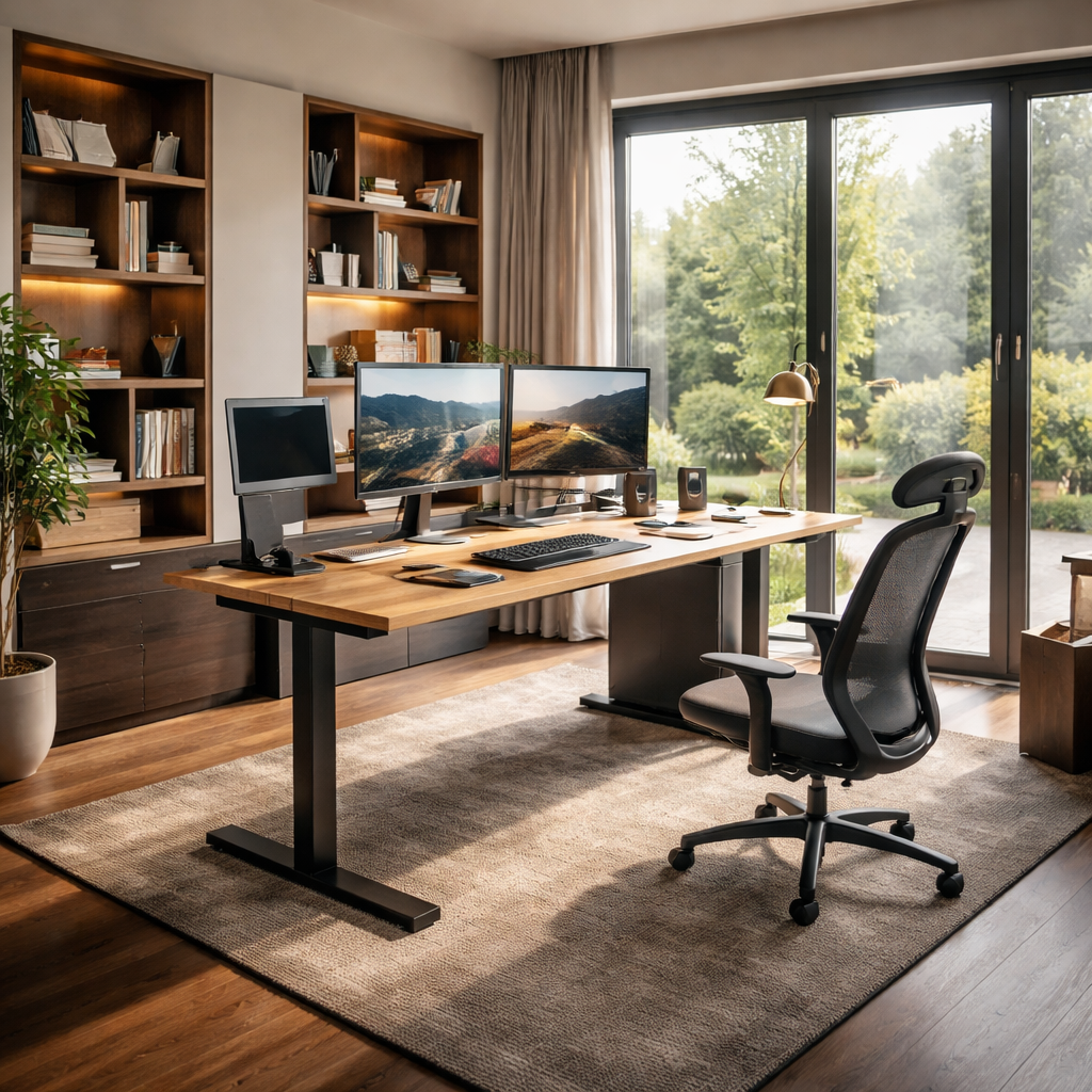
Step 2: Choose Modular Desk Systems
So you’ve mapped the zones, now it’s time to think about how the desk itself grows with you. Modular desk systems let you start small and expand as your workflow evolves, which is exactly what many homeowners in the UK want when they’re building a space that feels personal, not fussy.
In our experience at Harvey Bruce Interiors, the best setups start with a solid base—usually a robust desk with a good weight rating and a clean, cable‑friendly surface. Then you add components that fit your routines: a credenza for files, floating shelves for references, a pull‑out keyboard tray, or a laterals unit for document storage.
Start with a solid base
Choose a base desk that you’ll live with every day. Look for adjustable height if you want sit‑stand capability, and make sure the legs or frame offer real stability for a big monitor or two. A slim back edge and a generous surface on top help keep the room feeling open rather than crowded.
Think about the depth and the legroom you need. If you juggle papers and gadgets, you’ll thank yourself for extra knee space and a surface that doesn’t force you into awkward angles. The right base sets the tone for everything that comes after.
Add modular add‑ons that fit your workflow
A wall‑mounted monitor arm can save precious desk real estate, while a hidden cable channel keeps clutter out of sight. A slim filing cabinet or a mobile pedestal can slot under the desk without pinching legroom. When choosing finishes, aim for tones that harmonise with your floor and wall colours so the system reads as a cohesive unit.
Consider how you move through the day. If you need a dedicated space for drawing or drafting, add a return section or a corner module. Modular pieces should click together without fighting you during assembly, and they should feel like they belong next to each other, not like a mismatched add‑on.
Plan for future flexibility
Think ahead about potential shifts in your routine. Maybe you’ll add a second monitor, incorporate a printer station, or swap in a larger credenza later. Modular systems shine when they adapt, so map out at least two future scenarios and verify that the modules you’re eyeing can handle them.
In our practice, we’ve seen families in Edinburgh and beyond start with a core desk and a couple of thoughtfully chosen modules, then grow into a fully customized workspace without replacing the whole setup. That’s the beauty of modular design: it respects your living space while expanding with your life.
Delivery, assembly, and practical checks
Before you order, confirm delivery paths and access in your home. Measure doorways and stairwells, and ask about packaging protection for delicate finishes. A quick snag list helps you avoid surprises on delivery day.
Now, the practical checklist you’ll actually use: weight capacity for monitors and printers; secure interlocking for seamless alignment; finish swatches to compare under natural light; built‑in cable management options to keep wires tidy; and a clear plan for how the modules will sit in your room.
If you’d like a quick visual on how these pieces come together, watch this short guide. Watch this quick visual guide for a flavour of how modular components can fit around a single workstation.
Step 3: Select Adjustable Seating and Storage
Picture this: you’ve just settled into your new modular desk, but after a half‑hour the back‑ache you felt yesterday is creeping back. It’s a tiny reminder that a great desk is only half the story – the chair you sit on and the way you stash your stuff matter just as much.
So, how do you pick pieces that flex with your day and keep the space feeling sleek?
Adjustable Seating
In a home office, the chair is the workhorse you spend the most time with. An adjustable office chair guide points out that the sweet spot is a chair that lets you fine‑tune height, lumbar support, armrest width and tilt. When the seat height lines up with your elbows at a 90‑degree angle, your shoulders stay relaxed and you avoid that dreaded neck strain.
Look for a pneumatic lever that moves the seat between roughly 16‑21 inches – that range comfortably covers most UK heights, from a petite student to a taller designer. If you share the desk with a partner, a model with 4‑D armrests (height, width, depth, angle) lets each of you dial in your own comfort without fighting for space.
Breathable mesh or perforated fabric keeps you cool during a summer Zoom call, while a leather‑trimed option adds a touch of luxury for those evening brainstorming sessions. And don’t forget the base: a five‑point, swivel‑ready chassis with smooth‑rolling casters means you can glide to a printer or a filing cabinet without twisting your spine.
Smart Storage Solutions
Now that your seat is sorted, think about where everything lives. Modular drawer units that slide under the desk are a godsend for notebooks, styluses and that stack of client proposals you don’t want to see on the surface. Choose a system with adjustable depth so you can shrink the drawers for shallow items or expand them for larger folders.
For larger items – think a printer, external SSDs or a small filing cabinet – a mobile pedestal on lockable wheels offers the flexibility to move the unit when you need a clear floor path for yoga or a pet’s nap spot. If floor space is at a premium, consider wall‑mounted floating shelves with integrated cable channels. They keep cords tidy and free up the desk surface for creative work.
One trick we see homeowners love is a dual‑purpose credenza that doubles as a display case for decorative pieces. The lower cabinets hide the clutter, while the upper glass doors let you showcase a favourite plant or a few art books, keeping the room feeling personal and not purely utilitarian.
Putting It Together
Here’s a quick way to visualise the combo: sit at your desk, adjust the chair until your feet rest flat and your thighs are parallel to the floor, then pull a drawer out. Does the chair stay stable? Does the drawer glide without scraping the floor? If anything feels off, tweak the chair height or swap the drawer for a slimmer profile before you lock in the purchase.
Finally, create a short “test day” checklist. Spend an hour working, then stand up, stretch and note any pressure points. Jot down whether you had to reach over a cluttered cabinet or if the chair’s tilt felt natural when you leaned back. Those tiny observations will save you from a costly mis‑match later.
| Feature | Adjustable Option | Quick Tip |
|---|---|---|
| Seating Comfort | Height‑adjustable chair with 4‑D armrests and lumbar dial | Set seat height so elbows rest at 90°, then fine‑tune lumbar to fill the natural curve of your spine. |
| Storage Flexibility | Under‑desk modular drawer unit with adjustable depth | Start with shallow drawers for stationery, add deeper ones only if you need to store larger folders. |
| Combined Functionality | Sit‑stand desk with built‑in cable tray and side credenza | Use the credenza for items you need daily; keep the cable tray sealed to avoid a spaghetti mess. |
By matching an ergonomic, adjustable chair with storage that grows alongside your workflow, you create a home office that feels custom‑made for you – exactly the promise of customizable home office furniture.
Step 4: Add Personal Touches with Bespoke Accessories
You’ve curated a base that fits your space and your work. Now let’s make it truly yours. Personal touches aren’t fluff—they’re the heartbeat of a home office that feels like you. And yes, they can be functional, too.
Think about what tells your story when you sit down to work. A favourite mug that doubles as a pen holder. A small display shelf with travel finds or family heirlooms. Subtle textures like a leather desk pad or a woven desk runner that softens the room while guiding your hands to the right spots. The goal isn’t clutter but a curated backdrop that sparks focus.
So, what should you do next? Let’s walk through practical, real‑world moves you can implement this weekend.
1) Audit your daily rituals and define a mood
Spend 10 minutes jotting the moments you actually use your desk. Do you jot quick notes between calls? Do you need a quiet corner for reviewing photos or sketches? From there, pick 2–3 accents that reinforce those moods—calm, energised, or elegantly minimal. A well‑chosen palette of colour, texture, and finish makes your pieces feel intentional, not accidental.
2) Lock in a cohesive material palette
Choose two to three textures that will recur across accessories. For example, combine warm timber with brass hardware and a charcoal cloth or leather accent. This keeps the space visually coherent as you add pieces—from a bespoke lamp to a handcrafted pen pot—without looking like a showroom of mismatched knick‑knacks.
3) Introduce bespoke accessories that blend beauty and function
Invest in items that serve a purpose and tell your story. A leather desk pad protects your surface and ages beautifully. A handmade ceramic pen pot keeps styling tidy while giving you a tactile delight when you reach for a tool. A brass cable clip or a slim leather cable wrap hides wires in plain sight. And a small, elegant plant or a textile coaster can soften the hard lines of a modular desk system.
In our experience, homeowners who mix a couple of premium, handmade pieces with practical storage see an immediate uplift—not just in how the room looks, but how it feels to work there. If you’re sourcing, look for pieces that use sustainable materials and timeless forms—quality that lasts beyond trends.
4) Use lighting and showcases to highlight personality
A warm task lamp with a dimmer, a wall frame displaying a favourite print, or a glass‑front cabinet with a few heirloom objects can become design anchors. The key is restraint: don’t crowd the desk; let these pieces breathe and catch the light.
Harvey Bruce Interiors often emphasises that sustainable, thoughtfully chosen accessories elevate a space while aligning with a broader commitment to responsible sourcing. Platforms like ours make it easier to source exclusive, bespoke items that fit your room and values—without compromising style.
5) Plan for growth, not just décor
Leave space for one or two future accents—maybe a rotating display for seasonal finds or a modular shelf that can slide into a different configuration later. The furniture should adapt as your work evolves, not lock you into a single look.
Wouldn’t it be nice to walk into a home office that feels instantly “you”? With a few personal touches, that’s exactly what you get—a space that supports focus, sparks joy, and still looks impeccably polished.
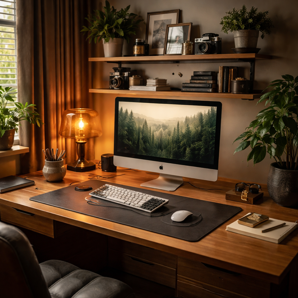
Step 5: Optimize Ergonomics and Tech Integration
Let’s get practical about making your customizable home office furniture work as hard as you do. Ergonomics aren’t a luxury; they’re daily productivity, clearer thinking, and less post-work ache. You bring the laptop, we bring the setup that supports it.
Start with the basics: a desk that fits your body and a chair that moves with you. If you’re using a modular system, pick pieces that feel integrated rather than tacked on. Your goal: a space that adapts to how you work, not the other way around.
Choose a solid base you won’t outgrow
Look for a base desk with enough depth to stage a monitor, keyboard, and a notebook without crowding. Knee clearance matters—aim for at least 60-65 cm of legroom. Pair it with a height-adjustable chair that offers lumbar support and a comfortable seat depth. An adjustable footrest can help with long days too.
Align your eyes, wrists, and back
Position your monitor so the top of the screen is at or slightly below your eye line. Your elbows should rest at about 90 degrees with forearms parallel to the floor. If your desk is deep, a slim keyboard tray can keep wrists neutral and reduce shoulder tension. Does this setup allow you to sit upright without leaning forward?
Make tech disappear with smart, flexible solutions
Choose monitor arms that tilt and rotate, so you can switch from code to video calls without hunching. A docking station or USB-C hub keeps cables under control. Wireless peripherals reduce clutter, and a charging tray keeps phones handy but out of the way. In our experience, these moves keep the surface calm and inviting.
Cable management that actually works
Plan for discreet pathways: cable raceways, under-desk trays, and grommets. Group related cables and label them so you can pull the right one quickly. If you’re using modular pieces, make sure there’s a shared channel where wires can pass between modules without tangling.
Lighting and glare control
Good lighting matters as much as good furniture. Use a task lamp with adjustable brightness and color temperature. Position lighting to avoid screen glare, especially if you face a window. A soft, warm glow in the background makes Zoom calls feel more natural.
Future-proof with flexibility
Leave space for growth—perhaps a second monitor, a printer station, or a slim credenza. Modular components should interlock cleanly so you can rearrange as your workflow shifts. In practice, this is the easiest way to stay current without starting from scratch.
Day-one checklist you can actually use
Measure height and depth options, confirm weight ratings, and check for built-in cable management. Test a quick 60-minute work session and adjust chair height, monitor tilt, and keyboard position. If something feels off, tweak before you buy and you’ll save time and money later.
Conclusion
So there you have it – a home office that bends to the way you work, not the other way around.
When you start with a solid, adjustable desk, pair it with a chair that moves with you, and sprinkle in modular storage, the whole room feels alive. You’ll notice the difference the moment you sit down and the cables stay hidden, the light hits just right, and you can stretch without bumping into a clunky table.
Remember the little checklist we built together: measure, map zones, test height, label wires. If any step feels off, tweak it now – it’s far easier than rearranging after you’ve bought the whole set.
What’s next?
Take a few minutes this week to walk the space, visualise a typical workday, and note where you still feel cramped or uninspired. Then head to Harvey Bruce Interiors’s online showroom and explore the range of customizable home office furniture that matches your style and sustainability values.
In the end, a well‑designed office does more than look good; it boosts focus, eases fatigue, and makes you actually enjoy the time you spend at your desk. Ready to make that shift? Your perfect workspace is only a few thoughtful adjustments away.
FAQ
What makes furniture truly customizable for a home office?
It’s all about pieces that you can tweak without buying a whole new set. Think adjustable‑height desks, interchangeable drawer modules, or panels that swap finishes. When each element snaps together, you can change the layout as your workflow evolves – whether you need extra surface for a dual‑monitor setup or want to hide a printer later on. The key is flexibility without sacrificing style.
How do I choose the right size desk when my room is small?
Start by measuring the clear floor space you need for a chair to move freely – at least 60 cm of legroom is ideal. Then look for a desk with a shallow depth (around 70 cm) but enough surface to hold a laptop, a notebook, and a lamp. Modular desks let you add a narrow side console only when you need it, so you’re not forced into a bulky piece.
Can I keep my existing chair and still get a fully customizable setup?
Absolutely. A good modular system works with any ergonomic chair, as long as the desk height can be adjusted to match your seat. If your chair sits at 44 cm, set the desk so your elbows are roughly 90 degrees. You’ll notice less strain and the desk will still accommodate future add‑ons like a pull‑out keyboard tray.
What materials are best for a sustainable home office?
Look for responsibly sourced wood, reclaimed timber, or FSC‑certified plywood. These give you a warm aesthetic while keeping the carbon footprint low. Pair them with metal hardware that’s recyclable and finishes that avoid volatile organic compounds. At Harvey Bruce Interiors we source pieces that balance durability, style, and environmental stewardship, so you get a lasting workspace you can feel good about.
How can I hide cables without buying a specialised kit?
Simple tricks go a long way. Route power strips to the back of the desk and tuck cords through a drilled grommet or a built‑in cable channel if the desk offers one. If not, adhesive clips can guide wires along the underside of the tabletop. Group chargers together and label each bundle – it makes future moves painless and keeps the surface looking sleek.
Is it worth investing in a sit‑stand desk now, or should I wait?
If you spend more than a couple of hours at your desk each day, a sit‑stand desk can boost circulation and reduce back fatigue. Even a modest height range (70‑110 cm) lets you alternate positions without a full‑body workout. Because many modular desks have interchangeable legs, you can start with a standard height and upgrade later, spreading the cost over time.
What’s the best way to future‑proof my home office layout?
Design with “add‑on zones” in mind. Leave at least 10 cm of clearance along one wall for a future wall‑mounted monitor arm or shelving unit. Choose modular drawer blocks that slide under the desk so you can swap shallow trays for deeper ones as paperwork grows. And keep an eye on cable pathways – a single conduit can serve multiple devices for years to come.
Additional Resources
Feeling a bit stuck after all that planning? You’re not alone – most homeowners hit a snag when they try to turn ideas into a real, customizable home office furniture layout.
We’ve pulled together a handful of go‑to resources that can turn that “meh” feeling into confidence. Our own blog series on modular desk systems walks you through each module, from core frames to hidden cable trays, with photos that show the finished look in a cosy UK townhouse.
If you prefer something tactile, swing by the Harvey Bruce showroom in West Lothian. A quick chat with one of our design consultants can uncover hidden storage ideas you hadn’t considered, and you’ll get a feel for the wood grain and finish options that keep your space sustainable and stylish.
Grab the printable checklist we’ve made for you – it maps out measurements, ergonomic tweaks, and a simple budgeting grid so you never miss a step.
Lastly, keep an eye on our quarterly trend report. It highlights emerging materials, like reclaimed oak and low‑VOC finishes, that blend durability with a low carbon footprint – perfect for any future‑proof home office.
With these resources at your fingertips, you’ll be ready to fine‑tune every detail of your customizable home office furniture setup.
Read more
Stylish Decorative Trays for Coffee Table: Elevate Your Living Space
Posted by Harvey Bruce on
Read more
How to Choose Rug Size for Living Room: A Simple Step-by-Step Guide
Posted by Harvey Bruce on
Picture this: you’ve just moved into a new living room, the paint is still fresh, the sofa is already in place, and you’re staring at an empty floor wondering what size rug will tie everything together.
It’s a moment most of us have been through – the excitement of a blank canvas mixed with the anxiety of making the wrong choice. A rug that’s too small looks like a stray carpet, while one that’s too big can overwhelm the room and hide the furniture you worked hard to pick.
Here’s what I mean: the right rug should anchor your seating area, define the space, and still let the flooring peek through for visual interest. In our experience at Harvey Bruce Interiors, we’ve helped countless homeowners find that sweet spot by measuring, visualising, and testing.
Step 1: Measure the layout of your main furniture group. For a typical three‑piece sofa set, aim for a rug that extends at least 45 cm (18 in) beyond the front legs of each piece. This creates a balanced border and keeps the eye from drifting off the rug.
Step 2: Consider the shape of the room. In a rectangular space, a rectangular rug works best; in a more open or irregular room, a large round rug can soften the angles and add flow.
Step 3: Sketch a simple floor plan on paper or use a free online room‑planner. Place the rug shape and dimensions over your furniture layout – you’ll instantly see whether the proportions feel right or if the rug eats up too much floor.
Real‑world example: a couple in Edinburgh bought a 200 cm × 300 cm rug for their long, narrow living room. By following the 45 cm rule, the rug covered the entire seating zone without crushing the walkways, and the room felt cozier rather than cramped.
Another tip: if you love a bold colour or pattern but fear it might dominate, start with a smaller runner under the coffee table and expand to a full‑size rug once you’re comfortable with the visual weight.
Don’t forget to factor in traffic flow. Leave at least 60 cm of clear floor between the rug edge and any doorways or high‑traffic paths to prevent tripping hazards.
And finally, when you’re ready to shop, our curated collection makes it easy to filter by size, shape, and material – from plush wool to natural jute – ensuring you pick something that fits both your measurements and your style.
Need a quick visual guide? Check out How to Choose Rug Color for Living Room: A Practical Design Guide for colour‑pairing tips that complement the size decisions you’re making now.
TL;DR
If you’ve been wrestling with how to choose rug size for living room spaces, remember the 45 cm rule, keep traffic flow clear, and let the rug anchor your furniture for a balanced, cosy feel.
In practice, measure your sofa group, add a generous border, and visualise the layout before buying, our curated collection makes finding the perfect piece quick and stress‑free.
Step 1: Measure Your Living Room Layout
Alright, let’s roll up our sleeves. Before you fall in love with a gorgeous rug, you need to know exactly how much floor you’ve got to work with. It sounds simple, but trust me – the right numbers make the difference between a room that feels curated and one that feels cramped.
First thing’s first: grab a steel tape measure, a notepad, and maybe a friend who won’t judge you for double‑checking every line. Start at the centre of your main seating cluster – usually the sofa and the armchairs that hug it. Measure the distance from the back of the sofa to the far‑most chair, and then from the left edge of the sofa to the right edge of the furthest piece. Write those numbers down; they’re your baseline layout dimensions.
Now, here’s where the 45 cm (18‑inch) rule comes in. Imagine you’re laying a carpet that extends at least 45 cm beyond the front legs of each piece of furniture. Why? That border gives the eye a visual pause, keeps the space from feeling “floating” and makes the rug look intentional rather than an afterthought.
Take your sofa’s front‑leg width – say it’s 1.2 m from wall to leg. Add 0.45 m on each side, and you’ve got a minimum rug width of about 2.1 m. Do the same for the depth, and you’ll quickly see whether a standard 2 × 3 m rug will do the job or if you need something a touch larger.
So, does that math feel a bit overwhelming? Not at all. Grab a piece of masking tape and lay it on the floor where you think the rug’s edges will sit. Step back and look at the rectangle you’ve created. Does it leave enough breathing room for traffic pathways? A good rule of thumb is to keep at least 60 cm (24 in) of clear floor between the rug edge and any doorways or high‑traffic routes.
Got a narrow living room? Measure the length first, then the width, but keep the rug’s shape in mind. A long, rectangular rug can accentuate the length, while a round rug can soften a tight‑corner feel. If you’re unsure, sketch a quick floor plan on graph paper – each square can represent 10 cm. Plot your furniture, then draw the rug outline using the measurements you just recorded. The visual will instantly tell you if the rug is dominating the space or slipping into the background.
And if you’re a tech‑savvy homeowner, pop open a free online room‑planner. Drag in a rug shape, type in the dimensions, and watch it sit among your sofa, coffee table, and side chairs. It’s a painless way to avoid buying a rug that’s either a “tiny rug” or a “giant carpet” in one go.
Here’s a quick checklist you can print out:
- Measure the width and depth of your main furniture group.
- Add 45 cm to each side for a balanced border.
- Confirm a minimum 60 cm clearance for traffic flow.
- Sketch or use a digital planner to visualise.
- Double‑check the shape matches your room’s geometry.
Once you’ve ticked those boxes, you’ll have a crystal‑clear idea of the exact rug size you need. No more guessing, no more returns, just a rug that feels like it was made for your space.
Take a moment now to grab that tape, map your room, and you’ll be one step closer to a living area that feels both luxurious and lived‑in – exactly the vibe Harvey Bruce Interiors loves to help you create.
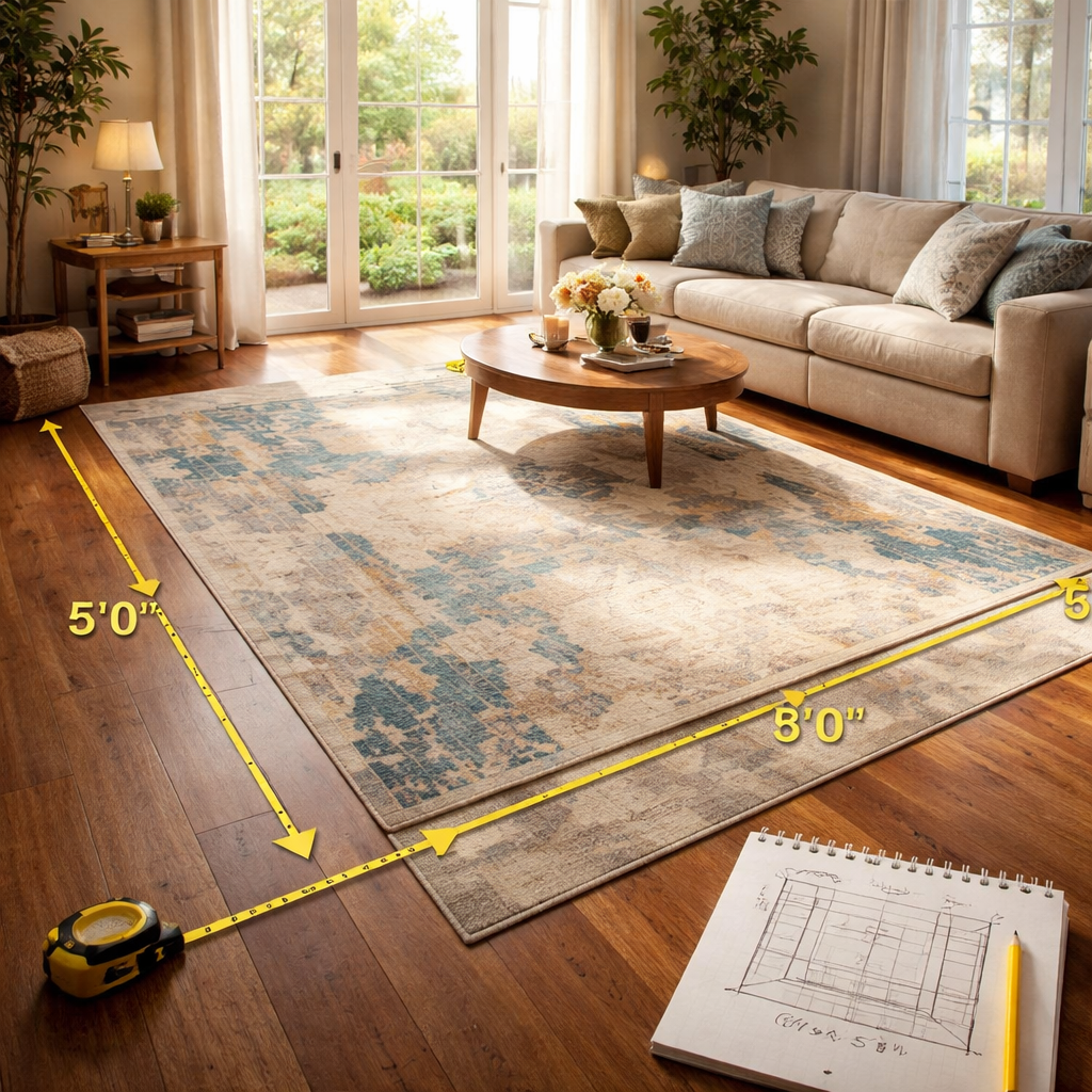
Step 2: Determine Furniture Arrangement
Let's get practical about how your sofa, chairs, and coffee table live together. The way you arrange them is the difference between a room that feels cohesive and one that looks like a showroom in a hurry.
In our experience at Harvey Bruce Interiors, the goal isn’t perfection; it’s comfort and flow. You want people to move, chat, and put their feet up without bumping into corners. So let’s break it down, room by room.
First, map the footprint of your main seating group. For a typical three‑seat sofa plus two chairs and a coffee table, aim to have the front legs of all seating pieces resting on the rug. Extend the rug about 45 cm (18 inches) beyond the fronts of the furniture to create a grounded border. This helps the eye anchor the space without the rug feeling like an afterthought.
Why this matters? A well‑placed rug visually connects textiles, lighting, and architectural features. It also protects high‑traffic paths from becoming tripping hazards. If the room is long and narrow, think about elongating the rug to emphasize the seating line. In an open plan, a larger or rounded rug can soften transitions between zones while still keeping the furniture feel cohesive.
Now, test the proportions before you buy. Outline the footprint with painter’s tape or use masking tape on the floor. Walk the space, check how light plays on the rug, and ensure there’s room to cross from one side to the other without stepping off the border. This little test is a designer’s secret for avoiding buyer’s remorse.
Speed round tips: keep traffic clear. Leave at least 60 cm of free floor between the rug edge and doorways or major walk paths. If you’re unsure about scale, start with a runner under the coffee table and grow to a larger rug once you’re confident in the balance. Our curated Harvey Bruce collection makes it easier to filter by size and shape, ensuring a seamless fit with your luxury aesthetic and sustainability goals.
Here’s a quick decision guide to help you compare options at a glance.
| Feature | Option / Guidance | Notes |
|---|---|---|
| Rug shape for room | Rectangular room → rectangular rug; open plan or irregular → large round or oversized rectangle | Shapes guide flow and soften angles |
| Front legs on rug | Ensure front legs rest on rug; extend about 45 cm (18 in) beyond fronts | Creates a grounded border and visual anchor |
| Traffic clearance | Maintain clear paths; 60 cm of free floor between rug edge and doors/paths | Prevents tripping and keeps pathways comfortable |
| Test method | Painter’s tape footprint on the floor | Helps you preview scale and movement before buying |
If you’re starting from scratch, step two anchors the seating, guides traffic, and lets the rug set the mood. Think of it as laying a stage for everyday living, inviting conversation and easy movement. Harvey Bruce Interiors can help you visualize layouts with your measurements, focusing on sustainable luxury.
If you’re unsure, book a quick design chat with us. We'll tailor the layout to your space.
Step 3: Choose Rug Shape and Size Proportions
So you’ve mapped the basics and now you’re wondering how to choose rug size for living room in a way that feels effortless. In our experience at Harvey Bruce Interiors, the rug’s shape should play with the room’s geometry, not fight it. The right shape invites flow and conversation, and that matters more than a perfect number on a page.
First, look at the room as a whole. Does your space read as rectangular, square, or open‑plan with irregular angles? Rectangular rooms typically pair best with rectangular rugs that mirror the floor boundaries. Open plans or irregular layouts can benefit from a large round rug or an oversized rectangle to soften edges and guide traffic. Does this really work for your space? Yes—when the rug aligns with the seating zone, the eye glides and the floor texture remains visible for depth.
Now think about the seating footprint. If you want a cohesive anchor, you’ll want front legs (or at least the front of each seating piece) resting on the rug. A common guideline is to extend the rug about 45 cm (18 in) beyond the fronts of the furniture. That generous border grounds the arrangement and prevents the rug from feeling like an afterthought.
Proportion, not perfection
Next, consider how the rug relates to doorways and walk paths. Keep a comfortable clearance—generally around 60 cm (24 in) if possible—between the rug edge and doors or main traffic routes. This keeps paths open and reduces tripping hazards. If your room is long, a narrower runner under a sofa or coffee table can help define the area while leaving visible floor for interest.
Testing helps more than guessing. Outline the footprint with painter’s tape, then walk the space to feel the movement and light on the rug. This simple test can save returns and buyer’s remorse—something we see all the time when people skip that step. For a practical, designer‑tested approach to rug size before buying, check out this designer trick: selecting the right rug.
Remember, the goal is harmony. In a rectangular room, mirror the shape with a rectangle rug. In open spaces, a large round rug can soften transitions between zones. We’ve found that matching the rug to the seating layout creates hospitality: people sit, feet rest, and conversation flows naturally.
Harvey Bruce Interiors can help you visualise layouts with your measurements, focusing on sustainable luxury. If you’re unsure, book a quick design chat with us. We’ll tailor the layout to your space and point you toward options in our curated rug collection that balance elegance with practicality.
For more designer tips on rug sizing and to see how others test the size before committing, you can explore designer tricks like selecting the right rug from this trusted resource: Designer tricks: selecting the right rug.
Step 4: Consider Room Function and Traffic Flow
Step 4 invites you to look beyond size and shape and ask how this rug will function in your daily life. You’re not just picking something pretty; you’re choosing a pathway, a seating anchor, a vibe. So let's make sure the rug supports real living.
First, define the main seating zone. If you’re entertaining, you want sofas and chairs to feel connected, not boxed in. The rug should pull those pieces into one conversation so guests lean in and relax.
Think about traffic patterns. Where will people walk most often? In busy living rooms, you want clear routes that don’t collide with foot traffic or doorways. A cluttered path kills momentum and makes spaces feel smaller. If your furniture is scaled for a larger family room, the rug should still feel cozy underfoot.
Rug shapes should play with your room’s geometry. Rectangular rooms usually respond best to rectangular rugs that mirror the floor plan. In open plans, a large round rug can soften transitions and invite people to move fluidly between zones. That choice also helps define seating without crowding windows.
Placement rules you can trust: front legs on the rug, or at least the fronts resting on the rug. Extend the rug roughly 45 cm (about 18 inches) beyond the fronts to create a generous border that grounds the seating.
Walkway clearance matters. Leave about 60 cm (24 inches) of free floor between the rug edge and doors or main traffic paths when possible. This keeps doors swinging freely and avoids a tripping hazard. This simple guideline makes daily living easier.
Testing before buying is timeless. Outline the footprint with painter’s tape, then live in the room for a day or two. Notice how light hits the rug, how conversations flow, and whether you need a bigger or smaller base. That simple test saves hundreds in returns.
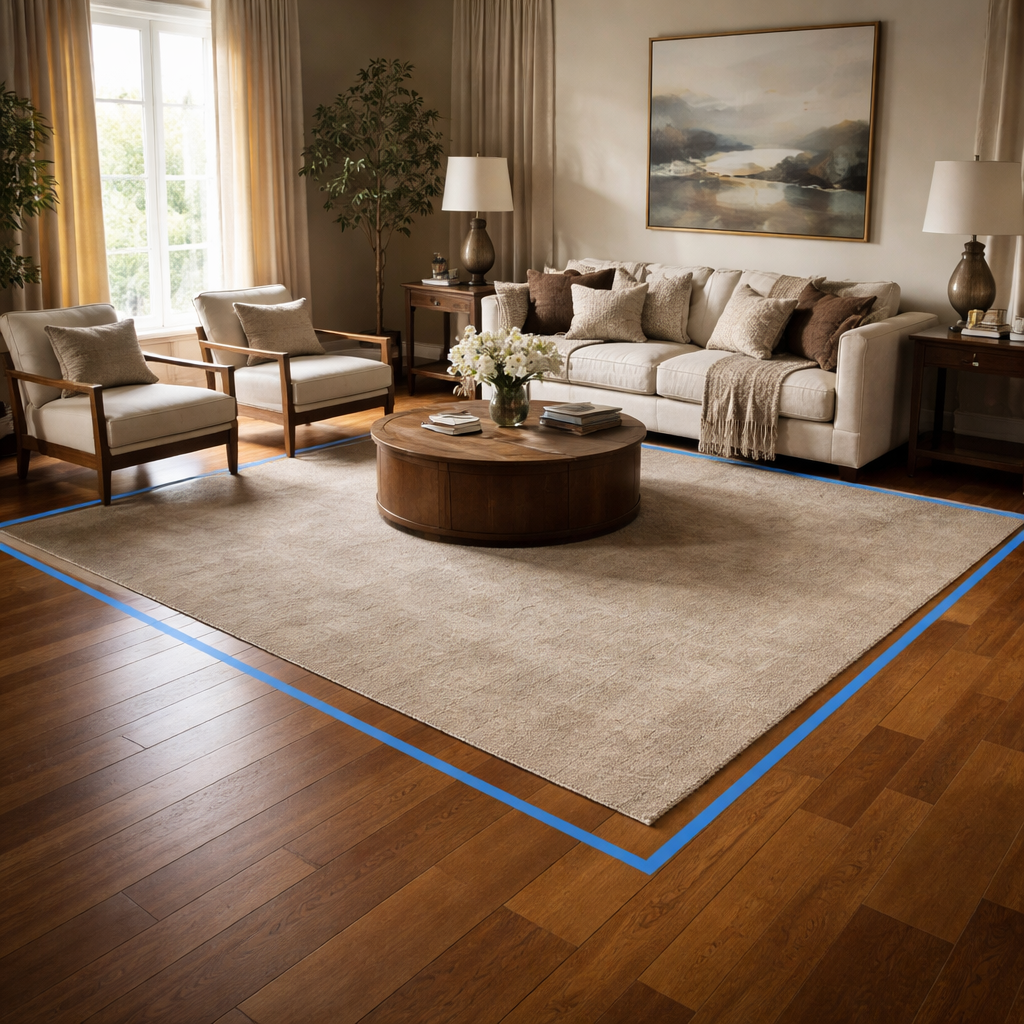
If your room is long and narrow, a runner under the coffee table or a slim strip along the sofa can define space without shrinking light. In square rooms, try a square rug that sits under the seating for symmetry.
Texture and color matter for wear and mood. Dark, low-pile options hide scuffs and footprints in high-traffic areas, while lighter tones can brighten the space if you have good natural light.
At Harvey Bruce Interiors, we curate rugs with durability and sustainability in mind, so you don’t have to sacrifice style for practicality. We’ll help you pair the rug with furniture, lighting, and your finishes for a cohesive look.
If you’re unsure, book a quick design chat with us. We’ll tailor the layout to your space and point you toward options in our curated rug collection that balance elegance with practicality.
For further grounding, the science of rug size reminds us to respect room dimensions and traffic flow; anchor zones, not overwhelm them. Read more here to see the principles in action: the science behind choosing the right rug size for your living room.
Step 5: Finalize Your Choice with Style and Budget
Let me be honest: finalizing a rug isn’t about chasing the perfect single number. It’s about balancing feel, function and what you’re comfortable investing in. The rug you land on should anchor your room without dictating every other purchase.
In our experience at Harvey Bruce Interiors, style and budget aren’t rivals. They’re partners. When you know what you truly want to spend, you’ll see the options more clearly and you won’t end up with buyer’s remorse.
Know your budget before you shop
First, set a realistic ceiling. For luxurious wool or handwoven pieces, expect to allocate more; for durable synthetic or natural-fiber options, you can get great looks at a lower price point. The key is to understand how much wear you need and how long you want the rug to last.
Ask yourself: will this rug anchor a high-traffic family zone or a quiet reading corner? If it's the former, invest a bit more in density and stain resistance. If it's the latter, you can lean toward mid‑range materials with elegant texture.
Match materials to lifestyle and aesthetics
Wool, wool blends, jute, and viscose each bring different personalities and costs. Wool feels plush and durable but can be pricier. Jute brings natural texture and budget-friendly warmth. If you’re decorating for longevity, consider a mid‑weight wool blend that’s easy to clean and resists flattening under chairs.
Size and placement as part of style budgeting
Remember the 45 cm rule? It still matters, because how the legs rest on the rug changes perceived value. A larger rug that all seating legs rest on can transform a room, but it costs more. You’ll often get more visual impact per pound by choosing one well‑considered oversized piece over two smaller rugs.
Maintenance, warranties and returns
Factor care requirements into your budget. Some materials clean up with a quick blot; others need professional cleaning every so often. Check return windows and warranties—Harvey Bruce Interiors prioritises peace of mind with transparent terms so you never feel trapped after a purchase.
Actionable plan to move forward
1) Pick a target budget band (low, mid, high) and write it down. 2) Narrow to two or three materials that fit that band and suit your style. 3) Visualise with painter’s tape footprints on the floor to confirm scale. 4) Compare closing options side by side with your lighting and finishes in mind. 5) Book a quick design chat if you want our curated rug collection help—our team can match options to your room’s personality and practical needs.
So, what should you do next? Start with your living room’s vibe, then let budget guide the tone. The right rug is an investment in comfort and mood—and with our curated range, it’s easier to land something that feels custom without breaking the bank.
Real-world example: a couple in a mid-size living room chose a mid-range wool blend rug and layered a smaller textured runner for warmth and practicality. It anchored the seating, echoed warm woods, and left enough light to showcase art. They saved by selecting a durable option that wears well with kids and pets.
Expert tip: if a swatch program is available, request fabric and color samples to see texture and undertone in your space before committing. It cuts down on returns and helps you feel confident about the final choice.
Harvey Bruce Interiors is here to help you transform your space with sustainable luxury. Our buyers source exclusive and bespoke rugs that balance elegance with durability, so you don’t have to compromise between style and practicality. If you’d like a tailored shortlist, book a design chat and we’ll bring options that fit your space, lifestyle, and wallet.
Conclusion
We've walked through measuring, arranging, shaping and budgeting, so now you know exactly how to choose rug size for living room spaces without the guesswork.
Remember the 45 cm border rule – it keeps the seating anchored and the room feeling generous. If you leave about 60 cm of clear floor for traffic, you avoid tripping and keep the flow natural.
Testing with painter's tape is still the easiest cheat: lay the footprint, walk around, and watch how light plays on the surface. That simple step saves you from costly returns.
For couples juggling style and kids, a durable mid‑range wool blend often hits the sweet spot: plush enough for comfort, tough enough for spills.
And if you’re still unsure, a quick design chat with Harvey Bruce Interiors can narrow the options to pieces that match your vibe, budget and sustainability goals.
So, what’s the next move? Grab your tape measure, sketch the rug outline, compare a couple of sizes, and trust the visual cue you create in your own floor plan. Your perfect rug is just a few inches away.
Take the confidence you’ve built here and let your living room tell a story of comfort and style. A well‑chosen rug becomes the quiet hero of everyday moments, inviting friends to linger and families to gather.
FAQ
What’s the first thing I should measure when I’m trying to figure out how to choose rug size for living room?
Start with the footprint of your main seating group – sofa, chairs and coffee table. Measure the length and width of that arrangement, then add roughly 45 cm (18 in) on each side so the front legs sit comfortably on the rug. That border creates a visual frame and keeps traffic flowing. In our experience at Harvey Bruce Interiors, that quick sketch saves you from buying a rug that feels too small or swallows the room.
How do I test a rug’s size before I actually buy it?
Grab some painter’s tape and lay it on the floor in the exact dimensions you calculated. Walk around, sit on the sofa, and notice whether you can still step off the edge without tripping. If the tape feels cramped, add a few centimetres; if there’s a huge gap, trim it back. This low‑cost mock‑up lets you visualise light, scale and movement, and it’s a trick we recommend to every client.
Which rug shape works best for a rectangular versus an open‑plan living room?
Rectangular rooms generally benefit from a rectangular rug – it mirrors the walls and elongates the space. In an open‑plan or irregular layout, a large round or oversized oval rug can soften hard lines and define a seating zone without cutting the flow. Think of the rug as a stage: match its shape to the room’s geometry, and you’ll guide eyes and footsteps naturally.
How can I keep traffic flow comfortable while still having a big rug?
Leave at least 60 cm (24 in) of clear floor between the rug edge and doorways or high‑traffic paths. That buffer prevents doors from catching on the rug and gives guests a clear route to move around. If you’re short on space, position the rug so the main seating sits fully on it, and let the remaining floor act as a natural corridor.
Is it okay to layer a runner under a coffee table before committing to a full‑size rug?
Absolutely. A runner lets you experiment with colour and pattern on a smaller scale. Once you’re happy with the feel, you can step up to a full‑size piece that extends the runner’s vibe. Many of our clients start with a runner, then upgrade to a larger rug once they’re confident the size and style work with the room’s rhythm.
Do material choices affect how a rug’s size feels in the room?
Yes. Light‑coloured, low‑pile fabrics make a rug appear larger because they reflect more light, while dark, plush fibres can shrink the visual footprint. If you love a bold pattern but worry it’ll dominate, choose a lighter background or a thinner weave. In our showroom we often pair a subtle jute base with a colourful border to keep the scale balanced.
How can I stay within budget while still getting the right rug size?
Set a price range first, then narrow materials to those that fit – wool blends for durability, synthetic fibres for cost‑effectiveness. Use the painter’s‑tape test to avoid overspending on a size that won’t work. Remember, a well‑chosen rug that anchors the room can look more expensive than a cheaper, mismatched piece, so focus on proportion over brand name.
Read more
Best Furniture Layout for Small Living Room: A Practical How‑To Guide
Posted by Harvey Bruce on
Picture this: you step into a cosy living room that feels surprisingly spacious, even though the floor plan is tighter than a city flat.
That moment of relief? It’s the magic of the best furniture layout for small living room – a blend of smart placement, sleek pieces and a pinch of personality.
We get it. As homeowners chasing a luxurious yet functional vibe, you often wrestle with too many items and not enough breathing room. You might be wondering, “How can I fit a sofa, a TV stand and still have room to move without it looking cramped?”
First, think about zones. Even in a modest space, you can create a subtle living zone and a relaxed reading nook by anchoring the larger piece – usually a sofa – against the longest wall. This frees up the centre for flow and makes the room feel grounded.
Second, choose furniture with built‑in storage. A contemporary modern media storage furniture unit, for example, hides cables and magazines while keeping the silhouette low and sleek. It’s a tidy solution that adds elegance without shouting for attention. At Harvey Bruce Interiors we source pieces that combine style and hidden storage, making the choice easy.
Third, embrace multi‑functional pieces. A stylish ottoman that doubles as a hidden chest, or a slim coffee table with a lift‑top, lets you keep the surface clear for drinks or a laptop without sacrificing style.
And don’t forget vertical space. Tall, narrow bookcases or wall‑mounted shelves draw the eye upward, creating the illusion of height. Pair them with a few well‑chosen accessories – a plush throw, a statement lamp – and you’ll see the room transform.
Finally, let natural light be your ally. Keep window treatments light and consider wooden plantation shutters for a touch of classic charm; they help regulate temperature, cut down on heating bills and look stunning in a refined setting.
So, what’s the next step? Start by sketching your floor plan, marking the focal wall, and then experiment with the pieces you already own before you add anything new. You’ll be amazed at how a few thoughtful moves can turn a cramped corner into the best furniture layout for small living room you’ve ever imagined.
TL;DR
If you want a stylish, spacious feel in a compact living room, focus on zoned layouts, sleek storage‑rich furniture, and vertical accents. Combine a low‑profile sofa, hidden‑storage media unit, and a multifunctional ottoman, then let natural light flow, and you’ll achieve the best furniture layout for your small living room.
Step 1: Assess Your Space
Before you even think about which couch to buy, grab a pencil and a blank sheet of paper. Sketch the room's outline, noting doors, windows and any built‑in features. It sounds simple, but that little drawing will become your secret weapon for the best furniture layout for small living room spaces.
Ask yourself: where does natural light pour in? Where do you want the eye to drift first when you step inside? Those zones become the backbone of your layout. If you love a bright, airy feel, you’ll want the main seating area opposite the biggest window, letting sunlight flood the space.
Next, measure everything – floor width, ceiling height, even the depth of the window sill. Write those numbers next to your sketch. It may feel a bit like a school project, but trust me, those measurements keep you from buying a sofa that ends up blocking the flow.
Now, think about the focal point. Is it a TV, a fireplace, or perhaps a striking piece of art? Whatever it is, anchor the largest piece of furniture – usually the sofa – to that wall. Our Stylish Home Interiors Sofa Collection offers compact, low‑profile options that sit nicely against a wall without overwhelming a modest floor plan.
Do you have a love‑it‑or‑leave‑it bookshelf, a media console, or a sideboard? Consider how each item fits into the flow you’ve just mapped. Tall, narrow storage units can double as vertical accents, drawing the eye upward and creating that illusion of extra height.
And here's a quick tip: leave at least 60‑cm of clear walking space in the centre of the room. That little breathing room makes the layout feel far larger than it actually is.
So, what about lighting? You might think a floor lamp is the easiest fix, but think bigger – a well‑placed decorative umbrella can temper harsh sunlight and add a cosy ambience. For a premium solution, check out Umbrello’s range of high‑quality outdoor umbrellas. They blend design and function, perfect for creating a soft‑lit corner even in a compact living area.
When you’ve plotted the main pieces, step back and visualise traffic patterns. Imagine yourself moving from the kitchen to the sofa, or reaching for a book on a shelf. Does the path feel natural? If not, shuffle the furniture in your sketch until the flow feels effortless.
Sometimes a piece of art can become the visual anchor you need. A striking wildlife print, for instance, can balance a minimalist sofa and add personality without taking up floor space. Explore ideas in contemporary wildlife art prints – they’re a great way to fill an empty wall and keep the room feeling curated.
Ready for a visual walk‑through? Below is a short video that shows how a simple floor‑plan tweak can transform a cramped room into a welcoming lounge.
Take a moment after the video to compare the before‑and‑after layout on your sketch. Does the new arrangement feel more open? If something still feels off, tweak the placement of one piece at a time – you’ll quickly see what works.
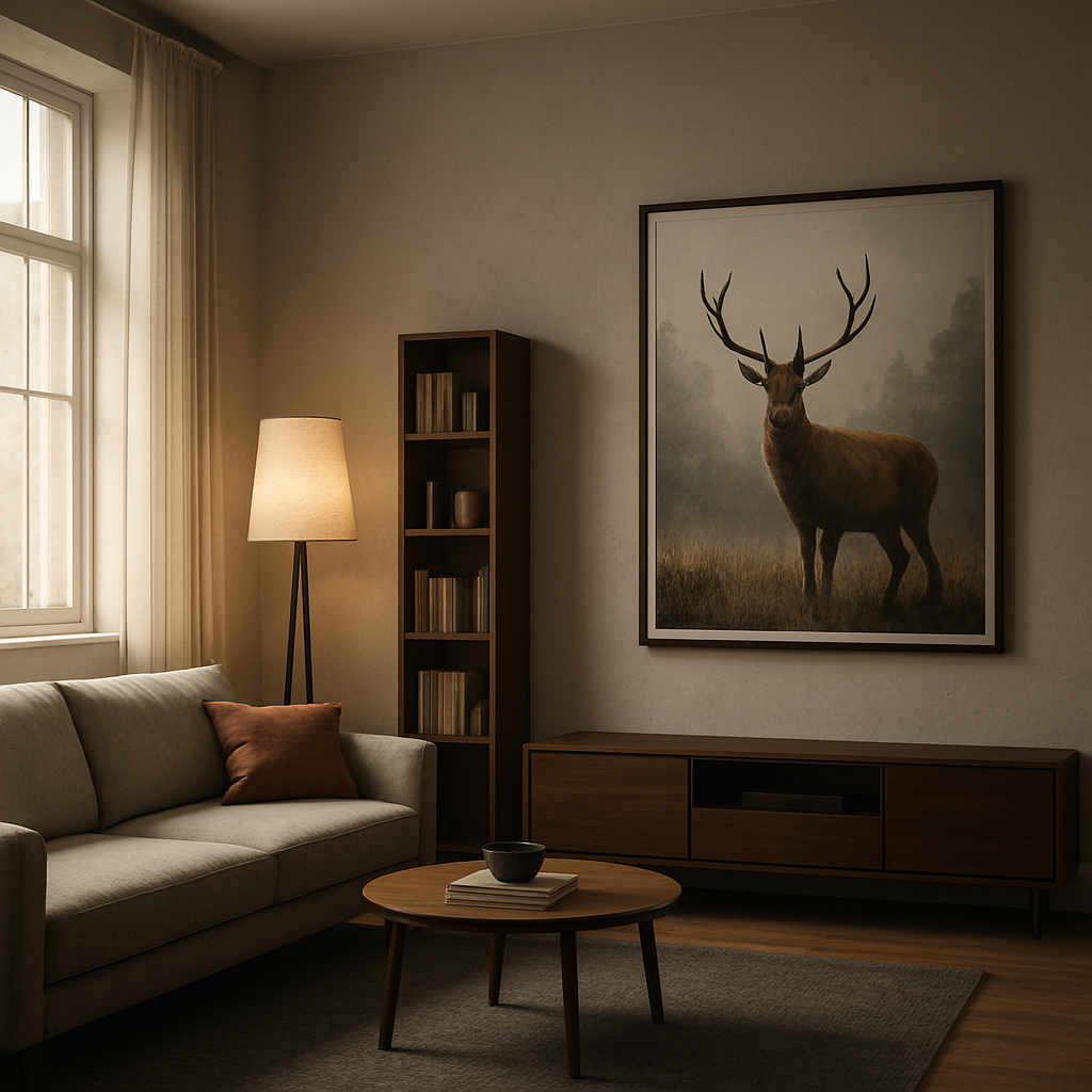
Finally, jot down any adjustments you made during this assessment. Those notes become your checklist when you start shopping – no more guesswork, just confident choices that fit your space like a glove.
Step 2: Choose the Right Furniture Pieces
Now that you’ve measured every wall and walked the traffic paths, the next question is: what actually belongs in that blueprint? The answer isn’t “fill every inch” – it’s “pick pieces that earn their square footage.”
Pick a scaled sofa that anchors without overwhelming
In a small living room the sofa is the room’s anchor, but it can also become a visual wall if you’re not careful. Look for a low‑profile, narrow‑depth design that sits comfortably against the longest wall while leaving at least 60 cm of breathing room on either side. A compact loveseat or a petite three‑seat sofa does the trick; it offers enough seating for two‑three people without swallowing the floor.
For inspiration, check out the range of small sofas on Italian Interiors’ small sofa collection. Their pieces blend sleek Italian styling with clever dimensions, so you get a statement seat that still feels airy.
And remember: a sofa with tapered wooden legs lifts the piece off the floor, creating an illusion of extra height – a subtle trick that makes the whole space feel larger.
Lean on multi‑functional media storage
TV stands, media consoles, and shelving units tend to dominate a room, but in a compact layout they should disappear into the background. Choose a media storage piece that’s shallow enough to sit close to the wall yet offers hidden compartments for cords, magazines, and remote controls. A low‑profile cabinet with sliding doors keeps the silhouette sleek and the clutter hidden.
If you love a clean line, a wall‑mounted media unit can free up floor space entirely. Just make sure the mount is secure and the unit spans no more than a third of the wall width so it doesn’t dominate the focal point.
Vertical storage & shelving – go up, not out
When floor area is at a premium, think vertical. Tall, narrow bookcases or floating shelves draw the eye upward, adding storage without eating precious square metres. A slim ladder shelf can hold books, decorative boxes, and even a few plants, creating a curated gallery wall.
Because you’re already using wall space for art, a staggered shelf layout can break up the visual mass and keep the room feeling balanced. Keep the top shelf no higher than 180 cm so you can reach items without a step stool.
Ottomans, nesting tables & flexible side pieces
Small rooms love pieces that wear many hats. An upholstered ottoman with hidden storage gives you a footrest, an extra seat, and a place to stash blankets – all in one compact block. Nesting side tables slide together when you need extra surface for drinks or a laptop, then tuck away to keep pathways clear.
Choose an ottoman with a removable lid; the extra compartment can become a mini‑library for magazines or a stash for board‑games when guests arrive.
Finish with textiles, lighting & personal touches
A light, neutral rug that’s slightly smaller than the seating area defines the space without cutting off the flow. Pair it with a slim floor lamp in a brushed metal finish – the lamp adds height and a warm pool of light without demanding a table surface.
Throw pillows in a pop of colour or a patterned throw can inject personality, but keep the quantity low; too many cushions can make the sofa look crowded. A single statement artwork on the opposite wall, as you already experimented with, balances the visual weight.
So, what’s the final checklist? Measure, choose a scaled sofa, pick shallow media storage, stack vertical shelves, add an ottoman with hidden space, and finish with purposeful textiles and lighting.
Give those pieces a quick “walk‑through test” now – imagine moving around them with a tray of coffee. If you can glide without bumping, you’ve nailed the best furniture layout for a small living room.
Step 3: Create a Functional Layout
Start with a conversation core
Picture the sofa and a couple of armchairs gathered around a low coffee table – that little island becomes the heart of the room. Instead of scattering pieces along the walls, pull them together so the flow moves around the conversation core, not through it. It feels cosy, but still roomy enough for a tray of tea or a laptop.
Ask yourself: does the layout let you walk from the front door to the kitchen without squeezing past a leg? If you need to sidestep a chair, you’ve probably placed too much furniture in the way.
Give the eye something to follow
When you look around, your gaze should glide from the TV or fireplace to the seating area, then up the wall to a tall shelf or artwork. This vertical‑horizontal rhythm tricks the brain into thinking the space is larger. A narrow ladder shelf on one side and a slim floor lamp on the other creates a subtle frame that guides traffic without blocking it.
We’ve seen this work wonders in tiny London flats – the eye travels up the ladder shelf, down the lamp, and lands on the sofa, keeping the room feeling balanced.
Choose furniture with visual lightness
Light‑coloured pieces or items with exposed legs appear less bulky than chunky, solid blocks. An armless chair with metal legs, for example, lets the floor stay visible and adds a sense of openness. A marble‑topped coffee table with a slim profile adds a touch of luxury without overwhelming the floor area.
Even a small ottoman can double as extra seating or hidden storage, but keep its silhouette slim. If you need a larger surface for guests, place a nesting side table next to it – pull it out when needed, tuck it away when you’re done.
Map traffic routes, then test them
Grab a piece of masking tape and mark the main pathways on your floor‑plan sketch: from the entry door, past the sofa, to the kitchen or bathroom. Aim for a minimum width of 75 cm (about 30 in) for each lane. Once you’ve arranged the furniture on paper, do a quick “walk‑through test” in the actual room. Imagine carrying a tray of coffee – can you glide past the coffee table without a wobble?
If something feels tight, slide the piece a few centimetres back or swap it for a more compact alternative. Small adjustments often free up more than you expect.
Layer functional zones without walls
In an open‑plan layout, the sofa itself can act as a visual divider between the living area and the dining nook. Position the back of the sofa facing away from the kitchen; this signals a subtle shift in purpose without erecting a wall. Add a narrow console or a slim side table at the junction to reinforce the boundary while still keeping the pathway clear.
For homeowners who love a reading corner, tuck a slim armchair and a floor lamp in the far corner of the layout. A tall bookcase behind the chair adds storage and draws the eye upward, echoing the vertical theme we mentioned earlier.
Bring in the experts
When you’re stuck on how to balance style and function, a quick look at proven small living room layout ideas can spark fresh configurations. The article highlights the power of a clear focal point and the benefit of arranging furniture in a centred cluster – exactly what we’re aiming for.
In our experience at Harvey Bruce Interiors, pairing a low‑profile sofa from our collection with a contemporary modern media storage unit (which sits flush against the wall) frees up precious floor space and keeps cables out of sight. The result is a sleek, functional layout that feels both luxurious and lived‑in.
So, what’s the final checklist? Sketch a conversation core, map clear traffic lanes of at least 75 cm, choose light‑looking pieces with legs, add vertical interest, and test the flow with a mental coffee‑tray run. Follow these steps and you’ll nail the best furniture layout for small living room – a space that feels spacious, stylish, and ready for everyday moments.
Step 4: Add Bespoke Homeware & Accessories
Now that the bones are in place, it’s time to layer in bespoke homeware and accessories that feel intentional, not cluttered. You want luxe touches that support living—not crowd it.
In our experience at Harvey Bruce Interiors, the right accessories do more than beautify. They anchor zones, cue light, and remind you why you chose the space in the first place. Choose pieces that are unique, sustainably sourced, and sized to complement your layout rather than overwhelm it.
Start by choosing a cohesive language: a mix of warm wood, softly marbled surfaces, and tactile fabrics. If you’re stacking textures, aim for three main textures—wood, linen, and ceramic—that repeat across cushions, vases, and a statement lamp.
Then select bespoke elements. A handcrafted vase, a one‑off sculpture, or an artisanal throw from our range can become a conversation starter. Because they’re bespoke, these pieces feel intentional and easy to swap out as seasons change or you update the room.
Let surfaces breathe. In small spaces, too many little objects scatter attention. Instead, pick a standout piece for the focal wall—perhaps a large, framed artwork or a sculptural lamp that creates a warm glow. The rest should support it rather than compete with it.
Layer textiles to add warmth without visual noise. A throw casually draped over the sofa, a couple of cushions in a limited palette, and a rug that defines the seating area can transform the vibe without overcrowding the space.
Practical decor matters too. Look for hidden storage opportunities that double as design features: a woven basket under a coffee table, a decorative box for remotes and chargers, or a slim storage trunk that doubles as extra seating when needed. These keepsakes feel personal and stay useful long after the first impression wears off.
Elevate vertical space with a tall plant or a sculptural light to draw eyes upward and widen the perception of the room. Plants not only bring life; they also soften hard edges and soften reflections on glass and metal surfaces.
Lighting is a design accessory in itself. A well‑placed floor lamp can sculpt corners, while a small table lamp on a console adds ambient warmth to evenings spent relaxing or working at home. When you plan lighting, think about how it interacts with art and textiles—the glow should flatter, not glare.
In short, curate with intention. Choose 2–3 hero pieces that define the room and sprinkle in supporting items that echo their tones and textures. This keeps the space cohesive, luxurious and comfortably liveable.
Does this really work in practice? Imagine a single sculptural vase on a narrow shelf, a throw tucked on the sofa with a couple of matching cushions, and a floor lamp that frames the seating area. It feels elevated, but still effortless enough for everyday life.
For inspiration, House Beautiful emphasises keeping surfaces clear while using open shelving and multipurpose items to maximise small spaces. You’ll find practical ideas that align with our approach to bespoke homeware in the way you layer and curate pieces that speak to your space. House Beautiful's small-space design ideas
Similarly, their small living room decorating ideas remind us to balance scale, light, and texture to avoid visual clutter while still making the room feel intimate. House Beautiful's small living room decorating ideas.
Step 5: Optimize Light & Flow
Okay, you’ve got the sofa, the storage and the accessories in place – now it’s time to think about how light and movement actually breathe life into that layout. Light isn’t just illumination; it’s a guide that nudges the eye and the footfall around the room.
When you treat light like a design element, the whole space starts to feel larger, even if the square footage stays the same. Think of it as a silent partner that helps the furniture layout do its job without shouting for attention.
Let the light in
First, keep your window dressings light and airy. Wooden plantation shutters are a stylish way to control glare while still letting daylight filter in – they cut down on heating bills and add a crisp, tailored look that suits a luxe living room.
If you have a large window, pull the curtains completely aside during the day. The extra daylight reflects off walls, ceiling and any light‑coloured rugs, instantly expanding the visual field. And because we’re talking about the best furniture layout for small living room, that extra glow makes each piece feel less cramped.
So, what happens when the sun sets? That’s where layered lighting steps in.
Mirror magic for flow
Mirrors are the unsung heroes of small‑room design. A well‑placed mirror not only doubles the amount of light bouncing around, it also creates the illusion of depth. Hang a tall mirror opposite a window or lean a sleek rectangular one against a wall that’s behind your sofa – you’ll see the room stretch outward.
For a deeper dive on how mirrors trick the eye, check out this guide on strategic mirror placement. The article shows how a single large mirror can act as a focal point while still keeping the floor clear for traffic.
Imagine you’re standing in front of the couch, coffee in hand – the mirror reflects the window, the lamp, even the bookshelf, giving you a sense that the room continues beyond the walls.
Layered lighting
Next, think three‑dimensional lighting: ambient, task and accent. A slim floor lamp in a brushed‑metal finish adds height without hogging floor space, while a small table lamp on a console creates a cosy pool of light for evenings.
Don’t forget subtle accent lights – LED strips tucked behind floating shelves or a narrow uplighter aimed at a tall plant can pull the eye upward, reinforcing that vertical feel we love in compact rooms.
Do you ever notice how a room feels different when you switch on a single lamp versus when you have a few soft glows? That’s the power of layered lighting.
Create clear pathways
Traffic flow is the bloodstream of any layout. Aim for at least 75 cm (about 30 in) of clear walkway between furniture groups. Use low‑profile pieces with exposed legs – they sit on “air” rather than a solid block, making the floor visually open.
Place the main seating cluster so you can walk from the entry door, past the sofa, to the kitchen without squeezing. If you need a side table, choose a nesting set that slides together when you’re not using it.
What if the layout feels tight after you’ve placed everything? That’s where a quick tweak can free up more space than you think.
Test the flow
Grab a tray of coffee or a stack of magazines and do a “walk‑through test”. Can you glide past the coffee table, reach the sofa and still have room to open the door? If you have to pivot or step over a leg, pull that piece back a few centimetres or swap it for a slimmer option.
Another trick: tape a line on the floor where the main traffic route should be. If any furniture crosses that line, it’s a red flag. Adjust until the line stays clear – that’s your visual cue for the best furniture layout for small living room.
Finally, remember that light and flow are a conversation, not a monologue. As you fine‑tune the lamps, mirrors and pathways, you’ll notice the room breathing easier, looking larger, and feeling more inviting.
Take a moment now: dim the main lights, turn on a floor lamp, glance at the mirror, and walk the path you just created. If it feels effortless, you’ve nailed it.
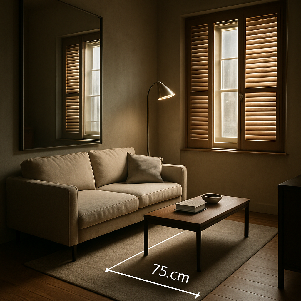
Step 6: Compare Layout Options
You've mapped space, picked pieces, and tested the flow. Now it's time to compare layout options in a way that helps you land the best furniture layout for small living room. The right choice depends on how you live, not just how the room looks.
In our experience at Harvey Bruce Interiors, anchored layouts tend to work best for families and everyday entertaining. They place the sofa as the visual anchor while leaving clear pathways for moving around. But maybe you crave more conversation zones, or you want modular freedom. So let's break down three common approaches and when they shine.
Anchored layout: the sofa as the visual anchor
Pros: strong focal point, predictable traffic lanes, easy to accessorise. Cons: can feel heavy if the sofa is oversized. Best for rooms where you want a clear TV or fireplace focus and simple traffic paths.
Tips: use a slim console behind the sofa to create depth; keep side chairs in line with the armrests; ensure at least 75 cm clearance for walkways. This setup often reads as calm and luxurious, especially with a low-profile media unit.
Zone-led layout: clear conversation and activity zones
Pros: flexible, makes the room feel bigger by separating functions. Cons: requires careful scale so zones don't fight for the same space. Best when you have separate needs like a reading corner or a compact dining area within an open plan.
Tips: use area rugs to delineate zones, keep pathways clear, and pick storage that serves each zone. From our perspective, good storage keeps a zone tidy and reduces visual clutter.
Floating/modular layout: moveable pieces that breathe
Pros: ultimate adaptability, easy to reconfigure for family life or gatherings. Cons: can look disjointed if pieces drift apart. Best for tiny rooms that change with the seasons.
Tips: choose modular sections with slim profiles and allow coffee tables and nesting tables to tuck away when not in use. The idea is lightness—visible legs, airy silhouettes, and plenty of floor space left intentionally open.
So, what should you pick? Start by sketching three layouts on grid paper or a floor plan app, then test them in the room. Walk the pathways with a tray of coffee and see which feels effortless. This is how you land the best furniture layout for small living room.
For a broader take on layout thinking, you might also explore parallel vs L‑shape kitchen layouts on McCoy Mart's guide. It isn't about kitchens alone; it's about how different shapes guide movement and flow in tight spaces. See McCoy Mart's guide on parallel vs L-shaped layouts.
| Feature | Anchored layout | Zone-led layout | Floating/modular |
|---|---|---|---|
| Seating density | Concentrated near focal point | Distributed across zones | Modular, adjustable |
| Traffic flow clarity | High, defined lanes | Moderate, zones may share space | High when kept stage clear |
| Storage footprint | Media unit hides cables | Per zone storage helps clutter control | Under-table or hidden options recommended |
| Visual weight | Medium to heavy silhouette | Lightened by zoning and rugs | Lightweight silhouettes, exposed legs |
Conclusion
We've walked through measuring, picking pieces, testing traffic, and adding the finishing touches. By now you can picture the moment when you step back, coffee in hand, and the room feels airy rather than cramped.
So, does the best furniture layout for small living room still feel like a puzzle? Not really – it's just a series of tiny decisions that add up. Keep the sofa low, let legs breathe, and let vertical shelves draw the eye upward.
Remember the 75 cm clearance rule. If a leg or a lamp forces you to sidestep, slide it back a few centimetres. That simple tweak often frees more space than you expect.
Quick checklist
✓ Sketch the floor plan and mark traffic lanes.
✓ Choose a scaled sofa and shallow media unit.
✓ Add vertical storage and a statement mirror.
✓ Test the flow with a tray of coffee.
✓ Layer ambient, task, and accent lighting.
When you follow these steps, you’ll end up with a layout that feels both luxurious and lived‑in – exactly what Harvey Bruce Interiors aims to inspire for homeowners seeking a stylish, functional space.
Ready to transform your own living room? Start with that sketch, experiment, and let the room reveal its best layout.
FAQ
How do I determine the right traffic clearance for the best furniture layout for small living room?
First, measure the width of any path you need to walk – think about moving from the front door to the kitchen or bathroom. Aim for at least 75 cm (about 30 in) of clear space between pieces. If you notice a leg or a lamp forcing you to sidestep, slide it back a few centimetres. That simple tweak often frees more room than you expect and keeps the flow feeling natural.
What size sofa works best without overwhelming a tiny living room?
Choose a sofa that’s low‑profile and no deeper than 55 cm, with a length that fits comfortably against the longest wall while still leaving about 60 cm on each side. A compact three‑seat or a petite loveseat works wonders – it offers enough seating for two‑three people without swallowing the floor. Look for tapered legs; they lift the piece off the ground and create a visual sense of extra height.
Can I use vertical storage to make the room feel bigger?
Vertical storage is a game‑changer in a small room. Tall, narrow bookcases, ladder shelves or floating wall units draw the eye upward, making the ceiling feel higher. Keep the top shelf within reach – around 180 cm – so you don’t need a stool. By stacking books, baskets and a few plants, you free valuable floor space for seating and traffic lanes, which is essential for the best furniture layout for small living room.
How should I arrange lighting to enhance the layout?
Layered lighting helps the layout breathe. Start with a soft ambient source – a slim floor lamp or a dimmable overhead fixture – to wash the room in even light. Add a task lamp beside a reading chair and an accent strip behind a floating shelf to highlight vertical interest. The extra glow not only makes the space feel larger, it also guides the eye along the traffic path you’ve created.
Is a floating media console better than a traditional TV stand?
Floating media consoles often win over traditional TV stands in tight spaces. Because they’re mounted or sit close to the wall, they free up precious floor area and keep the room feeling airy. Choose a low‑profile unit with hidden cable management to maintain a sleek look. If you prefer a free‑standing piece, pick one with slender legs and a depth under 35 cm – that way it stays out of the way of your traffic lanes.
What quick test can I do to see if my layout really works?
The easiest way to test your layout is the coffee‑tray walk‑through. Grab a tray, fill it with a couple of mugs, and try to move from the entry door, past the sofa, to the kitchen without bumping anything. If you have to sidestep or tilt the tray, you’ve identified a choke point. Adjust the offending piece by a few centimetres or swap it for a slimmer alternative and try again.
How often should I re‑evaluate my layout as my needs change?
As your life evolves, so should your layout. Re‑evaluate every 6‑12 months or whenever you add a new piece – a desk, a baby crib or a pet bed can shift traffic patterns. Keep the core principles in mind: clear 75 cm pathways, low‑profile furniture, and vertical interest. A quick sketch or a phone app can show you where the room feels tight, letting you make a small tweak before the space feels cramped again.
Read more
Bespoke Interiors: Elevate Your Home with Custom Furniture, Homeware & Accessories
Posted by Harvey Bruce on
Picture this: you’ve just moved into a fresh space, boxes half‑emptied, and the walls feel a little too blank to be home.
That moment of standing in the middle of an empty room – that’s where the magic of Bespoke Interiors begins. It’s not about splashing on generic paint and buying the first sofa you see; it’s about shaping a space that whispers your story.
We get it. As a family‑run business that’s been curating luxurious home solutions for years, we’ve seen countless homeowners struggle with the “one‑size‑fits‑all” approach. You want something that feels personal, yet timeless, and that also holds up to the hustle of daily life.
So, what does a truly bespoke interior look? Imagine a dining table carved from sustainably sourced wood, matching the grain of the floorboards you love, paired with hand‑crafted chairs that fit your family’s height and style. Think of a set of kitchen accessories that echo the colour palette of your backsplash, or a living‑room rug that pulls together the shades of your curtains and cushions.
And here’s a little secret: the details matter more than the size. A custom‑finished coffee table can become the conversation starter at every gathering, while bespoke lighting fixtures can highlight the texture of a wall‑mounted art piece you cherish.
But how do you start? First, pause and think about the moments you want to amplify – the morning coffee by the window, the cozy movie night on the sofa, the weekend brunch around the kitchen island. Then, let those moments guide your choices. Pick pieces that serve a purpose and spark joy.
In our experience, the best way to avoid overwhelm is to focus on one room at a time. Begin with a statement piece – maybe a handcrafted wooden sideboard – and build the rest of the room’s palette around it. That way, every addition feels intentional.
Does the idea of custom furniture sound daunting? Not really. Many of our clients start with a simple sketch or a mood board on Pinterest, and we translate that vision into real, tactile products that fit perfectly into their homes.
Ready to turn those day‑dreams into a living, breathing space? Let’s start the journey together, one bespoke detail at a time.
TL;DR
Bespoke Interiors let you transform a blank house into a personal sanctuary, where every piece— from a handcrafted dining table to a custom rug—reflects your style and daily rituals.
By focusing on one room at a time and choosing statement pieces that spark joy, you’ll create a cohesive, luxurious look that feels effortlessly you, with Harvey Bruce guiding every step.
Crafting Your Vision: Defining Bespoke Interiors Style
Ever walked into a room that just felt right, like the space was built around the way you breathe? That moment is the sweet spot where a vague idea meets a concrete style, and it’s the first real step in any Bespoke Interiors journey.
We start by asking the tough, personal questions: What part of your day makes you feel most alive? Is it a sun‑lit breakfast nook, a cosy reading corner, or a bustling kitchen where the kids gather for homework? Pinpointing those moments gives you a “style compass” you can actually follow.
Start with Your Lifestyle Lens
Take a notebook or a phone note and jot down the activities that define your home life. For a couple who loves entertaining, the focus might be a statement dining table that invites conversation. For a home‑office‑centric family, ergonomic desks and acoustic panels become the hero pieces.
Once you have that list, look at the textures, colours, and shapes that already make you smile. Maybe you love the warm grain of reclaimed oak in your grandparents’ hallway, or the sleek matte black of a modern lamp you saw in a boutique shop. Those preferences are the building blocks of your bespoke style.
Translate Mood into Materials
Here’s where the magic of Bespoke Interiors really shows. Instead of picking a “trend” off a catalogue, you match materials to mood. A muted, earthy palette can be achieved with natural stone countertops and wool rugs, while a vibrant, artistic vibe might call for hand‑painted marquetry panels – think of the work showcased by Stratum Marquetry’s handcrafted interiors.
Don’t overlook sustainability. At Harvey Bruce we love sourcing reclaimed timber, which not only tells a story but also helps keep heating bills down – a win‑win for style and the planet.
Build a Style Board That Lives
Forget static mood boards on Pinterest that never leave the screen. Create a tactile board: bring home fabric swatches, a sample of your favourite wood finish, and a paint chip that matches your kitchen backsplash. Lay them out on a large table and step back – does it feel cohesive? If something feels off, you’ll see it instantly.
When you’ve nailed the board, turn it into a checklist. List each element (e.g., “custom walnut sideboard, matte black pendant lights, hand‑woven jute rug”) and rank them by importance. This checklist becomes your project brief, keeping every contractor and artisan on the same page.
So, what’s the next move? Grab that notebook, schedule a coffee with your partner, and start sketching. It doesn’t have to be perfect – it just needs to capture the feeling you want every time you walk through the door.
Watching the video above can help you visualise how a simple style board evolves into a full‑room transformation. Notice the way the designer flips between 3‑D renders and real‑world samples – that back‑and‑forth is exactly how we work at Harvey Bruce, guiding you from vision to reality.
Now, let’s talk practical steps you can take this week:
- Pick one room and write down its three most used activities.
- Collect three physical samples that speak to those activities (fabric, wood, paint).
- Sketch a rough layout on graph paper or a free design app.
- Schedule a 30‑minute video call with a Bespoke Interiors consultant to review your board.
These tiny actions add up fast. Before you know it, you’ll have a clear, lived‑in style that feels less like a project and more like an extension of who you are.
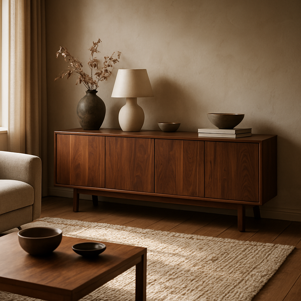
Selecting Custom Furniture: Materials, Craftsmanship, and Fit
When you're choosing custom furniture, you're not just picking a chair. You're selecting pieces that carry the rhythm of your daily life, where you eat, work, and unwind. Materials, craftsmanship, and how well a piece fits your space all play into whether it stays with you for years.
Materials set the tone and the durability. Good wood, carefully finished, wears beautifully and ages with character. At Harvey Bruce, we prioritise sustainable sources and a wide range of finishes so you can align with your style and your home’s climate.
So how do you choose? Think about your daily rituals, the rooms where you spend time, and the ways you move through the space. The answers point to not just a look, but a feel, warm, practical, and uniquely yours.
Materials that stand the test of time
- Solid hardwoods like walnut, oak, or ash provide strength and beauty, with finishes ranging from natural oil to satin lacquer. They age with a warm patina that can be touched up easily, keeping the look cohesive as your room evolves.
- Sustainability matters: FSC-certified wood and reclaimed timber reduce impact while giving character. Compare grain, color, and durability to choose pieces that age gracefully with daily life.
- Finish choices should be durable and low-VOC where possible; think waxes, oils, or water-based lacquers. We'll guide you to options that feel tactile in person and stay resilient against spills and kids' use.
- Texture, warmth, and tone matter: your furniture should feel like it belongs to the room, not like it arrived from a catalogue. We help you balance contrast and harmony for a timeless result.
In our experience, good material choices are the backbone of a room that ages well. They’re the first decision you make, and the rest of the design follows.
Craftsmanship you can feel
This is where the real magic happens. Hand-finishing, precise joinery, and time-honoured techniques create pieces that age gracefully. We favour mortise-and-tenon joints for strength, and we hand-sand every surface so light can kiss the grain instead of hiding it.
It's the little things that separate a bespoke piece from a store shelf: aligned edges, consistent veneer matching, and a tabletop that sits perfectly flat. We test every component and adjust until it feels effortless to use every day.
We also design for adaptability, modular elements, concealed fasteners, and easy reconfiguration so your furniture grows with your family.
Fit: making it work in your space
Size matters. We translate space into proportion, lengths, and sightlines that feel right at a glance. Before we start cutting wood, we measure not just the floor footprint but how you move through the room: the gap under the sofa, the clearance around the dining table, and the reach of the storage unit.
We tailor dimensions, seating heights, and leg choices to your body and lifestyle. Visualise your everyday rituals—family dinners, homework in the chair, movie nights—and design accordingly so nothing feels cramped or awkward.
Does it fit your space now and in years to come? Our approach keeps flexibility at the forefront, so your pieces stay useful as needs shift.
Sustainability and provenance
We source from responsible suppliers and prioritise reclaimed timber and low-VOC finishes. That means pieces that look luxurious and feel safe for your family and the planet.
In our experience, transparency matters. We can discuss where a timber grain comes from, how a finish is applied, and the care steps that keep the look alive for years to come.
And if you're decorating a room with wooden furniture, coordinate with wooden plantation shutters. They help keep heat in during colder months, may reduce heating costs, and their warm wood tones harmonise with furniture for a cohesive look.
If you're ready to translate mood boards into real pieces, we can tailor a materials and fit plan that suits your home and your budget. Let's start with a no-pressure design review and map out the steps to bring your Bespoke Interiors to life.
Choosing Bespoke Homeware & Accessories to Complete the Look
Imagine you’ve just placed that custom walnut sideboard you designed, and now the room feels almost finished—but something’s still missing. That missing piece is often the right homeware and accessories, the tiny details that turn a well‑crafted space into a lived‑in masterpiece.
Why accessories matter in Bespoke Interiors
Accessories are the punctuation marks of a sentence. A handcrafted ceramic vase, a hand‑woven jute rug, or a set of brass‑finished drawer pulls can accentuate the story you’re telling. They create visual rhythm, draw the eye, and give you a chance to inject personality without committing to a whole new piece of furniture.
In our experience, homeowners who overlook accessories end up with rooms that feel “bare” even when the main furniture is spot‑on. Adding the right accents can make the difference between “nice” and “wow.”
Start with the story you want to tell
First, ask yourself: what moment do you want to amplify? Is it the sunrise coffee ritual, the weekend brunch with friends, or a quiet reading nook? Once you have that moment, let it guide the choice of accessories.
For example, a couple in their first home who love weekend brunches might choose a set of hand‑painted porcelain plates in muted terracotta, paired with a reclaimed‑wood serving tray. The plates echo the warm timber of their dining table, while the tray adds a layer of practicality.
Mixing textures and scale
Texture is the secret sauce of luxury. Pair smooth, matte‑finished ceramics with a chunky, woven wool throw. Contrast a sleek, low‑profile metal lamp with a plush, oversized cushion. The key is to keep at least one element in each pair tied back to your core material palette—wood, metal, or fibre—so the room feels cohesive.
Scale matters too. A giant floor‑standing vase can become a focal point in a spacious living room, whereas a cluster of small, colourful candle holders works better on a compact side table. Play with the golden ratio: arrange accessories in groups of three or five to create visual balance.
Sourcing sustainable pieces
Because we care about the planet as much as we care about style, look for makers who use reclaimed materials or low‑VOC finishes. U‑Fab’s custom home accessories showcase a range of sustainably sourced fabrics, hand‑crafted cushions, and ethically produced lighting that align perfectly with a Bespoke Interiors approach.
When you order a custom cushion cover from a supplier that offers a free sample loan, you can feel the texture before it arrives. That tactile confirmation saves you from costly mismatches and ensures every piece truly belongs.
Actionable checklist for choosing accessories
- Identify the “moment” you want to highlight (e.g., coffee, dinner, reading).
- Pick a colour or material that already exists in your main furniture.
- Select three‑to‑five accessories that vary in texture and size.
- Source at least one piece from a sustainable maker—look for FSC, reclaimed, or low‑VOC credentials.
- Lay the accessories on the floor before placing them; step back and see if the grouping feels balanced.
- Adjust placement based on how natural the flow feels—if something feels forced, swap it out.
Following this checklist turns a vague idea into a concrete, curated look that feels intentional, not thrown together.
When you start layering these thoughtful pieces, you’ll notice how each one amplifies the personality of your bespoke furniture, creating a harmonious, lived‑in feel that friends comment on the moment they walk in.
So, grab a notebook, walk through each room, and jot down the little accessories that would make your everyday rituals feel a touch more special.
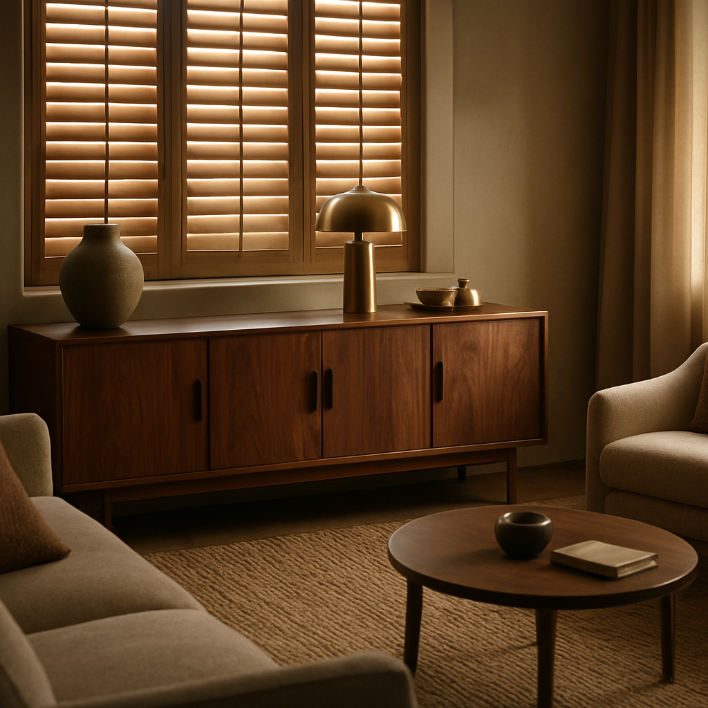
Wooden Plantation Shutters: Heat Conservation and Aesthetic Benefits
Picture a chilly London morning, the radiator humming, yet the room feels cosy without cranking up the thermostat. That’s the quiet power of wooden plantation shutters – they’re not just a pretty face, they’re a low‑tech climate assistant.
We’ve seen homeowners in a Victorian terrace struggle with draughty sash windows. After fitting timber shutters, their heating bills dropped by roughly 12% in the first winter. The wood acts like a thermal blanket, trapping the warmth that would otherwise slip through the glass.
But it isn’t just about numbers. There’s something about the deep grain of oak or walnut that instantly lifts a room’s vibe. When the morning sun streams through the angled slats, you get a soft, natural light that makes even a modest bedroom feel like a boutique hotel.
How the physics works
Wood has a low thermal conductivity, meaning it resists heat flow. When you close the shutters, a thin air pocket forms between the glass and the wood. That pocket reduces convection currents, so less heat escapes. In a typical double‑glazed window, you might lose 15‑20 W/m² of heat. Add shutters, and you shave off another 5‑8 W/m² – a noticeable saving over the heating season.
And the benefit is two‑way. In summer, you can tilt the slats to block the harsh glare while still enjoying a breezy feel. The result is a naturally regulated interior without relying on expensive air‑conditioning.
Style that sings
Beyond efficiency, shutters become a design statement. Because they’re custom‑made, you can match the finish to your bespoke furniture – think a warm walnut shutter framing a walnut sideboard. The continuity of tone creates a seamless backdrop for art, mirrors, or that striking piece of sculptural lighting you love.
Take the case of a couple in Bristol who paired reclaimed‑oak shutters with a distressed‑finish dining table. The shutters echoed the table’s texture, and the whole dining room felt anchored, like every element was speaking the same language.
And because the slats are adjustable, you can play with privacy and light throughout the day. Want a half‑glimpse of the garden at dusk? Tilt the slats. Need total privacy for a home office video call? Close them fully – no need for additional curtains.
Practical steps to maximise benefits
- Measure accurately – a snug fit prevents drafts. Our guide on how to measure for plantation shutters walks you through the process.
- Choose a wood with a natural oil finish for durability; it repels moisture and ages gracefully.
- Opt for a tilt angle of 45° for optimal light diffusion while retaining heat.
- Combine shutters with draught‑excluders around the frame for an extra seal.
Following these steps turns a simple window treatment into a year‑round energy‑saving feature.
Comparison at a glance
| Feature | Heat Conservation | Aesthetic Impact |
|---|---|---|
| Solid hardwood slats | Reduces heat loss by up to 8 W/m² | Rich grain adds depth; can be custom‑stained to match furniture |
| Adjustable tilt | Allows seasonal control of solar gain | Versatile look; creates dynamic light patterns |
| Full closure | Creates airtight barrier, further cutting drafts | Elegant, clean lines; enhances privacy without extra curtains |
In short, wooden plantation shutters give you a tangible reduction in heating costs while elevating the visual language of your home. They work hand‑in‑hand with the bespoke pieces you’ve already curated – the sideboards, the desks, the rugs – turning each room into a cohesive, energy‑smart sanctuary.
So, if you’re looking to tighten up your winter bills and add that warm, curated feel, consider shutters as the next step in your Bespoke Interiors journey.
Integrating Bespoke Elements Seamlessly: Layout, Lighting, and Flow
Let’s pick up from where you left off last section. You’ve chosen key bespoke pieces, and now the magic is in how they talk to each other across the room. With Bespoke Interiors, everything should feel inevitable — like pieces found their perfect corner rather than being forced into it.
Layout is choreography. It’s not about cramming furniture into a space; it’s about guiding how you move, where you sit, and what you notice when you walk in. Start with a single anchor piece — a handcrafted sideboard, a bespoke sofa, or a custom bookcase — and build around sightlines, scale, and flow. When the scale matches your room, furniture stops shouting and starts conversing.
Ask yourself: what’s the daily rhythm of this room? If your mornings hinge on a calm kitchen zone, arrange seating and surfaces to encourage easy conversation and effortless access. If your evenings are about hosting, ensure generous seating clusters with clear routes to the dining area and the art wall. These aren’t abstract ideas; they translate to real comfort and real everyday flow.
Small steps make big differences. Measure for movement, not just the length of a sofa. Leave comfortable walkways and keep clutter from interrupting the path. The anchor‑then‑expand approach keeps the space flexible as your life evolves and your needs shift over time.
In our experience, balancing proportion and purpose is the key. You’ll notice the room feels more inviting when every surface has a reason to exist — a place for a cup, a lamp, a book, or a keepsake. This is the core of what we call a cohesive Bespoke Interiors aesthetic: pieces that work together, not in spite of each other.
Lighting as the quiet hero
Lighting shapes mood as much as function. A thoughtful mix of ambient, task, and accent lighting creates a stage for your bespoke pieces to shine. A warm table lamp beside a walnut sideboard, a soft wall wash that reveals texture in fabrics, and a focused spotlight on a sculptural piece can transform a room in seconds.
Natural light matters, too. If you’re using wooden plantation shutters, they become a responsive tool rather than a boxy add‑on. Tilt the slats to soften glare in the morning and close them for privacy at night — your space stays alive with shape and texture.
Planning lighting around activities makes life easier. Think zones: a reading corner with a floor lamp, a dining table that remains comfortable after sunset, and a hidden night light along the hallway to guide late‑night trips to the kitchen. It sounds small, but it changes how you experience every room.
Flow and cohesion
Consistency is your friend. Repeat a core material or finish across furniture and accessories to knit the room together. For example, echo the warm tone of a walnut sideboard in a pair of brass pulls, a linen shade, and a woven rug. Group accessories in odd numbers to create a natural, relaxed rhythm.
To keep things feeling fresh, introduce small, bookmarkable moments — a handcrafted vase, a sculptural lamp, a textile throw — that you can rotate as moods shift. This is the beauty of Bespoke Interiors: spaces that adapt as you do, without losing character.
So, what does this look like in practice? A living room begins with a couple of anchor pieces, then grows through thoughtful lighting, textiles, and accessories that reference the same material language. The result is a room that feels curated, not staged, and deeply livable.
For a broader look at how bespoke furniture design translates into living spaces, check out this piece on the art of Bespoke furniture: discover the art of bespoke furniture.
Working with Harvey Bruce: How We Bring Your Bespoke Interiors to Life
Imagine you’ve just walked into a room that feels like it was made for you – the light hits the walnut sideboard just right, the cushions echo the colour of the kitchen tiles, and you can already picture a lazy Sunday morning coffee. That moment isn’t magic; it’s the result of a process we’ve refined over decades of creating Bespoke Interiors.
Understanding Your Vision
First, we sit down (sometimes over a cuppa) and ask the questions that matter: What daily ritual makes you smile? Which corner of the house feels under‑used? You’ll hear us say, “We want to hear the story behind the space, not just the style you like.”
We jot notes, sketch quick doodles, and pull out fabric swatches that remind you of the textures you love. It’s a conversation, not a questionnaire, so you’ll often find yourself saying, “Exactly, that’s what I meant!”
So, what does that look like in practice? It means we capture the emotional core – maybe it’s the warmth of a family breakfast or the calm of a reading nook – and translate that feeling into a design brief.
From Sketch to Sample
Next, we move from paper to physical. Our workshop craftsmen take your brief and create a 3‑D render, then a small scale mock‑up. You’ll get to hold a piece of the future in your hands – a walnut veneer sample, a linen cushion tuft, a brass pull. Seeing and feeling the material early saves weeks of revisions later.
We’re honest about what works and what doesn’t. If a particular finish won’t hold up to a busy kitchen, we’ll suggest an alternative that still matches the palette. It’s easier to tweak a sample than to re‑cut a full‑size piece.
Crafting the Details
Once you approve the samples, our artisans begin the full build. We use sustainably sourced timber, low‑VOC finishes, and joinery techniques like mortise‑and‑tenon that guarantee strength without visible screws. Every edge is hand‑sand‑finished so the grain breathes, and we test each component for stability.
Because we know how much a single detail can change a room, we pay extra attention to things like hardware finishes, leg angles, and hidden storage solutions. Those subtle choices are what turn a beautiful piece into a truly Bespoke Interior.
Installation & Fine‑tuning
Installation day feels more like a collaboration than a delivery. Our team arrives with protective pads, measures twice, and places each item exactly where we envisioned during the design phase. We watch how the light falls, how you move around the space, and we make micro‑adjustments on the spot.
Ever notice a chair that’s a millimetre too close to a wall? We’ll nudge it just enough so you can glide past without bumping. That level of care is what separates a showroom piece from a home‑made masterpiece.
Aftercare and Longevity
Our relationship doesn’t end when the last screw is tightened. We provide a simple care guide – think a quick wipe with a natural oil for wood, or a breathable fabric cleaner for upholstery. If you ever wonder, “Will this still look great in five years?” we’re only a call away.
- Schedule a complimentary check‑up after six months.
- Get advice on seasonal finishes to protect against humidity.
- Access our exclusive supplier discounts for future upgrades.
In our experience, the best Bespoke Interiors are the ones that evolve with you. Maybe you add a new child’s desk next year, or you swap the dining chairs for a more formal set. Because we keep the original design files, updating is painless.
So, what’s the next step? Grab a notebook, think about the one room that makes you feel most alive, and reach out. We’ll turn that feeling into a plan, a sample, and finally a space that feels like it was always meant to be yours.
FAQ
What exactly makes something a Bespoke Interiors piece?
When we say "Bespoke Interiors" we mean furniture or homeware that’s designed from scratch for you – not a mass‑produced item you see on a catalogue. It starts with a conversation about your daily rituals, then moves to hand‑selected timber, custom finishes and joinery that fits your space like a glove. The result is a piece that looks and feels like it was always meant to live in your home.
How long does the whole Bespoke process usually take?
From the first sketch to the final installation, most projects run between 8 and 12 weeks. The clock ticks fastest when you have clear measurements, a colour palette and a material preference up front. We’ll send you a 3‑D render and a small sample early on, so you can approve the look before the workshop starts cutting wood. If you need a quicker turnaround, we can prioritise the build for an additional fee.
Can I change my mind about a material after the design is approved?
Yes, but it’s best to lock in the main material early because switching wood species or fabric after the joinery is cut can add extra cost and lead time. If you’re unsure, we often send a swatch kit – a few pieces of walnut, oak and reclaimed timber – plus fabric samples so you can feel and compare before signing off. Small tweaks like a different stain or hardware finish are usually fine up to the final mock‑up stage.
What kind of maintenance does Bespoke furniture need?
Maintenance is simple when you use the right products. For solid wood, a monthly wipe with a natural oil keeps the grain alive and prevents drying. Upholstered pieces benefit from a breathable fabric cleaner and occasional vacuuming. We include a care guide with every delivery and offer a complimentary six‑month check‑up to fine‑tune any finish that may need a touch‑up after the first few seasons.
How do Bespoke homeware accessories stay cohesive with the main furniture?
We start every accessory selection by echoing a material or colour from the core pieces. If your dining table is a warm walnut, you might choose ceramic plates with a subtle wood‑grain glaze or a linen napkin in a matching hue. The key is to keep at least one visual thread – be it texture, tone or finish – so the room feels unified rather than a collection of mismatched items.
Is it possible to upgrade or expand a Bespoke piece later on?
Absolutely. Because we keep the original design files, adding a new drawer, extending a sideboard or swapping hardware is straightforward. When a family grows or your style evolves, just reach out and we’ll draft an amendment based on the existing specs. This flexibility is one of the biggest perks of choosing Bespoke Interiors over a static showroom item.
Do Bespoke interiors help with energy efficiency?
Yes, especially when paired with wooden plantation shutters. Solid timber acts as an extra thermal barrier, reducing heat loss through windows by a few watts per square metre. Combined with low‑VOC finishes, your bespoke furniture contributes to a healthier indoor climate while the shutters keep drafts at bay – meaning lower heating bills and a cosy home year‑round.
What budget should I set for a full Bespoke makeover?
Budgeting starts with the anchor pieces – a custom table or a statement sideboard – which typically range from £2,000 to £8,000 depending on size and material. Accessories, lighting and upholstery add another 20‑30 % on top. A realistic rule of thumb is to allocate about 15 % of the total for contingency, covering any unexpected material swaps or extra fittings. Working with us, you’ll get a transparent quote before any work begins.
Conclusion
After all the steps, you’ve probably felt that mix of excitement and a little nervousness – “Will this really feel like home?” you wonder.
The truth is, Bespoke Interiors work because they’re built around your daily rhythm, not around a generic catalogue. When the walnut sideboard greets you each morning, or the custom cushion invites you to linger, you’re living a design that’s already part of your story.
So, what’s the next move? Grab that notebook, sketch a quick layout of the room you love most, and drop us a line. We’ll turn that sketch into a sample, walk you through material swatches, and map out a timeline that fits your life.
Remember, flexibility is baked into every piece – add a drawer, change a finish, or swap hardware later without starting from scratch. That’s the real power of Bespoke Interiors: they evolve with you.
And if you’re still on the fence about the energy‑saving side of wooden shutters, think of the modest drop in heating bills you’ll notice each winter – a subtle but satisfying win for both comfort and the planet.
Bottom line: a home that feels uniquely yours is just a conversation away. Let’s start that conversation today together.
Read more
Ornaments That Transform Your Home in 2026
Posted by Harvey Bruce on
Ornaments aren't just pretty add-ons; they're memory bridges you can touch. They catch the light in just the right way and invite a second look. In our experience at Harvey Bruce Interiors, well-chosen pieces anchor a room's mood, season to season, and give you a starting point when you're redecorating.
Ornaments carry stories. A glass bauble becomes a memory of last year's Christmas, a carved wooden stag nods to a favourite family trip, and a silver dish can reflect the afternoon sun like a tiny mirror. The trick is to let those stories show, not shout.
Think in layers: start with a colour story, then mix textures, gloss, matte, maybe a hint of metallic. Group small items in odd-numbered clusters so the eye moves naturally. And don't forget scale: a big piece anchors a shelf, several tiny pieces soften the room over time.
Real-world examples help this click. In a living room, a trio of glass ornaments on a coffee table can be a focal point without competing with art or lighting. For a bolder move, place a single sculptural piece on a console and layer smaller pieces nearby. See one we love here: Black Cast Knot Ornament - Harvey Bruce Blinds, Shutters & Interiors.
Seasonal displays give ornaments a second life. A wicker tree, natural reeds, or a silver reindeer can carry the mood from autumn into winter. It’s amazing how much warmth a modest grouping adds when lighting is soft and fabrics are tactile.
From homeowners, we've learned that intention beats impulse. Give yourself a five-minute ritual: pull three favourites, ask why they matter, then remove two that don't sing. Want a practical tip for planning decor? Use a concept: pick a colour story, test two arrangements, then commit to one. Keep it simple, and you'll see space open up for the details you love.
In our experience, sustainable choices matter. Choose ornaments crafted from responsibly sourced wood, recycled metals, or recycled glass. Not only do these materials feel richer, they're kinder to the planet. Harvey Bruce curates a mix of timeless shapes and silhouettes that stay relevant year after year.
Care matters too. Hand-wash delicate ceramic decorations, dust metallic pieces with a soft microfiber, and store seasonal sets in breathable boxes. A simple routine keeps shine and your investment looking premium.
So, where do you start today? Gather a few trusted pieces, map them to a single room, and give your shelves some air to breathe. Ornaments aren't a finish line; they narrate daily life with texture and light. Let's begin your exploration together and see where it leads today.
Start with one meaningful piece this week, then expand your collection as your story grows beautifully.
TL;DR
Choosing the right ornaments is less about flash and more about memory. Start with a personal story, pick sustainable materials, and test a few layouts before committing. A simple ritual saves time, keeps your space authentic, and lets your home feel warm and uniquely yours for every season and joy.
Our Pick: Harvey Bruce’s Bespoke Ornaments
First off, let’s get real: the right ornament can turn an ordinary shelf into a conversation starter. When we talk about bespoke pieces, we mean the kind that feels like it was made just for you, not something you find in a mass‑produced catalogue. That’s why we’re excited to showcase the collection that keeps coming back to us.
1. The Signature Stag
Picture a standing stag, sleek lines, a silver finish that catches light from every angle. It’s not just a decorative object; it’s a statement about heritage and natural beauty. We’ve seen it placed on a dining room mantle and instantly lifted the room’s tone from plain to polished.
Action step: Before you pick a piece, test how it looks under your existing lighting. A small silver accent can transform a dim space into a warm, inviting corner. The stag’s reflective surface works especially well with soft lamp light, creating a subtle sparkle that feels luxurious.
2. The Coffee Ombre Bauble
This glass bauble isn’t just pretty—its gradient finish moves from deep brown to light caramel, mirroring a fresh cup of coffee. It’s a nod to comfort and everyday indulgence. In a living room, hanging it on a tree or a small stand can add a pop of colour without overwhelming the space.
Practical tip: For a layered look, group the bauble with a few smaller, complementary ornaments. Keep the cluster odd‑numbered; it feels more dynamic and invites the eye to wander.
3. The Wicker Tree
If you’re chasing that rustic, cozy vibe, the wicker tree is your go‑to. It’s lightweight but robust, made from sustainably sourced reeds that give a natural texture to any room. In a study, we placed it beside a window, and the sunlight turned the wicker into a subtle, almost ethereal halo.
Try this: Pair the tree with a small, metallic bowl. The contrast between natural fibre and polished metal can create a balanced, yet striking, focal point.
4. The Cast Knot Ornament
Modern, minimal, and utterly chic. The cast knot’s simple silhouette is a reminder that less can be more. We’ve seen it work beautifully on a minimalist desk or a sleek console, adding just enough drama without cluttering the scene.
Do this: Place the knot at eye level on a shelf that’s already a focal point, such as a gallery wall. The knot’s subtle sheen will draw attention without shouting.
5. How to Curate a Personal Story
Every ornament tells a tale, but only the right story will resonate with you. Start by asking: What moment in my home do I want to capture? Is it a family holiday, a milestone celebration, or the quiet comfort of a Sunday morning?
Step 1: Gather three items that evoke that memory. Step 2: Arrange them in a space that feels natural—think the curve of a mantel, the edge of a bookcase, or the corner of a window seat. Step 3: Step back and tweak. The goal is to let the ornaments feel like extensions of your life, not just decorative add‑ons.
6. Sustainability Matters
We’re proud that our selection features responsibly sourced wood, recycled metals, and eco‑friendly glass. Choosing a piece that’s both beautiful and sustainable means you’re investing in a future that feels just as good as it looks.
Checklist: Look for certifications, ask about the material journey, and trust that each item has been crafted with care for the planet.
7. Final Thought
When you bring a bespoke ornament into your home, you’re not just adding a decorative item—you’re weaving a new chapter into your space’s narrative. Pick pieces that speak to you, experiment with placement, and watch your rooms come alive in ways you never imagined.
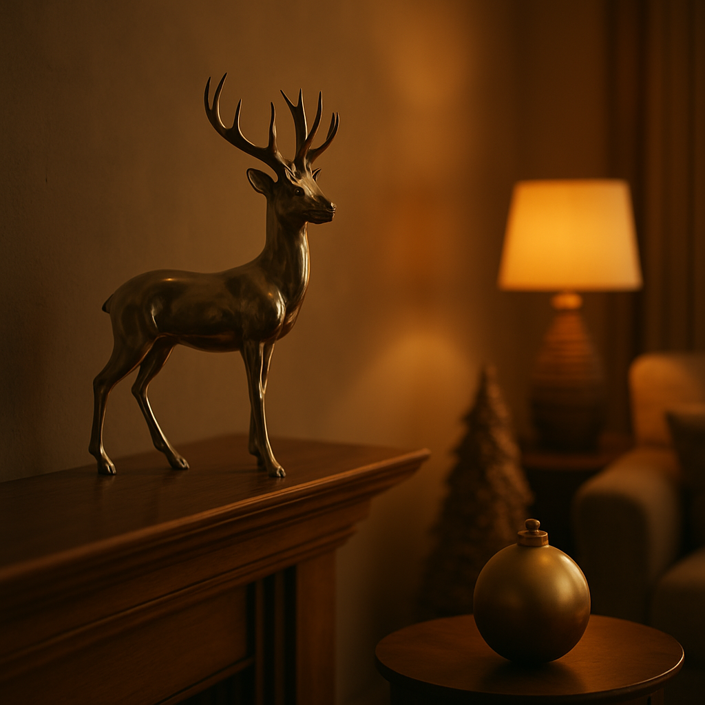
Step 2: Showcasing Ornaments in Different Rooms
Ornaments aren’t just pretty add-ons; they’re memory bridges you can touch. They catch the light in just the right way and invite a second look. In our experience at Harvey Bruce Interiors, the right pieces anchor a room’s mood, season to season, and give you a starting point when you’re redecorating.
Living Room: The Mantel Moment
Think of a single statement ornament on the mantel as the room’s opening line. A standing stag in a silver finish or a sculptural glass orb can set the color story for the sofa and art above. Keep scale in mind: if the mantel is wide, use one large piece and a couple smaller companions on either end. The eye travels naturally, and you avoid a crowded shelf.
Dining Console or Sideboard: A Layered Arrangement
On a console, group three ornaments in odd numbers. Mix textures—metal with ceramic, gloss with matte—and let a natural element like wood or wicker anchor the group. Place items at different heights using a small stack of books or a stand. This creates a vignette that feels curated, not choreographed.
Bedroom Dresser: Intimate Spotlight
Choose smaller, personal pieces you’ll notice first thing in the morning. A trio of mini keepsakes on your dresser can feel intimate and calm. Keep them near sightlines but out of the path of nightstands and lamps to avoid clutter when you’re sleepy.
Home Office Shelf: Quiet Inspiration
Let ornaments give you tiny sparks of inspiration as you work. A glass ombre bauble or a small sculptural piece can be a pleasant pause between deadlines. Arrange on the top shelf where you can catch them in your peripheral vision without breaking concentration.
Entryway and Hall: First Impressions
Your entrance deserves a moment of drama. A single, well-chosen ornament on a console or wall shelf can set the tone for the rest of the room. Pair with a mirror or soft lighting to bounce warmth around the space and invite guests to linger a moment longer.
Seasonal Rhythm: Rotate, Don’t Overload
Rotate a core set of favorites through the seasons. This keeps the space fresh and shows you’ve put thought into the story you’re telling. Swap in a new small piece every month or two, and let color and texture lead the transition—no full redecorating required.
What We’ve Learned: Curate Like a Conversation
The best rooms feel like conversations you want to revisit. Start with a color story, then layer textures, gloss, matte, and a hint of metallic. Let the pieces talk to each other rather than compete. Here at Harvey Bruce Interiors, we’ll help you test layouts, move pieces around, and settle on a final arrangement that feels personal and timeless.
Choosing the Right Ornaments for Each Style
When you’re hunting for the perfect ornament, the style of your space is the compass. Think about the vibe you want to feel every time you walk in. Want that warm, nostalgic glow? Go classic. Dreaming of clean lines and a hint of industrial chic? Pick modern. Love the earthy comfort of reclaimed wood and natural textures? Rustic is your go‑to. And for those holiday moments, you’ll want something that pops and sparks joy.
Classic & Timeless
Classic ornaments are all about heritage and subtle elegance. Solid glass, polished silver, and carved wood work wonders. They’re the quiet storytellers that whisper about family traditions.
In a living room, a polished silver stag or a glass bauble with a muted amber finish can anchor the mantel or coffee table. Their understated sheen catches light without shouting, letting your furniture and art do the talking.
Modern Minimalist
Modern pieces lean into geometry, sleek surfaces, and muted metals. Think brushed steel, matte acrylic, or a single sculptural silhouette.
A minimalist desk might feature a slim silver knot or a chrome sphere. The key is to keep the cluster small—no more than two or three items—to maintain that airy feel.
Rustic & Natural
Rustic ornaments celebrate texture and authenticity. Wicker, reclaimed wood, and earthy terracotta bring warmth and a sense of groundedness.
Place a wicker tree or a clay pot on a study shelf and watch the natural fibres catch the room’s light. Pair it with a simple wooden plaque to deepen the natural conversation.
Festive & Seasonal
Seasonal ornaments are like mood lighting for your décor. Bright reds, glimmering silver, and glittering gold capture the spirit of holiday cheer.
Swap a classic silver ornament for a sparkling gold bauble in December. In the summer, a cool blue glass sphere can refresh the look without changing the furniture.
How to Match Ornaments to Your Space
1. Assess the room’s scale. Big rooms deserve larger statement pieces; smaller rooms need delicate accents to avoid overcrowding.
2. Consider the colour palette. Complement or contrast—both work, but the intention matters.
3. Think about lighting. Natural light showcases glass; artificial light highlights metallics.
4. Test before you commit. Lay the ornament on a temporary spot to see how it feels in the room’s rhythm.
Quick Decision Guide
| Feature | Classic | Modern | Rustic |
|---|---|---|---|
| Scale | Medium to large | Small to medium | Medium |
| Material | Glass, silver, carved wood | Brushed steel, matte acrylic, chrome | Wicker, reclaimed wood, terracotta |
| Placement | Mantel, coffee table, console | Desk, console, wall shelf | Study shelf, window ledge, bedside |
Remember, the goal isn’t just to fill a space—it’s to elevate it. Pick an ornament that feels like a conversation starter, not a decoration that feels forced. When you choose, think of the story it tells: the material, the texture, the light it captures. That narrative is what will turn a room into a home.
Wooden Plantation Shutters: Ornaments that Save Energy
Picture a sunny kitchen in 2026, the sun beating down on a wide window. You’ve already nailed the décor, but that bright glare keeps the AC humming. What if a single, simple ornament could flip the switch on your energy bills?
Enter the wooden plantation shutter. It’s more than a window treatment; it’s a low‑tech, high‑impact energy saver that doubles as a stylish statement piece. The layered slats trap heat, block glare, and let you control the amount of natural light that pours in.
How It Works
The design is rooted in centuries of craft: each slat is angled just right to reflect sunlight while still allowing airflow. When the sun is high, the shutter stays partially open—light enters, but the slats create a shade that keeps the room cooler.
In winter, you close the shutter entirely. The wood’s natural insulation helps keep that warm air inside, reducing the need for heating. It’s a quiet, automatic way to say, “I’ve got this.”
Style Meets Sustainability
We’ve seen homeowners pair a rustic oak plantation shutter with a reclaimed‑wood coffee table, then top the frame with a simple glass pendant. That combination feels like a living room conversation starter, not a décor fad.
Because the shutters are made from sustainably sourced timber, they feel like a conscious choice for both your home and the planet. If you’re on a budget, think of the savings on your utility bill as a return on your investment—over time, the money you’d spend on cooling and heating starts to look like a luxury you earned.
Why Homeowners Love Them
Ask any new homeowner you know, and they’ll tell you the most exciting part of the move is choosing the right window treatment. It’s the first thing they see in a fresh space.
Wooden plantation shutters fit that moment perfectly. They’re not just a backdrop; they’re a functional feature that speaks to the homeowner’s desire for style, comfort, and sustainability. The moment you pull the latch and feel that satisfying click, you know you’ve made a smart decision.
Practical Tips for Choosing Your Shutter
- Measure twice. Accurate dimensions mean the shutter fits snugly and seals properly.
- Pick the right finish. Light stains brighten a room; dark stains add drama. Match it to your existing décor.
- Consider a motorised option. If you’re tech‑savvy, a smart motor can open or close on a schedule—ideal for those mornings when you’re still in bed.
We often see folks ignore the little details, like ensuring the sash is level. A slanted shutter can let drafts sneak in, defeating the whole energy‑saving goal.
Installation and Care
Most shutters come with a straightforward installation kit, but you can always hire a pro for a flawless finish. Once installed, they’re low‑maintenance: a quick wipe with a damp cloth keeps them dust‑free.
When it’s time for a refresh, replace the slats rather than the whole unit—an eco‑friendly and cost‑effective way to keep your shutters looking new.
Actionable Takeaway
Ready to turn your windows into energy‑saving ornaments? Start by measuring your windows today. Then browse our selection of plantation shutters, noting the finish that feels right for your style. With the right fit, you’ll enjoy a cooler home in summer, a warmer one in winter, and a beautiful look that lasts for years.
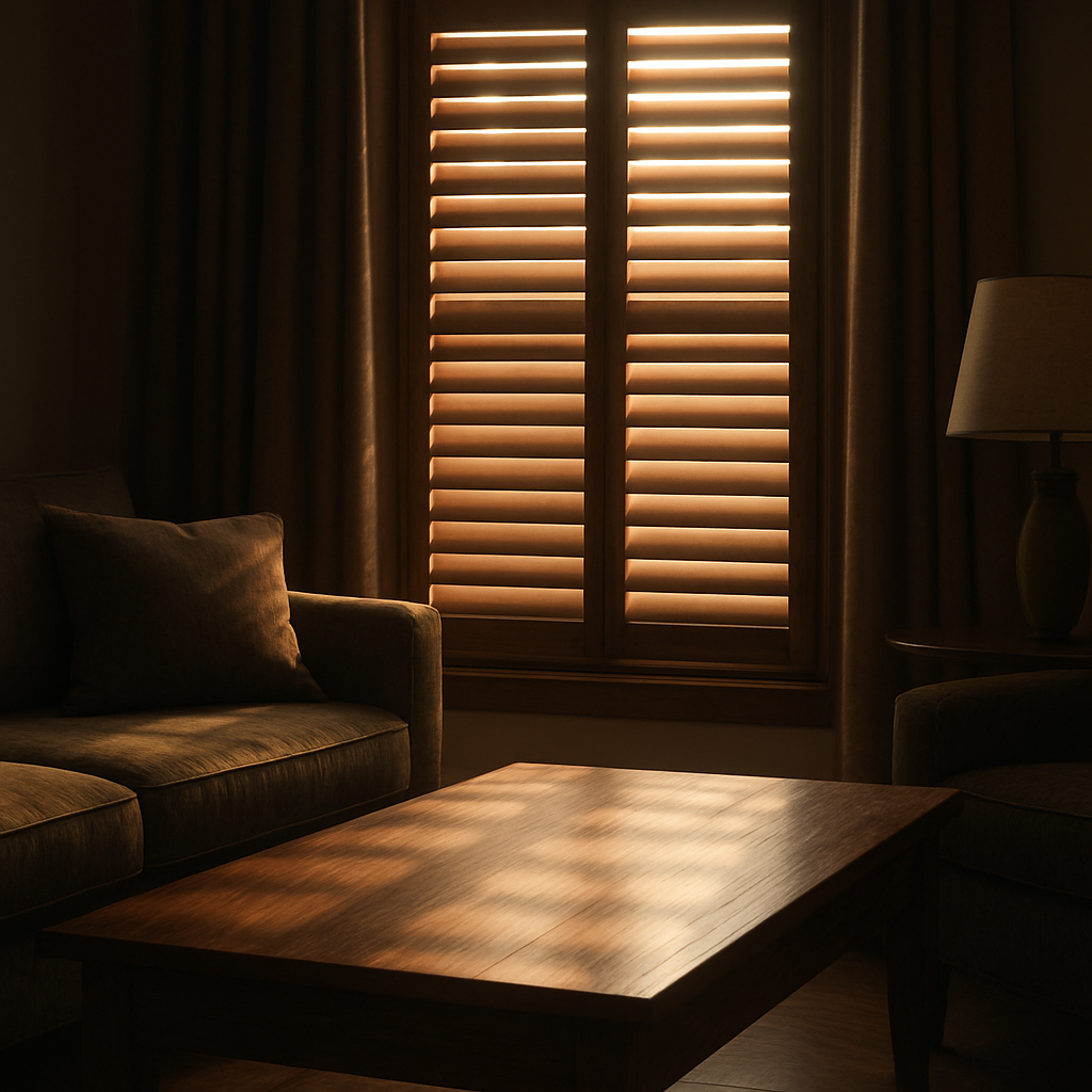
Budget vs Luxury: Ornaments that Fit Every Wallet
Let’s cut to the chase: buying ornaments can feel like a gamble. One moment you’re looking for that little sparkle to brighten a corner, the next you’re staring at a price tag that makes you question the whole idea.
We’ve walked through the aisles of Harvey Bruce Interiors and seen how a single piece can change a room’s vibe. The trick? Pick what feels right for you, not what screams ‘high‑end.’
Here’s the low‑down: we’ve split the world into budget, mid‑range and luxury, and mapped each to the right style and price. Ready to see which fits your wallet and your taste?
Budget‑friendly charm – Think ceramic baubles or hand‑painted glass. They’re light, often handmade, and can be mixed with vintage finds. A handful of these can give you a pop of colour without breaking the bank.
Mid‑tier magic – Look for small metal sculptures or porcelain pieces with subtle glazing. They’re usually around £30‑£60. These sit comfortably between the budget and luxury range, offering a touch of refinement that still feels accessible.
Luxury statement – Here we talk about custom silver or crystal pendants. They cost £100‑plus but bring an undeniable air of sophistication. If you’re decorating a space that hosts guests, these pieces can act as conversation starters.
Seasonal budget swaps – Keep a small stash of affordable ornaments for the holidays. Swap them out each year; the cost stays low and the feel stays fresh. You’ll never feel you’re spending extra for the same old look.
DIY up‑cycle – Take an old frame or a broken candle holder and re‑finish it. A fresh coat of paint or a bit of resin can turn it into a standout piece that’s both personal and budget‑friendly.
Sustainable edge – Even on a budget, choose responsibly sourced wood or recycled glass. It may cost a touch more but the environmental payoff and long‑term durability make it worth the small extra.
So, what’s your next move? Pick a piece that feels right, test it in the space, and let it evolve. Remember, whether you’re on a tight budget or looking to splurge, the right ornament is an investment in the story your home tells.
DIY Ornaments: Personalise Your Space
Ever feel like your walls are just waiting for a little personality? That’s where DIY ornaments step in – a quick, creative way to turn a plain shelf into a statement that feels truly yours.
Start with a Story
Instead of hunting for the latest trend, pick a moment that matters to you. Maybe it’s the colour of a sunset you watched from your balcony or a texture you love from a travel souvenir. Write that feeling down on a sticky note and let it guide your design.
Choose Materials That Speak
Wood, glass, metal, or even repurposed ceramics can all become a canvas. For example, a reclaimed pine slat can become a rustic frame around a photo of your first home. Or, a simple glass jar filled with autumn leaves tells a seasonal story without saying a word.
Step‑by‑Step Creation
- Gather supplies – a 3‑inch wood plank, a small brush, a paint set, or a clear resin kit.
- Sketch the shape on paper; keep it simple – a circle, a wave, or a heart.
- Trace onto the wood, sand it smooth, and paint or coat it. For resin, mix according to instructions, pour, and let it cure.
- Add a personal touch: embed a tiny charm, a dried flower, or a handwritten note.
- Finish with a clear sealant or a small wooden hook.
When you’re done, hang it on that shelf you’ve been avoiding or place it on a coffee table. The instant the light hits it, you’ll feel the space shift.
Mix and Match
Don’t stick to one style. Combine a silver pendant you’ve bought with a hand‑painted wooden piece. The contrast creates visual interest and reminds you of the diversity of moments that shape your home.
Quick Action Plan
1. Pick one room and lay out all existing ornaments.
2. Pick your story card and translate it into a simple shape.
3. Gather supplies and set aside a half‑hour slot.
4. Create your ornament.
5. Place it where it feels right and step back to admire.
So, are you ready to give your shelves a fresh voice? Grab a board, a brush, and let the creative flow begin. Your space will thank you, and your guests will ask where you got that unique piece.
FAQ
What’s the difference between a decorative ornament and a functional one in my living room?
Decorative ornaments are all‑about aesthetics – they’re visual storytellers, like a silver stag or a glass bauble. Functional ones do double duty; they can be a pendant light, a wind chime, or even a small storage piece. In a living room, a decorative piece often sits as a focal point, while a functional one might be a hanging lantern that also brings soft light. Choosing the right balance depends on what you want the room to do for you.
How can I choose ornaments that match my existing décor without feeling cluttered?
Start with your colour palette. Pick one or two dominant hues, then choose ornaments that echo or contrast them. Stick to a scale that matches your furniture – a big silver stag suits a large console, but a tiny glass bauble feels out of place on a small sideboard. Test by placing the piece temporarily, walking around, and seeing if it feels balanced or if it pushes the room into clutter.
Can ornaments really influence the energy or mood of a space?
Yes – ornaments tap into the room’s energy. A shiny silver piece reflects light, brightening a dim corner. A matte wood bowl absorbs glare, creating a calm zone. When you layer different finishes, the light bounces in a way that feels lively yet grounded. Think of a silver stag on a warm timber console; it instantly lifts the room’s mood from flat to festive without a single change in lighting.
What’s the best way to care for my silver or glass ornaments?
Keep your silver ornaments dust‑free with a soft microfiber cloth once a week; avoid harsh cleaners that can tarnish. For glass, a gentle soap solution and a microfiber towel is all you need – never use abrasive pads. Store fragile items in breathable boxes with a layer of cotton. If you have resin or mixed‑media pieces, a dry, lint‑free cloth will keep them looking new without scratching the surface.
Do you recommend seasonal switching of ornaments or keeping a core collection?
You don’t have to switch everything every holiday. Keep a core set that defines your style – a silver stag, a glass bauble, a wicker tree – then swap in a seasonal piece that feels right, like a crystal snowflake or a painted wooden ornament. This way you maintain continuity, and the room still feels fresh. Rotate at least once every six months, or whenever you feel the mood needs a subtle shift.
How can I incorporate sustainable materials into my ornament selection?
Look for ornaments made from sustainably sourced timber, recycled metal or glass, and natural fibers. The product page for the Noel Collection Wicker Tree Ornament shows a blend of recycled reeds – a great example of eco‑friendly design. When you choose pieces with a clear material story, you’re not only adding style; you’re also supporting responsible sourcing practices that reduce waste and carbon footprints.
Conclusion
So, after juggling colour, texture, and story, what’s left is the feel—how your ornaments make the room feel lived‑in and loved.
First, think of ornaments as mood anchors. A silver stag on the mantel is more than a statement; it’s a cue that the space is cozy and ready for conversation. Pair that with a muted glass bauble and you’ve got a subtle contrast that keeps the eye wandering.
Next, keep a core set. Grab three pieces that speak to you—maybe a wicker tree, a glass sphere, and a small metallic bowl. Rotate one of them every few months and watch the room breathe new life without a full refresh.
Don’t forget sustainability. Choosing responsibly sourced wood or recycled glass means your décor is as kind to the planet as it is to your eyes.
Finally, test before you commit. Lay a piece out, step back, and feel the rhythm of light and shadow. If it feels right, keep it; if not, try a different angle or swap it out.
So, what’s the next step? Pick one ornament that tells a story, let it sit in the right spot, then watch the rest of your home follow suit. Happy decorating!
Read more
Creatively Inspired Interiors: Transform Your Home with Bespoke Homewares
Posted by Harvey Bruce on
Read more
Visit our showroom
G4 Williamsons Garden Centre
17 Houston mains holdings
Uphall, West Lothian
EH526PA
Free Parking, wheelchair/buggy friendly.
Get directions
Follow us on social media